Statistics and Probability Unit
Last updated on 2025-11-11 | Edit this page
Estimated time: 44 minutes
Overview
Questions
- How can statistics and probability be used to solve questions in infectious disease epidemiology?
Objectives
At the end of this workshop you will be able to:
Understand the role of statistics in the study of infectious diseases.
Understand and use statistical measures to summarize and analyze information.
Become familiar with the concept of a random variable and recognize common probability distributions.
Learn how to approach a statistical problem as an inference problem from a sample.
Understand the concept of confidence intervals for estimating epidemiological parameters.
Prerequisite
This unit is a supplement to the Introduction to Infectious Disease Modelling for Public Health Course
Table of contents
|
Topic 1: Introduction to Statistical Thinking (See in course platform) Topic 2: Descriptive Statistics (See complement on the course platform) Topic 3: Probability (See course platform add-on) Topic 4: Principal Probability Distributions (See supplement on the course platform) Topic 5: Introduction to Statistical Inference (See complement on the course platform) |
Before you start
Please check that you have installed the following libraries
tidyverse, pak, epiparameter e infer in case they are not
installed, run the code below according to your need:
R
# To install the tidyverse package if you don't have it (or are unsure if you have it), run the following code

if(!require("tidyverse")) install.packages("tidyverse")

# To install the epiparameter package if you don't have it (or are unsure if you have it), run the following code

if (!require("epiparameter")) install.packages("epiparameter")

# To install the epitools package if you don't have it (or are unsure if you have it), run the following code

if (!require(epitools)) install.packages("epitools")

# To install the infer package if you don't have it (or are unsure if you have it), run the following code

if(!require("infer")) install.packages("infer")


# To install the cfr package if you don't have it (or are unsure if you have it), run the following code

if (!require("cfr")) install.packages("cfr")
R
#Before start and eveytime that you start a session in R charge this libraries
library(ggplot2)
library(dplyr)
OUTPUT
Attaching package: 'dplyr'OUTPUT
The following objects are masked from 'package:stats':

    filter, lag
OUTPUT
The following objects are masked from 'package:base':

    intersect, setdiff, setequal, union
R
library(epiparameter)
library(epitools)
library(infer)
OUTPUT
Attaching package: 'infer'OUTPUT
The following object is masked from 'package:epiparameter':

    generate
R
library(cfr)

Topic 2: Descriptive Statistics
Exercise: Visualising and Analysing Data in R
There are many graphs according to the type of scale of the variable you want to analyse. Here are some examples to help you understand these concepts.
Please take into account that you have previously completed the introductory unit on R and the data visualisation unit. The data table for this exercise can be found in: https://raw.githubusercontent.com/epiverse-trace/translation-epitkit/refs/heads/main/data/sample_data.RDS
Once you have the data downloaded to your computer and in the data folder of your project you can execute the following command:
R
sample_data <-
  base::readRDS("data/sample_data.RDS")
Histogram and Boxplot
The two most common types of graphs for visualising the distribution of quantitative variables are histograms and boxplots.
The histograms allow you to visually describe the distribution of data by grouping the data into intervals on the x-axis, which are generally of equal size, and then for each interval describe the absolute frequency, relative frequency or density on the y-axis. A density histogram adjusts the relative frequency of each interval according to the width of the interval. In R it can be constructed as follows:
R
# Histogram with absolute frequency
ggplot(sample_data, aes(x = age)) +
  geom_histogram(color="darkblue", fill="lightblue") +
  labs(y = "Absolute Frequency", x = "Age in years",
     title = "Age Distribution")
OUTPUT
`stat_bin()` using `bins = 30`. Pick better value with `binwidth`.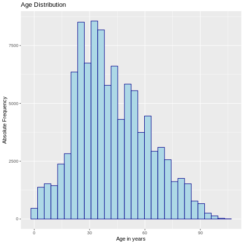
R
# Histogram with density

ggplot(sample_data, aes(x = age)) +
  geom_histogram(aes(y = after_stat(density)),
                 color = "darkblue", fill = "lightblue") +
  labs(y = "Density", x = "Age in years",
       title = "Age Distribution")
OUTPUT
`stat_bin()` using `bins = 30`. Pick better value with `binwidth`.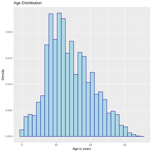
Next, we will visualise the age of the COVID-19 cases using a boxplot.
R
# Boxplot

ggplot(sample_data, aes(x = " ", y = age)) +
  geom_boxplot(outlier.shape = NA) +
  ylab("Age (in years)") + xlab(" ")
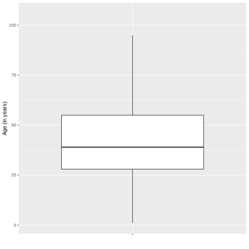
According to the boxplot of the age of the sample of COVID-19 cases it is possible to conclude that the distribution of the data is positively skewed, since there is a greater closeness between the values of Q1 and the median, so it is advisable to describe the behaviour of the data by means of the median and interquartile range, this in R can be found as follows using the functions highlighted in blue:
R
# Descriptive Statistics Quantitative Variables

sample_data %>% dplyr::summarise(
  n = n (), # Number of observations
  Mean = mean(age), # Mean
  SD = sd(age), # Standard deviation
  median = quantile(age, 0.50), # median-50th percentile
  P25 = quantile(age, 0.25), # 25th percentile
  P75 = quantile(age, 0.75)) # 75th percentile
OUTPUT
       n     Mean       SD median P25 P75
1 100000 41.99912 19.51872     39  28  55
Finally, for the variable age it can be concluded that half of the patients with covid-19 are aged between 27 and 52 years (“RIQ”) with a median of 38 years, indicating that half of the cases have an age below this value. It is important to note that, due to the skewness of the distribution, the mean and median do not coincide, which is expected in skewed distributions.
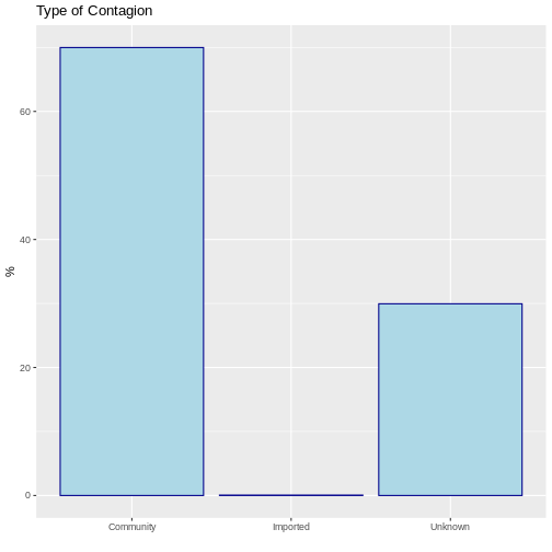
Bar Graphs and Frequency Tables
Qualitative variables are recommended to be represented by bar charts. Generally, these are constructed by indicating on the X axis the categories of the variables and on the Y axis the value of the absolute, relative or percentage frequencies according to the needs, i.e. it is always necessary to first evaluate the frequency table of the variable. Let us suppose that we want to know the type of infection of COVID-19. This can be done in R using the following command:
R
# Frequency Tables

table <- sample_data %>% # Frequency Table Created
  dplyr::count(type_of_contagion) %>% # Frequency count for the state variable
  dplyr::mutate(prop = base::prop.table(n), # Proportion
                perc = base::prop.table(n)*100) # Percentage

table
OUTPUT
  type_of_contagion     n    prop   perc
1         Community 69985 0.69985 69.985
2          Imported    63 0.00063  0.063
3           Unknown 29952 0.29952 29.952
With this information it can be concluded that 70% of the covid-19 cases were from the community and only 0.06% were imported from elsewhere. This can be visualised by means of a bar chart:
R
# Bar Graphs

ggplot(data = table, aes(x = type_of_contagion, y = perc)) +
  geom_bar(stat="identity", color="darkblue", fill="lightblue")+
  labs(y = "%", x = " ", title = "Type of Contagion")
Topic 3: Probability
In a study published in the NEJM in 2014 entitled “Ebola Virus Disease in West Africa- The First 9 Months of the Epidemic and Forward Projections” (DOI: 10.1056/NEJMoa1411100), described the clinical and epidemiological characteristics of Ebola cases reported during the epidemic that affected the countries of Guinea, Liberia, Nigeria and Sierra Leone since December 2013. The study found that those over 44 years of age were more likely to die from the disease. Similar to the referenced article, a comparable conclusion is reached if we perform an equivalent calculation using measures of association seen in the General Epidemiology Unit applied to infectious diseases, such as Relative Risks (RR) of the Risk Ratio or Relative Risk (RR). For this, a 2x2 table can be reconstructed, where the RR can be measured by the ratio between the CFR of a group A (e.g., cases aged 45 years or older) and a group B (e.g., cases aged 44 years or younger), where the CFR is the case fatality risk (CFR).
Thus, we obtain that the risk of death in cases aged 45 years or older is 1.20 times the risk of death in cases aged 44 years or younger, with a 95% confidence interval of 1.13 to 1.27, and a p-value of less than 0.01. To reproduce this calculation you can use theepitools library as shown below.
R
# Load the epitools package
library(epitools)

# Create a 2x2 contingency table with the given values
table2x2 <- matrix(c(311, 51, 768, 299), nrow = 2, ncol = 2)

# Calculate the risk ratio using the contingency table
epitools::riskratio(table2x2)
OUTPUT
$data
          Outcome
Predictor  Disease1 Disease2 Total
  Exposed1      311      768  1079
  Exposed2       51      299   350
  Total         362     1067  1429

$measure
          risk ratio with 95% C.I.
Predictor  estimate    lower    upper
  Exposed1 1.000000       NA       NA
  Exposed2 1.200227 1.133086 1.271346

$p.value
          two-sided
Predictor    midp.exact fisher.exact   chi.square
  Exposed1           NA           NA           NA
  Exposed2 3.179312e-08 4.200177e-08 9.982161e-08

$correction
[1] FALSE

attr(,"method")
[1] "Unconditional MLE & normal approximation (Wald) CI"
An introduction to statistical inference and confidence intervals can be found in Topic 5 of this Unit.
Topic 4: Principal probability distributions
As described in Topic 3, probability studies the behaviour of random phenomena “events”. In this process, the following are observed random variables (v.a), usually denoted as X which aim to assign a real number to each event that can happen in the sample space.
For the explanation and examples of the main distributions, it is important that you install and load the packages epiparameter packages from Epiverse.
R
# If you haven't loaded it yet, load the epiparameter library

library(epiparameter)
Discrete Models
The binomial distribution allows describing the probability of occurrence of an event with two possible outcomes, success (p) or failure (1-p), in a given number of independent trials n with constant probability of success p. The random variable under study corresponds to:
X: Number of successes in n trials
The binomial model can be useful to know the probability of observing a given number of events (e.g. cases, deaths, re-infections) in a population of size n under the assumption that the probability of the event is constant. The binomial distribution depends on two parameters: the probability of success p and the number of independent trials n.
If X has a binomial distribution then it is represented as follows: X~Bin(n,p)
And its density function, mean, expectation and variance correspond to:
\(f(x)=P(X=x)=(n x )\)
\(p^x (1-p)^{(n-x)}\)
\(E(x)=np\)
\(Var(x)=np(1-p)\)
Example: If a virus with an attack rate of 60% is introduced into a community of 20 individuals, what is the probability that 10 or fewer individuals are infected in this community?
Be \(X~Bin(n=20,p=0.60)\) then the following expression needs to be calculated:
\(P(X≤10)=∑_(x=0)^10 (20 x ) 〖0.60〗^x (1-0.60)^(20-x)\)
In R this can be calculated as follows:
R
# Define the probability of success
p <- 0.60

# Define the number of trials
n <- 20

# Define the number of successes we are analyzing
x <- 10

# Compute the cumulative probability of getting at most 'x' successes
pbinom(x, n, p, lower.tail = TRUE)
OUTPUT
[1] 0.2446628Therefore, the probability of a maximum of 10 individuals becoming infected is 24.5%.
On distribution-zoo you can view the complete distribution of the variable
\(X~Bin(n=20,p=0.60)\). Thus, it can be concluded that on average one would expect to find 12 infected in a community of 20 individuals based on an attack rate of 60%.
Poisson distribution
The distribution of Poisson distribution distribution models the behaviour of random variables describing the number of events, “counts”, occurring in a fixed observation interval, e.g. time (number of infections occurring in an hour, day, week, year, etc.), or area (number of infections occurring in a municipality, hospital, etc.).
This distribution has a parameter called lambda (\(λ\)), \(λ>0\) which describes the average number of events occurring in the fixed observation interval. If \(X\) has a Poisson distribution, then it is represented as follows:
\(X\)~\(Poisson(λ)\)
Its density, expectation, mean and variance function corresponds to:
\(fx=P(X=x)=\frac{e^{-λ}λ^x}{x!}, x=0,1,2,..,\)
\(E(x)=λ Var(x)=λ\)
In infectious diseases, the Poisson distribution can be used to model the number of secondary cases generated by a primary case. In this context, the parameter is a function of the effective number of replication R which represents the average number of secondary infections caused by each primary case over time in a population composed of susceptible and non-susceptible individuals.
:::: challenge \[**Example**\]{.underline}
Suppose one wishes to study the propagation of an outbreak based on a Poisson model as days (t) elapse. The random variable of interest is:
\(X_{(t )}\) Number of secondary cases caused by each primary case on day t
This is a Poisson model since there is a fixed observation interval “each primary case” and one wishes to study the number of observed secondary cases “events”. Thus, the following model could be constructed:
\(X_{(t )}∼Poisson (λ= R X_{(t-1)})\)
The above expresses that the average number of secondary cases on day t depends on the number of reproduction \(R\) and the number of observed cases \(X\) on the previous day \((t-1)\). However, R is difficult to know in real life and it may be of interest to approximate its value based on data observed during the outbreak in order to generate control strategies.
Let us assume that on day 1 of the outbreak \((t=1)\) a total of 5 new cases occurred on day 1 of the outbreak and that on the following day \((t=2)\) 10 new cases occurred on the following day. With the above information we are interested in studying the number of secondary cases on day 2, which is equivalent to:
\(X_{(2 )}\) Number of secondary cases caused by each primary case on Day 2
Which has the following distribution:
\(X_{(2 )}∼Poisson (λ= R *5)\)
From this, we could estimate the value of \(R\) by finding out which value maximises the probability of observing this specific number of secondary cases on day 2, i.e:
\(P(X_{(2 )}=10)=\frac{e^{-(R *5)} (R *5)^{10}}{10!}\)
In R we could find this out by varying different values of the number of reproduction number (R) as follows:
R
# Poisson probability calculation function
poisson_probability <- function(x1, x2, r) {
  dpois(x2, r * x1)
}


# Input values
x1 <- 5
x2 <- 10
reproduction_numbers <- seq(0, 5, 0.01)


# Calculate probabilities
poisson_results <- poisson_probability(x1, x2, reproduction_numbers)


# Create dataframe for ggplot
results_data <- data.frame(reproduction_numbers, poisson_results)


# Find the most probable reproduction number
most_probable_number <- results_data %>%
  filter(poisson_results == max(poisson_results)) %>%
  pull(reproduction_numbers)


# Create the plot with ggplot2
ggplot(results_data, aes(x = reproduction_numbers, y = poisson_results)) +
  geom_line() +
  geom_vline(xintercept = most_probable_number, color = "red", size = 1) +
  labs(y = "Probability", x = "Reproduction Number (R)", title = "Poisson Model")
WARNING
Warning: Using `size` aesthetic for lines was deprecated in ggplot2 3.4.0.
ℹ Please use `linewidth` instead.
This warning is displayed once every 8 hours.
Call `lifecycle::last_lifecycle_warnings()` to see where this warning was
generated.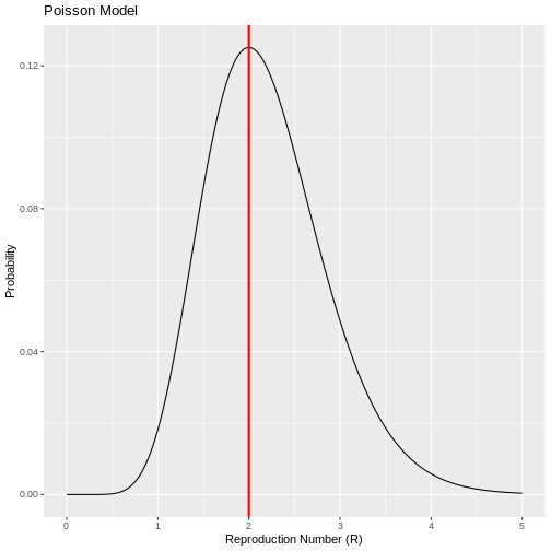
Therefore, if the number of secondary cases behaves according to a Poisson distribution, there is a high probability that the number of new cases observed on day 2 were generated with a reproduction number of R=2. This implies that the average number of secondary cases per primary case is 2. However, this simple model assumes that the number of secondary cases generated by each primary case have equal mean and variance, implying that all primary cases generate on average a similar number of secondary cases. This assumption may be difficult to make for some infectious diseases especially when they follow a pattern of overdispersion (20% of cases cause 80% of transmission) so the Poisson model has limitations in its application. :::
Negative Binomial Distribution
Like the Poisson distribution, the negative binomial distribution allows one to model the number of events that occur “counts”. If \(X\) has a Negative Binomial distribution, then it is represented as follows.
$X \(~\) BN(μ,k)$
where, \(μ\) represents the mean of the distribution and \(k\) is the dispersion parameter that allows the mean and variance of the events not to be equal. This parameter \(k\) allows the degree of dispersion in how events are generated to be introduced to the model. Thus, \(k\) inversely measures the degree of variation of the events that occur given that the mean and variance of the distribution correspond to:
\(E(x)=μ\)
\(Var(x)=μ(1+\frac{μ}{k})\)
With density function:
\(f(x)=\frac{Γ(x+k)}{Γ(k)Γ(x+1)} (\frac{μ}{μ+k})^x (\frac{k}{μ+k})^k,x=0,1,2...\)
Challenge
\[**Example**\]{.underline}
In the study of infectious diseases, the negative binomial distribution plays a relevant role since it allows modelling the distribution of the number of secondary cases generated by a primary case, i.e. it allows knowing the distribution of the basic reproduction number R_0. In this context, the mean of the distribution corresponds to \(R_0\)(Number of secondary cases in a fully susceptible population) and the parameter \(k\) controls for the variation among primary cases. Thus, small values of k suggest that secondary cases are generated by a small group of primary cases, while large values suggest that the spread of the virus is high. Thus, being \(X\) the number of secondary cases, then
\(X \sim Bn(R_0,k)\)
\(E(x)=R_0\)
\(Var(x)=R_0 (\frac{1+R_0}{k})\)
The paper by Lloyd-Smith et al. shows how the negative binomial
distribution allows modelling the distribution of secondary cases of
various pathogens. Based on the cases reported during the SARS outbreak
in Singapore in 2023, they estimated the parameters of the negative
binomial distribution and found a \(R_0=1.630\) y \(k=0.160\). These estimates are available in
the epiparameter which is a package available at
R which compiles the main estimates for several
epidemiological parameters of interest in the study of infectious
diseases.
R
# Retrieve epidemiological parameter data for SARS
SARS_R <- epiparameter::epiparameter_db(
    disease = "SARS",  # Specify the disease as SARS
    epi_name = "offspring distribution",  # Select the epidemiological parameter: offspring distribution
    single_epiparameter = TRUE  # Request a single epidemiological parameter
)
OUTPUT
Using Lloyd-Smith J, Schreiber S, Kopp P, Getz W (2005). "Superspreading and
the effect of individual variation on disease emergence." _Nature_.
doi:10.1038/nature04153 <https://doi.org/10.1038/nature04153>..
To retrieve the citation use the 'get_citation' function
R
# Display the retrieved data
SARS_R
OUTPUT
Disease: SARS
Pathogen: SARS-Cov-1
Epi Parameter: offspring distribution
Study: Lloyd-Smith J, Schreiber S, Kopp P, Getz W (2005). "Superspreading and
the effect of individual variation on disease emergence." _Nature_.
doi:10.1038/nature04153 <https://doi.org/10.1038/nature04153>.
Distribution: nbinom (No units)
Parameters:
  mean: 1.630
  dispersion: 0.160
With these results it would be possible to plot the distribution of
the number of secondary SARS cases in order to suggest control measures.
This is also available in the epiparameter with the
function plot.
R
# Plot the retrieved epidemiological parameter for SARS
plot(SARS_R)
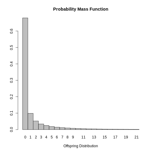
Finally, it is possible to conclude that most cases infected with SARS do not spread the disease since the mode of the distribution is \(0\). This result is expected given that \(k<1\) indicating that the secondary cases are generated by a small group of infected people and that the estimated value of \(R_0\) varies for the cases.
Geometric distribution
Another discrete distribution of interest that can be used to model counts or number of events is the geometric distribution. In infectious diseases its main use arises when the dispersion parameter of the negative distribution is equal to 1. This distribution depends on the probability of occurrence of the event of interest and is represented as follows.
\(X \sim Geom(p)\)
where p represents the probability of success or the probability of occurrence of the event of interest with mean equal to:
\(E(x)=\frac{1}{p}\)
Challenge
Example
If in the case of the SARS outbreak in Singapore in the year 2023, the estimated value of \(k\) would have been \(1\) then the distribution of secondary cases could be modelled with a geometric distribution such that its mean is equal to the \(R_0\) estimate, i.e. it must be satisfied that:
\(E(x)=\frac{1}{p}=1.630\) and therefore, \(p=\frac{1}{1.630}\)
So the distribution of the number of secondary contacts could be written as:
\(X \sim Geom(p=0.613)\)
In R we could simulate the behaviour of the number of secondary cases with the following code:
R
# Geometric Distribution

# Create a sequence of values from 0 to 20 representing different R values
x <- seq(0, 20, 1)

# Define the probability parameter for the geometric distribution
prob <- 1 / 1.630

# Create a data frame with the values of x and their corresponding geometric probabilities
data_geom <- data.frame(x, probg = dgeom(x, prob))

# Plot the geometric distribution using ggplot2
ggplot(data = data_geom, aes(x = x, y = probg)) +
  geom_bar(stat = "identity") +  # Use a bar plot to visualize the probability distribution
  labs(y = "Probability", x = "Secondary cases", title = "Geometric Distribution")  # Add labels and title
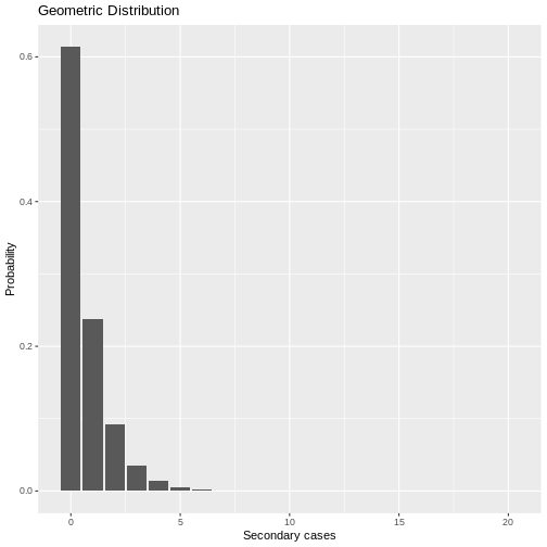
Under the geometric distribution, then there is a higher probability that a primary case can transmit the virus since the probability of a primary case generating 1,2, or more secondary cases is higher with this model than estimated with the negative binomial model.
Continuous Models
Uniform Distribution
The uniform distribution models a continuous variable that takes values within an interval. $ [a,b] $ with equal probability. This distribution is often used in the simulation of random numbers. If \(X\) follows a uniform distribution, this can be represented by:
\(X ∼U(a,b)\)
Its parameters a and b, represent the minimum and maximum value that the variable can take, respectively. Its density function is determined by:
\(f(x)=\frac{1}{b-a}\),with \(a<x<b\)
The mean and variance is determined by:
\(E(x)=\frac{a+b}{2}\) y \(V(x)=\frac{(b-a)^2}{12}\)
Challenge
Example
A researcher wants to simulate the behaviour of COVID-19 and needs to randomly generate the value that the basic reproduction number can take. \(R_0\) and then use it within his propagation model. For this, he assumes that the \(R_0\) of COVID-19 follows a uniform distribution between 2 and 5:
$R0∼U [2,5] $
For your simulation you need to generate five possible values of
\(R_0\) with equal probability, this in
R is solved using the following code:
R
# Generation of random numbers with a uniform distribution

# Define the number of random values to generate
n <- 5

# Set the lower and upper bounds of the uniform distribution
a <- 2
b <- 5

# Generate 'n' random numbers uniformly distributed between 'a' and 'b'
runif(n, a, b)
OUTPUT
[1] 3.904747 4.780271 2.789915 3.721485 4.408765Normal Distribution
The normal distribution is undoubtedly the most important probabilistic model in statistical theory because of its ability to model many real-life problems and its relevant role in the field of inference. This distribution attempts to model random variables that can be influenced by multiple factors, whose effects when added together make the values of the distribution tend towards the centre (mean). For example, body temperature may follow a normal distribution because it is influenced by multiple biological and environmental factors, which when added together cause most individuals to lie around a central value.
To express mathematically that a continuous variable has a normal distribution, we write:
\(X ∼N(μ,σ)\)
Which will have the following probability density function associated with it:
$f(x)=exp [-frac{1}{2 σ2}(x-u)2] $
Where \(μ\) y \(σ\) are the parameters of the distribution and represent respectively the mean and the standard deviation of the random variable, i.e. the central value and the dispersion of the data with respect to it. These parameters correspond to the values that would be obtained if the entire population rather than a sample of the population could be studied.
When \(μ=0\) y \(σ=1\) is called normal distribution standard. However, there are many normal distributions according to the values taken by their parameters, but regardless of the value of the parameters, the shape of the distribution is always symmetric and can always be transformed to a standard normal distribution by means of a standardisation procedure applying the following formula:
\(Z=\frac{X-μ}{σ}∼N(0,1)\)
Challenge
Example,
If it is known that in a community the age of the cases that died from COVID-19 has a normal distribution with mean 67.8 and standard deviation 15.4 years. What is the probability that a deceased is younger than 40 years old?
First, we define the variable to be studied, which has a normal distribution.
\(X∼N(67.8,15.4)\)
\(X\) Age of deceased COVID-19 cases
In R, we can use the function pnorm() function as
follows to find:
\(P(X<40)=?\)
R
# Define the mean of the normal distribution
mu <- 67.8
# Define the standard deviation of the normal distribution
sigma <- 15.4
# Define the value for which we want to compute the cumulative probability
x <- 40
# Compute the cumulative probability
pnorm(x, mean = mu, sd = sigma)
OUTPUT
[1] 0.0355221Therefore, the probability of a COVID-19 fatality being under the age of 40 is 3.5%.
Log-normal distribution
The log-normal distribution arises when considering continuous random variables that do not take the value of zero or negative numbers whose distribution has an asymmetric shape and whose variation is generated by multiple factors whose effects are not symmetric. If an a.v. follows a lognormal distribution, its transformation by applying the logarithm function will generate a normal variable and hence its name. In the field of infectious diseases, the log-normal distribution is very useful for modelling incubation periods (time from infection to onset of symptoms).
If \(X ∼LogN(μ,σ)\) then it holds that \(Y=log (X) ∼N(μ,σ)\) and the density function of \(X\) is given by:
\(f(x)=\frac{1}{ xσ\sqrt{2\pi}}e^{-\frac{1}{2}(\frac{ln(x)-u}{σ})^2}\)
Unlike the normal distribution, in the log-normal distribution the parameter μ plays the role of a scaling parameter since it increases the dispersion of the data by increasing its degree of amplitude and the parameter σ controls the shape, i.e. the degree of skewness.
Challenge
Example
In the 2009 paper by Lessler et al. the incubation periods of several pathogens were modelled based on a lognormal distribution. The main interest was to estimate the parameters of \((μ,σ)\). For example, in the case of SARS, an estimate was found of \(μ=0.660\), y \(σ=1.205\) which implies that on average an infected case develops symptoms in 0.7 days. This information can be obtained in the epiparameter package with the following command:
R
# Retrieve epidemiological parameter data for the incubation period of SARS
SARS_incubation <- epiparameter::epiparameter_db(
  disease = "SARS",  # Specify the disease as SARS
  epi_name = "incubation period",  # Select the epidemiological parameter: incubation period
  single_epiparameter = TRUE  # Request a single epidemiological parameter
)
OUTPUT
Using Lessler J, Reich N, Brookmeyer R, Perl T, Nelson K, Cummings D (2009).
"Incubation periods of acute respiratory viral infections: a systematic
review." _The Lancet Infectious Diseases_.
doi:10.1016/S1473-3099(09)70069-8
<https://doi.org/10.1016/S1473-3099%2809%2970069-8>..
To retrieve the citation use the 'get_citation' function
R
# Display the retrieved incubation period data
SARS_incubation
OUTPUT
Disease: SARS
Pathogen: SARS-Cov-1
Epi Parameter: incubation period
Study: Lessler J, Reich N, Brookmeyer R, Perl T, Nelson K, Cummings D (2009).
"Incubation periods of acute respiratory viral infections: a systematic
review." _The Lancet Infectious Diseases_.
doi:10.1016/S1473-3099(09)70069-8
<https://doi.org/10.1016/S1473-3099%2809%2970069-8>.
Distribution: lnorm (days)
Parameters:
  meanlog: 1.386
  sdlog: 0.593
The complete incubation period distribution for SARS can be plotted by means of:
R
# Plot the retrieved epidemiological parameter for SARS
plot(SARS_incubation)
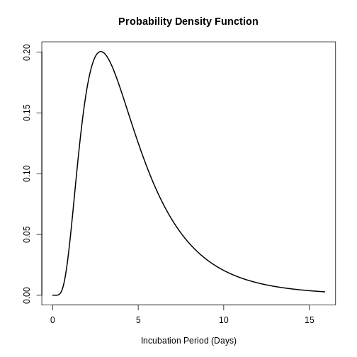
The above is useful for answering questions such as: What is the probability that a SARS case will develop symptoms two days after infection?
R
# Compute the complementary cumulative probability (P(X > 2)) for a lognormal distribution

stats::plnorm(2, meanlog = 0.660, sdlog = 1.205, lower.tail = FALSE)
OUTPUT
[1] 0.4890273Gamma distribution
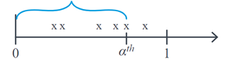
When we are studying Poisson random variables, we are usually interested in studying the number of events that occur with mean \(λ\) for a defined time interval. The Gamma distribution focuses on studying the v.a \(X\): the time it takes for a given number of events to occur. \(α^th\). For example, if we are evaluating the number of infections per hour and we want to study how much time can elapse until we find α infections, graphically \(X\) corresponds to:
The Gamma distribution is widely used in survival analysis due to its flexibility given by its shape parameters. \(α\) and scale \(θ\) which determine its density function, which has an asymmetric behaviour. Here, \(θ\) represent the average waiting time until the first event occurs, and \(α\) is the number of events expected to occur. This distribution is denoted as follows:
\(X ∼Gamma(α,θ)\)
\(f(x)=\frac{1}{(α-1)!θ^α}e^{\frac{-x}{θ}} x^{α-1}\)
\(E(x)=αθ\)
\(Var(x)=αθ^2\)
When \(θ\) value increases, the concentration of the probability shifts to the right, the same is true when expecting a higher number of events. \(α\) given that the waiting time \(X\) can be longer.
:::: challenge Example
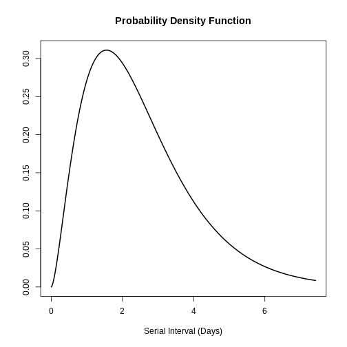
One possible application of the Gamma distribution is in modelling the serial interval of infectious diseases. The serial interval (s) is defined as the time between the onset of symptoms of the primary case and the onset of symptoms of the secondary case. In the study by Ghani et al. the serial interval distribution of influenza was described as follows Influenza-A-H1N1Pdm by means of the gamma distribution and found the following parameters:
\(s ∼Gamma( α=2.622,θ=0.957)\)
This information can also be obtained from the package
epiparameter with the following command:
R
# Retrieve epidemiological parameter data for the serial interval of Influenza
influenza_s <- epiparameter::epiparameter_db(
  disease = "Influenza",  # Specify the disease as Influenza
  epi_name = "serial_interval",  # Select the epidemiological parameter: serial interval
  single_epiparameter = TRUE  # Request a single epidemiological parameter
)
OUTPUT
Using Ghani A, Baguelin M, Griffin J, Flasche S, van Hoek A, Cauchemez S,
Donnelly C, Robertson C, White M, Truscott J, Fraser C, Garske T, White
P, Leach S, Hall I, Jenkins H, Ferguson N, Cooper B (2009). "The Early
Transmission Dynamics of H1N1pdm Influenza in the United Kingdom."
_PLoS Currents_. doi:10.1371/currents.RRN1130
<https://doi.org/10.1371/currents.RRN1130>..
To retrieve the citation use the 'get_citation' function
R
# Display the retrieved serial interval data
influenza_s
OUTPUT
Disease: Influenza
Pathogen: Influenza-A-H1N1Pdm
Epi Parameter: serial interval
Study: Ghani A, Baguelin M, Griffin J, Flasche S, van Hoek A, Cauchemez S,
Donnelly C, Robertson C, White M, Truscott J, Fraser C, Garske T, White
P, Leach S, Hall I, Jenkins H, Ferguson N, Cooper B (2009). "The Early
Transmission Dynamics of H1N1pdm Influenza in the United Kingdom."
_PLoS Currents_. doi:10.1371/currents.RRN1130
<https://doi.org/10.1371/currents.RRN1130>.
Distribution: gamma (days)
Parameters:
  shape: 2.622
  scale: 0.957
R
# Plot the retrieved epidemiological parameter for influenza
plot(influenza_s)
With this information the mean and standard deviation of the distribution could be found based on the application of the gamma distribution:
R
# Define the shape and scale parameters
shape <- 2.622
scale <- 0.957

# Calculate the mean of the distribution
mean <- shape * scale

# Calculate the standard deviation of the distribution
sd <- sqrt(shape * scale^2)

# Print the computed mean and standard deviation
print(c(mean, sd))
OUTPUT
[1] 2.509254 1.549631Therefore, the mean of the influenza serial interval is 5.51 days with a standard deviation of 1.55 days. :::
Weibull distribution
Like the Gamma distribution, the Weibull distribution is useful in the analysis of v.a.s representing waiting times until a particular event is observed. The Weibull distribution has two parameters and its density function is defined by:
\(f(x)= \frac{β}{η}(\frac{x}{η})^{β-1}{e^{-(x/η)}}^β\)
Here, \(η\) is the scale parameter and \(β\) the shape parameter. The shape parameter \(β\) is also known as slope and attempts to model the relationship between probability and lead times. Thus when \(β>1\) the rate of occurrence of events increases over time, while if \(β<1\) describes that the risk of the event decreases over time. The scale parameter handles the degree of variability of the distribution and is found in the same units of \(X\).
:::: challenge Example
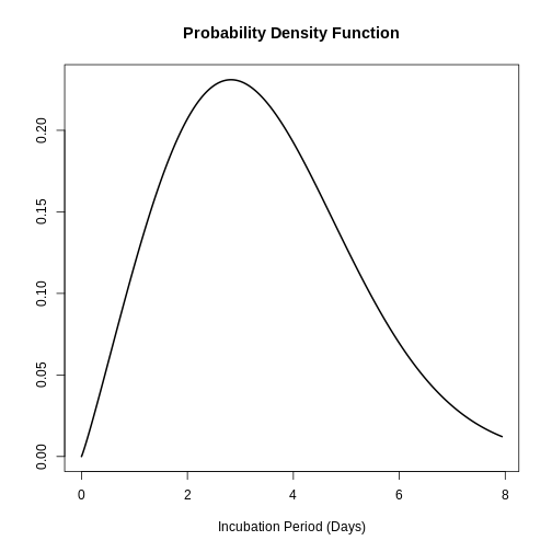
The study by Virlogeux et al. described the distribution of the incubation time of influenza using the Weibull distribution and found the following parameters:
\(x∼Gamma( β=2.101,η=3.839)\)
This information can also be obtained in the epiparameter package with the following command:
R
# Retrieve epidemiological parameter data for the incubation period of Influenza
influenza_incubation <- epiparameter::epiparameter_db(
  disease = "Influenza",  # Specify the disease as Influenza
  epi_name = "incubation period",  # Select the epidemiological parameter: incubation period
  single_epiparameter = TRUE  # Request a single epidemiological parameter
)
OUTPUT
Using Virlogeux V, Li M, Tsang T, Feng L, Fang V, Jiang H, Wu P, Zheng J, Lau
E, Cao Y, Qin Y, Liao Q, Yu H, Cowling B (2015). "Estimating the
Distribution of the Incubation Periods of Human Avian Influenza A(H7N9)
Virus Infections." _American Journal of Epidemiology_.
doi:10.1093/aje/kwv115 <https://doi.org/10.1093/aje/kwv115>..
To retrieve the citation use the 'get_citation' function
R
# Display the retrieved incubation period data
influenza_incubation
OUTPUT
Disease: Influenza
Pathogen: Influenza-A-H7N9
Epi Parameter: incubation period
Study: Virlogeux V, Li M, Tsang T, Feng L, Fang V, Jiang H, Wu P, Zheng J, Lau
E, Cao Y, Qin Y, Liao Q, Yu H, Cowling B (2015). "Estimating the
Distribution of the Incubation Periods of Human Avian Influenza A(H7N9)
Virus Infections." _American Journal of Epidemiology_.
doi:10.1093/aje/kwv115 <https://doi.org/10.1093/aje/kwv115>.
Distribution: weibull (days)
Parameters:
  shape: 2.101
  scale: 3.839
R
# Plot the retrieved incubation period data
plot(influenza_incubation)
:::
Topic 5: Introduction to Statistical Inference
Statistics can be divided into two main branches: descriptive and inferential. As we saw in previous units, the former commonly seeks to summarise and explore data that have been collected from a selected sample of a population. In contrast, the second aims to make generalisations and conclusions about the whole population based on the information or data from a sample.
By the nature of the inferential process, which is based on taking random samples from the population, an estimator can take multiple values since it depends on the units that were selected in the sample. This variation due to chance, calledvariation sampling variation must be involved in the inference process as we will see below.
It is important to stress that sampling variation will depend on the sample size. For example, if we take samples of size 10 and calculate the CFR in each of them, these estimates will be more similar to each other compared to those obtained when only 5 individuals per sample are selected. This can be tested by running a simulation in R and selecting 1000 samples of size 5 and 10, respectively. As can be seen in the figure below, the estimated CFRs when increasing the sample size from 5 to 10 were more similar with a lower RIQ.
R
# Set the random seed for reproducibility
set.seed(200)

# Create the population data frame with death indicators (1 = dead, 0 = alive)
population <- data.frame(dead = c(rep(1, 40), rep(0, 160)))

# Sample with size 5: Draw 100 random samples of size 5 (without replacement)
samples_n5 <- population %>%
  rep_sample_n(size = 5, reps = 100, replace = FALSE)

# Compute the Case Fatality Ratio (CFR) for each replicate in the sample size 5
cfr_n5 <- samples_n5 %>%
  group_by(replicate) %>%
  summarise(cfr = mean(dead))

# Sample with size 10: Draw 100 random samples of size 10 (without replacement)
samples_n10 <- population %>%
  rep_sample_n(size = 10, reps = 100, replace = FALSE)

# Compute the Case Fatality Ratio (CFR) for each replicate in the sample size 10
cfr_n10 <- samples_n10 %>%
  group_by(replicate) %>%
  summarise(cfr = mean(dead))

# Combine the results from both sample sizes (5 and 10)
cfr <- bind_rows(cfr_n5, cfr_n10) %>%
  mutate(size = factor(c(rep(5, 100), rep(10, 100))))

# Plot the sampling distribution of CFR estimates using a boxplot
ggplot(cfr, aes(x = size, y = cfr, fill = size)) +
  geom_boxplot(show.legend = FALSE) +  # Create a boxplot without legend
  labs(x = "Sample size", y = "CFR estimate",
       title = "Sampling Distribution of CFR Estimates") +  # Add labels and title
  scale_fill_brewer(palette = "Blues")  # Use a blue color palette for visualization
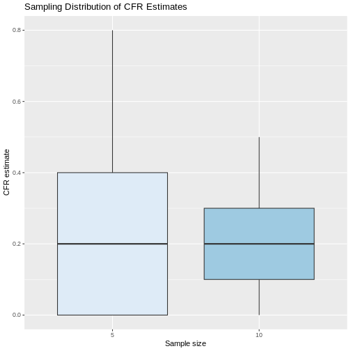
If we calculate the mean and standard deviation of the estimated values of the CFR with the samples of size 5 and size 10, we see that indeed the standard deviation of the estimates is smaller with increasing sample size, but in both cases on average the samples were closer to the true parameter value of 0.20.
R
# Summarize CFR estimates by sample size

cfr %>%
  group_by(size) %>%  # Group data by sample size
  summarise(
    media = mean(cfr),  # mean CFR
    sd = sd(cfr),  # standard deviation of CFR
    mediana = median(cfr),  # median CFR
    P25 = quantile(cfr, 0.25),  # 25th percentile (lower quartile)
    P75 = quantile(cfr, 0.75)  # 75th percentile (upper quartile)
  )
OUTPUT
# A tibble: 2 × 6
  size  media    sd mediana   P25   P75
  <fct> <dbl> <dbl>   <dbl> <dbl> <dbl>
1 5     0.208 0.180     0.2   0     0.4
2 10    0.197 0.116     0.2   0.1   0.3
But, if in real life we can only take a random sample, this means that we will only have a single chance to calculate a statistic which will be the point estimatorof the parameter. However, this single value will not be able to provide information on the variability embedded in the random selection of the sample. In addition, as we saw in the previous example, there is a high probability that many of the possible sample configurations will give estimates that are far from the true value of the parameter. Therefore, we must try to involve sampling variability in the estimation process.
Confidence interval estimation
The objective of confidence interval estimation is to provide a range of values, a lower and upper bound (a; b), which with a high probability “…” (a; b), is the most likely to be used in the estimation of a confidence interval.confidence”contains the true value of the parameter to be estimated. Although each random sample that may be selected would yield different bounds, this procedure ensures that a \((1-α) %\) of the intervals constructed will contain the true value of the parameter. This also implies that a \(α%\) of the intervals will not contain the true value. The symbol α is known as the significance level.
In general, a confidence interval is constructed with the following ingredients:
\(\text{Estimator} ±(\text{reliability coefficient})*(\text{standard error})\)
Challenge
Example
In the CFR package of the Epiverse-TRACE initiative, information is available on an Ebola outbreak that occurred in 1976 in Zaire, now called the Republic of Congo, documenting the number of cases and deaths over 73 days. Ultimately, 245 cases of Ebola were reported and 234 of these were fatal cases. If the interest is to perform a 95% CFR interval estimate. What should the procedure be?
● \[**Step 1-Estimator**\]{.underline}: one should start by finding the estimate in the observed sample:
\(\hat{p} = \widehat{\text{CFR}} = \frac{234}{245}= 0.955\)
So the estimated CFR was 95.5%.
● \[**Step 2-Reliability coefficient**\]{.underline} based on the normal distribution for 95% confidence would correspond to 1.96
● \[**Step 3-Standard error:**\]{.underline}
\(\sqrt{\frac{\hat{p}(1-\hat{p})}{n}}=\sqrt{\frac{0.955 (1-0.955)}{245}}\)
● \[**Step 4-Gather the ingredients**\]{.underline}
As you have noticed so far this step-by-step can become cumbersome because of the calculations, but in R we can get everything in a faster and more efficient way as follows:
$ = $
As you have noticed so far, this step-by-step can become cumbersome because of the calculations, but in R we can obtain everything in a faster and more efficient way in the following way:
R
# Download the Ebola data from 1976
data(ebola1976)

# Calculate key statistics related to the Case Fatality Ratio (CFR)
cfr_summary <- ebola1976 %>%
  summarise(
    n = sum(cases),  # Total number of cases
    deaths = sum(deaths),  # Total number of deaths
    cfr_est = deaths / n,  # Estimate of the Case Fatality Ratio (CFR)
    error = sqrt((cfr_est * (1 - cfr_est)) / n),  # Standard error calculation
    lim_inf = cfr_est - 1.96 * error,  # Lower bound of the 95% confidence interval
    lim_sup = cfr_est + 1.96 * error  # Upper bound of the 95% confidence interval
  )

# Print the result
print(cfr_summary)
OUTPUT
    n deaths  cfr_est      error   lim_inf   lim_sup
1 245    234 0.955102 0.01322986 0.9291715 0.9810326
Finally, we can conclude that with 95% confidence, the CFR of Ebola in the 1976 epidemic in the Democratic Republic of Congo is contained in the interval between 92.9% and 98.1%.
The CFR package also has a built-in function to automatically estimate with its respective 95% interval the CFR during an epidemic by means of the function:
R
# Compute a static Case Fatality Ratio (CFR) using the cfr package
cfr::cfr_static(data = ebola1976)
OUTPUT
  severity_estimate severity_low severity_high
1          0.955102    0.9210866     0.9773771
As you can see there are slight differences between the CI
constructed step by step and the one reported by the function.
cfr_static. This is because the CFR package performs the
construction of the CI by the method based on maximum likelihood and
different statistical distributions according to the total number of
cases, but the interpretation does not change.
Key Points
At the end of the session, check if you achieved the objectives:
Understand the role of statistics in the study of infectious diseases.
Understand and use statistical measures to summarize and analyze information.
Become familiar with the concept of a random variable and recognize common probability distributions.
Learn how to approach a statistical problem as an inference problem from a sample.
Understand the concept of confidence intervals for estimating epidemiological parameters.