If you are unfamiliar with the {simulist} package or the
sim_linelist() function Get Started
vignette is a great place to start.
This vignette describes how to simulate a line list with either a uniform or non-uniform distribution of ages within the population. This population age structure may either describe the population of a region as a whole, or specifically which age groups are more likely to become infected than others.
The {simulist} package uses a branching process (using a random
network model of contacts), which is independent of population age
structure to simulate the line list, and then {simulist} paints
the demographic information onto the infected individuals (and in the
case of sim_outbreak() or sim_contacts() the
contacts of infected individuals). In other words, once the cases in the
line list have been simulated the ages are assigned to each individual
post hoc, specified by the age range, and age structure, if
supplied.
The age range and age structure for the simulation functions
(sim_*()) in {simulist} is controlled by the
population_age argument. The default age structure in
{simulist} is a uniform structure between a lower and upper age range.
The sim_linelist() function (and other sim_*()
functions) can accept a <data.frame> instead of the
numeric vector to specify the age structure for specified
age groups. This feature can be especially useful when wanting to
simulate an outbreak in a region with a heavily non-uniform age
structure, for
example younger populations such as Nigeria, or older populations such
as Japan.
First we load the requested delay distributions using the {epiparameter} package. The onset-to-hospitalisation and onset-to-death delay distributions are extracted from the {epiparameter} database, and the contact distribution and the infectious period are manually defined as they are not yet available from the {epiparameter} database.
contact_distribution <- epiparameter(
  disease = "COVID-19",
  epi_name = "contact distribution",
  prob_distribution = create_prob_distribution(
    prob_distribution = "pois",
    prob_distribution_params = c(mean = 2)
  )
)
#> Citation cannot be created as author, year, journal or title is missing

infectious_period <- epiparameter(
  disease = "COVID-19",
  epi_name = "infectious period",
  prob_distribution = create_prob_distribution(
    prob_distribution = "gamma",
    prob_distribution_params = c(shape = 1, scale = 1)
  )
)
#> Citation cannot be created as author, year, journal or title is missing

# get onset to hospital admission from {epiparameter} database
onset_to_hosp <- epiparameter_db(
  disease = "COVID-19",
  epi_name = "onset to hospitalisation",
  single_epiparameter = TRUE
)
#> Using Linton N, Kobayashi T, Yang Y, Hayashi K, Akhmetzhanov A, Jung S, Yuan
#> B, Kinoshita R, Nishiura H (2020). "Incubation Period and Other
#> Epidemiological Characteristics of 2019 Novel Coronavirus Infections
#> with Right Truncation: A Statistical Analysis of Publicly Available
#> Case Data." _Journal of Clinical Medicine_. doi:10.3390/jcm9020538
#> <https://doi.org/10.3390/jcm9020538>..
#> To retrieve the citation use the 'get_citation' function

# get onset to death from {epiparameter} database
onset_to_death <- epiparameter_db(
  disease = "COVID-19",
  epi_name = "onset to death",
  single_epiparameter = TRUE
)
#> Using Linton N, Kobayashi T, Yang Y, Hayashi K, Akhmetzhanov A, Jung S, Yuan
#> B, Kinoshita R, Nishiura H (2020). "Incubation Period and Other
#> Epidemiological Characteristics of 2019 Novel Coronavirus Infections
#> with Right Truncation: A Statistical Analysis of Publicly Available
#> Case Data." _Journal of Clinical Medicine_. doi:10.3390/jcm9020538
#> <https://doi.org/10.3390/jcm9020538>..
#> To retrieve the citation use the 'get_citation' function
By setting the seed we ensure the output of the vignette remains the same each time it is rendered. When using {simulist}, setting the seed is not required unless you need to simulate the same line list multiple times.
set.seed(1)Uniform population age
By default sim_linelist() simulates individuals ages
assuming a uniform distribution between 1 and 90. To change this age
range, a vector of two numbers can be supplied to the
population_age argument. Here we simulate an outbreak in a
population with a population ranging from 5 to 75 (inclusive,
[5,75]).
Note: all ages are assumed to be in the unit of years and need to be integers (or at least “integerish” if stored as double).
All simulations in this vignette condition the simulation to have a
minimum outbreak size of 100 cases (outbreak_size, the
maximum outbreak size is left at 1e4) to clearly visualise
the distribution of ages.
linelist <- sim_linelist(
  contact_distribution = contact_distribution,
  infectious_period = infectious_period,
  prob_infection = 0.45,
  onset_to_hosp = onset_to_hosp,
  onset_to_death = onset_to_death,
  population_age = c(5, 75),
  outbreak_size = c(100, 1e4)
)
head(linelist)
#>   id               case_name case_type sex age date_onset date_reporting
#> 1  1          Jawonna Exline confirmed   f  56 2023-01-01     2023-01-01
#> 2  2           Marcelo Barco  probable   m   7 2023-01-01     2023-01-01
#> 3  3 Tamara Casiano-Martinez suspected   f  15 2023-01-01     2023-01-01
#> 4  5        Chukwuma Jackson confirmed   m  60 2023-01-02     2023-01-02
#> 5  6        Jasoor el-Khalid confirmed   m  57 2023-01-02     2023-01-02
#> 6  8        Haajara al-Zahra suspected   f  38 2023-01-01     2023-01-01
#>   date_admission   outcome date_outcome date_first_contact date_last_contact
#> 1           <NA> recovered         <NA>               <NA>              <NA>
#> 2           <NA> recovered         <NA>         2022-12-30        2023-01-05
#> 3     2023-01-05      died   2023-01-08         2022-12-29        2023-01-06
#> 4           <NA> recovered         <NA>         2022-12-30        2023-01-03
#> 5           <NA> recovered         <NA>         2022-12-26        2023-01-03
#> 6           <NA> recovered         <NA>         2022-12-28        2023-01-02
#>   ct_value
#> 1     24.1
#> 2       NA
#> 3       NA
#> 4     26.4
#> 5     25.3
#> 6       NA
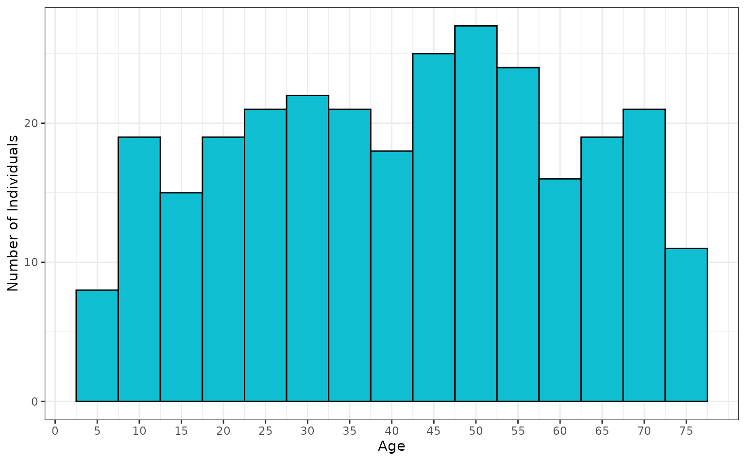
We can plot the age distribution for individuals in the line list, binned into 5 year categories.
ggplot(linelist[, c("sex", "age")]) +
  geom_histogram(
    mapping = aes(x = age),
    fill = "#10BED2",
    colour = "black",
    binwidth = 5
  ) +
  scale_y_continuous(name = "Number of Individuals") +
  scale_x_continuous(name = "Age", breaks = seq(0, 75, 5)) +
  theme_bw()
If the population_age argument was left unspecified, it
would have assumed the default age range of 1 to 90
(c(1, 90)).
Structured population age
To simulate with a non-uniform age structure we create a table
(<data.frame>) containing the age bounds of each age
bracket in the population and the proportion of the population made up
by that age group.
The upper bound (maximum) of the population also needs to be
specified in the age structure <data.frame>,
therefore, the last element in the age limits column is taken as the
upper bound of the age in the population. All elements before the last
one are the lower bound of each age group.
The simplest way to set the maximum population age is to set the proportion to zero.
For this example we will simulate a population where 30% of the
population are between 1 and 19, 40% of the population are between 20
and 59, and 30% are between 60 and 89. The age limits
($age_limit column) is inclusive. There will be no
individuals in the population younger then 1 or older than 90.
age_struct <- data.frame(
  age_limit = c(1, 20, 60, 90),
  proportion = c(0.3, 0.4, 0.3, 0)
)
age_struct
#>   age_limit proportion
#> 1         1        0.3
#> 2        20        0.4
#> 3        60        0.3
#> 4        90        0.0
linelist <- sim_linelist(
  contact_distribution = contact_distribution,
  infectious_period = infectious_period,
  prob_infection = 0.45,
  onset_to_hosp = onset_to_hosp,
  onset_to_death = onset_to_death,
  population_age = age_struct,
  outbreak_size = c(100, 1e4)
)

head(linelist)
#>   id            case_name case_type sex age date_onset date_reporting
#> 1  1           Joe Valdez confirmed   m  22 2023-01-01     2023-01-01
#> 2  3       Aslam al-Kamal  probable   m  26 2023-01-01     2023-01-01
#> 3  4        Bryan Camacho  probable   m  59 2023-01-01     2023-01-01
#> 4  6           Matthew Ho suspected   m  60 2023-01-01     2023-01-01
#> 5  7    Ghuzaila el-Hasan suspected   f  72 2023-01-01     2023-01-01
#> 6  8 Chase Salgado Orozco confirmed   m  16 2023-01-01     2023-01-01
#>   date_admission   outcome date_outcome date_first_contact date_last_contact
#> 1           <NA> recovered         <NA>               <NA>              <NA>
#> 2           <NA> recovered         <NA>         2022-12-29        2023-01-05
#> 3           <NA> recovered         <NA>         2022-12-31        2023-01-02
#> 4           <NA> recovered         <NA>         2022-12-30        2023-01-03
#> 5           <NA> recovered         <NA>         2022-12-27        2023-01-03
#> 6     2023-01-04      died   2023-01-07         2023-01-01        2023-01-03
#>   ct_value
#> 1     27.7
#> 2       NA
#> 3       NA
#> 4       NA
#> 5       NA
#> 6     22.8
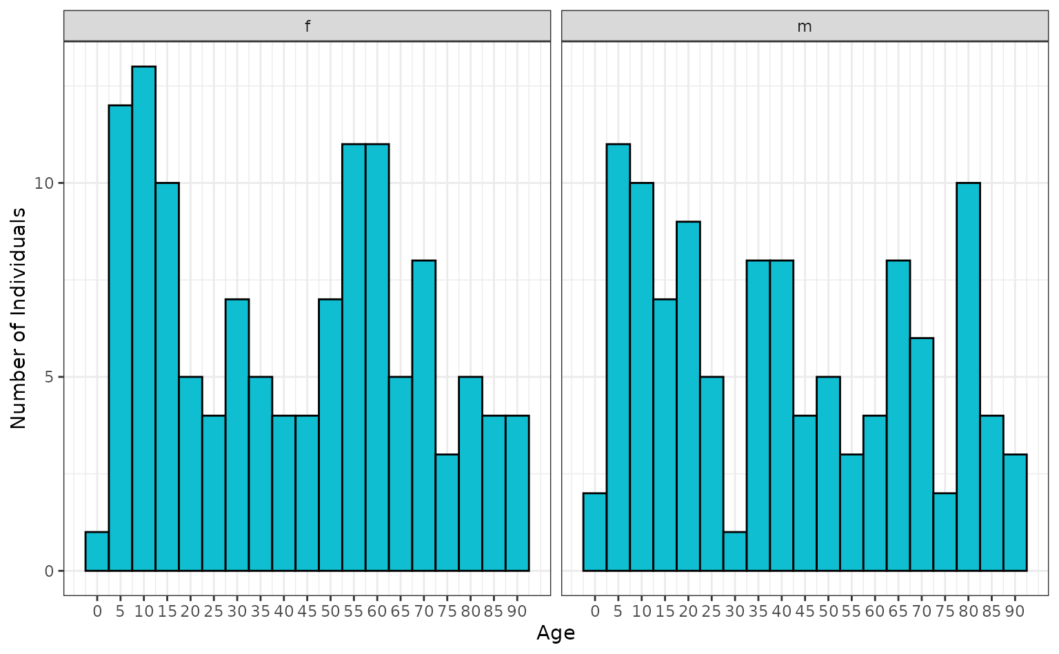
Again we can plot the age distribution to see the age structure for individuals in the line list. Given the relative uniformity of the age structure specified it is not greatly different from the uniform age structure plotted above, other than having a higher upper age limit. The data is binned into 5 year categories and facetted by sex.
ggplot(linelist[, c("sex", "age")]) +
  geom_histogram(
    mapping = aes(x = age),
    fill = "#10BED2",
    colour = "black",
    binwidth = 5
  ) +
  scale_y_continuous(name = "Number of Individuals") +
  scale_x_continuous(name = "Age", breaks = seq(0, 90, 5)) +
  theme_bw() +
  facet_wrap(vars(sex))
An example for a much younger population could instead specify:
-
0.4(or 40%) for 1-9 years old -
0.3(or 30%) for 10-29 years old -
0.2(or 20%) for 30-59 years old -
0.1(or 10%) for 60-75 years old
age_struct <- data.frame(
  age_limit = c(1, 10, 30, 60, 75),
  proportion = c(0.4, 0.3, 0.2, 0.1, 0)
)
age_struct
#>   age_limit proportion
#> 1         1        0.4
#> 2        10        0.3
#> 3        30        0.2
#> 4        60        0.1
#> 5        75        0.0
linelist <- sim_linelist(
  contact_distribution = contact_distribution,
  infectious_period = infectious_period,
  prob_infection = 0.45,
  onset_to_hosp = onset_to_hosp,
  onset_to_death = onset_to_death,
  population_age = age_struct,
  outbreak_size = c(100, 1e4)
)

head(linelist)
#>   id            case_name case_type sex age date_onset date_reporting
#> 1  1        Ezra Mcintosh  probable   m  17 2023-01-01     2023-01-01
#> 2  2      Daniela Maestas confirmed   f  53 2023-01-01     2023-01-01
#> 3  4 Maranda Maldonado Jr confirmed   f  20 2023-01-01     2023-01-01
#> 4  5         Jason Lawson suspected   m   6 2023-01-01     2023-01-01
#> 5  6   Alexis Pelayo-Pena  probable   f  14 2023-01-04     2023-01-04
#> 6  8      Megan Mattorano confirmed   f  60 2023-01-01     2023-01-01
#>   date_admission   outcome date_outcome date_first_contact date_last_contact
#> 1           <NA> recovered         <NA>               <NA>              <NA>
#> 2           <NA> recovered         <NA>         2022-12-29        2023-01-03
#> 3           <NA> recovered         <NA>         2022-12-27        2023-01-02
#> 4     2023-01-03      died   2023-01-12         2022-12-29        2023-01-05
#> 5           <NA> recovered         <NA>         2022-12-28        2023-01-04
#> 6           <NA> recovered         <NA>         2022-12-29        2023-01-08
#>   ct_value
#> 1       NA
#> 2     22.7
#> 3     22.3
#> 4       NA
#> 5       NA
#> 6     22.9
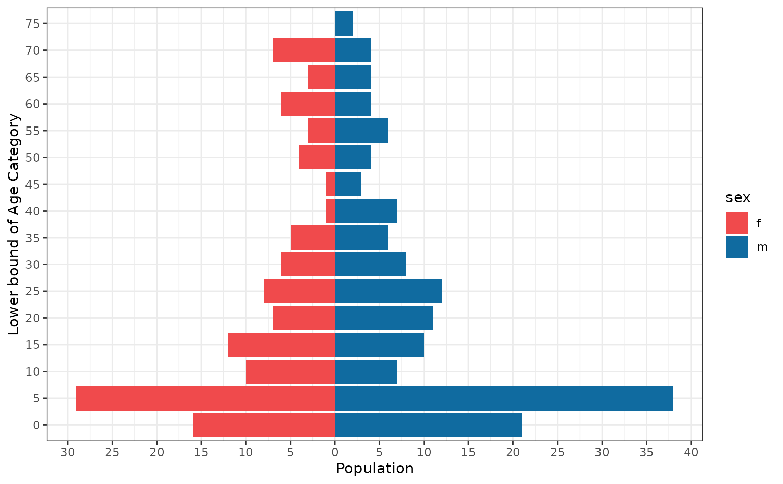
A common and useful method for plotting age data is in the form of age pyramids. Here we partition the data by sex and plot the age distribution.
linelist_m <- subset(linelist, subset = sex == "m")
age_cats_m <- as.data.frame(table(floor(linelist_m$age / 5) * 5))
colnames(age_cats_m) <- c("AgeCat", "Population")
age_cats_m <- cbind(age_cats_m, sex = "m")
linelist_f <- subset(linelist, subset = sex == "f")
age_cats_f <- as.data.frame(table(floor(linelist_f$age / 5) * 5))
colnames(age_cats_f) <- c("AgeCat", "Population")
age_cats_f$Population <- -age_cats_f$Population
age_cats_f <- cbind(age_cats_f, sex = "f")
age_cats <- rbind(age_cats_m, age_cats_f)

breaks <- pretty(range(age_cats$Population), n = 10)
labels <- abs(breaks)
ggplot(age_cats) +
  geom_col(mapping = aes(x = Population, y = factor(AgeCat), fill = sex)) +
  scale_y_discrete(name = "Lower bound of Age Category") +
  scale_x_continuous(name = "Population", breaks = breaks, labels = labels) +
  scale_fill_manual(values = c("#F04A4C", "#106BA0")) +
  theme_bw()
We have used the {ggplot2} package to construct our age pyramid, however the {apyramid} R package from R4Epi can assist in making these plots; as can the Applied Epidemiology Handbook chapter on age pyramids. The blog post on “Population Pyramid Plots in ggplot2” also contains useful tips on constructing pyramid plots.
As shown in the two age-structured examples, the number of age groups is flexible. Therefore a coarse population structure with two or three age groups can be specified, or where precise census demographic data is available, several age groups can be specified.