Epidemic Risk
Superspreading on policy, decision making and control measures
Source:vignettes/epidemic_risk.Rmd
epidemic_risk.RmdNew to the {superspreading} package?
See the Get started vignette for an introduction to the concepts discussed below and some of the functions included in the R package.
During the early stages of an infectious disease outbreak information on transmission clusters and heterogeneity in individual-level transmission can provide insight into the occurrence of superspreading events and from this the probability an outbreak will cause an epidemic. This has implications for policy decisions on how to bring disease transmission under control (e.g. < 1) and increase the probability that an outbreak goes extinct.
A recent example of where individual-level transmission and superspreading were analysed to understand disease transmission was by the Scientific Advisory Group for Emergencies (SAGE) for the UK’s COVID-19 response.
This vignette explores the applications of the functions included in the {superspreading} package and their visualisation in understanding and informing decision-makers for a variety of outbreak scenarios.
Early in the COVID-19 epidemic, a number of studies including Kucharski et al. (2020) investigated whether data on SARS-CoV-2 incidence had evidence of superspreading events. These events are often estimated as some measure of overdispersion. This was in light of evidence that other coronavirus outbreaks (Severe acute respiratory syndrome (SARS) and Middle East respiratory syndrome (MERS)) had superspreading events. The detection of variability in individual-transmission is important in understanding or predicting the likelihood of transmission establishing when imported into a new location (e.g. country).
First we set up the parameters to use for calculating the probability
of an epidemic. In this case we are varying the heterogeneity of
transmission (k) and number of initial infections
(num_init_infect).
epidemic_params <- expand.grid(
  R = 2.35,
  R_lw = 1.5,
  R_up = 3.2,
  k = seq(0, 1, 0.1),
  num_init_infect = seq(0, 10, 1)
)
Then we calculate the probability of an epidemic for each parameter combination. The results are combined with the the parameters.
# results are transposed to pivot to long rather than wide data
prob_epidemic <- t(apply(epidemic_params, 1, function(x) {
  central <- probability_epidemic(
    R = x[["R"]],
    k = x[["k"]],
    num_init_infect = x[["num_init_infect"]]
  )
  lower <- probability_epidemic(
    R = x[["R_lw"]],
    k = x[["k"]],
    num_init_infect = x[["num_init_infect"]]
  )
  upper <- probability_epidemic(
    R = x[["R_up"]],
    k = x[["k"]],
    num_init_infect = x[["num_init_infect"]]
  )
  c(prob_epidemic = central, prob_epidemic_lw = lower, prob_epidemic_up = upper)
}))
epidemic_params <- cbind(epidemic_params, prob_epidemic)
To visualise the influence of transmission variation (k)
we subset the results to only include those with a single initial
infection seeding transmission (num_init_infect = 1).
# subset data for a single initial infection
homogeneity <- subset(epidemic_params, num_init_infect == 1)
# plot probability of epidemic across dispersion
ggplot(data = homogeneity) +
  geom_ribbon(
    mapping = aes(
      x = k,
      ymin = prob_epidemic_lw,
      ymax = prob_epidemic_up
    ),
    fill = "grey70"
  ) +
  geom_line(mapping = aes(x = k, y = prob_epidemic)) +
  geom_vline(
    mapping = aes(xintercept = 0.2),
    linetype = "dashed"
  ) +
  annotate(geom = "text", x = 0.15, y = 0.75, label = "SARS") +
  geom_vline(
    mapping = aes(xintercept = 0.4),
    linetype = "dashed"
  ) +
  annotate(geom = "text", x = 0.45, y = 0.75, label = "MERS") +
  scale_y_continuous(
    name = "Probability of large outbreak",
    limits = c(0, 1)
  ) +
  scale_x_continuous(name = "Extent of homogeneity in transmission") +
  theme_bw()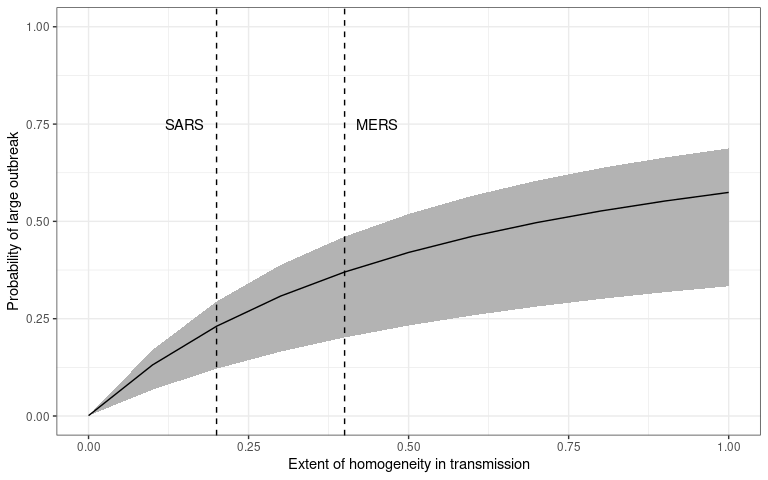
The probability that an initial infection (introduction) will cause a
sustained outbreak (transmission chain). The dispersion of the
individual-level transmission is plotted on the x-axis and probability
of outbreak – calculated using probability_epidemic() – is
on the y-axis. This plot is reproduced from Kucharski et al. (2020)
figure 3A.
The degree of variability in transmission increases as decreases (Lloyd-Smith et al. 2005). So the probability of a large outbreak is smaller for smaller values of , for a given value of , meaning that if COVID-19 is more similar to SARS than MERS it will be less likely to establish and cause an outbreak if introduced into a newly susceptible population.
However, this probability of establishment and continued transmission will also depend on the number of initial introductions to that populations. The more introductions, the higher the chance one will lead to an epidemic.
introductions <- subset(epidemic_params, k == 0.5)
# plot probability of epidemic across introductions
ggplot(data = introductions) +
  geom_pointrange(
    mapping = aes(
      x = num_init_infect,
      y = prob_epidemic,
      ymin = prob_epidemic_lw,
      ymax = prob_epidemic_up
    )
  ) +
  scale_y_continuous(
    name = "Probability of large outbreak",
    limits = c(0, 1)
  ) +
  scale_x_continuous(name = "Number of introductions", n.breaks = 6) +
  theme_bw()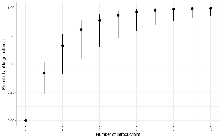
The probability that a number of introduction events will cause a
sustained outbreak (transmission chain). The number of disease
introductions is plotted on the x-axis and probability of outbreak –
calculated using probability_epidemic() – is on the y-axis.
This plot is reproduced from Kucharski et al. (2020) figure 3B.
Different levels of heterogeneity in transmission will produce different probabilities of epidemics.
# plot probability of epidemic across introductions for multiple k
ggplot(data = epidemic_params) +
  geom_point(
    mapping = aes(
      x = num_init_infect,
      y = prob_epidemic,
      colour = k
    )
  ) +
  scale_y_continuous(
    name = "Probability of large outbreak",
    limits = c(0, 1)
  ) +
  labs(colour = "Dispersion (*k*)") +
  scale_x_continuous(name = "Number of introductions", n.breaks = 6) +
  scale_colour_continuous(type = "viridis") +
  theme_bw() +
  theme(legend.title = element_markdown())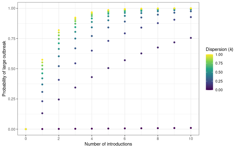
The probability that an a number of introduction events will cause a
sustained outbreak (transmission chain). The number of disease
introductions is plotted on the x-axis and probability of outbreak –
calculated using probability_epidemic() – is on the y-axis.
Different values of dispersion are plotted to show the effect of
increased transmission variability on an epidemic establishing
In the above plot we drop the uncertainty around each point and assume a known value of in order to more clearly show the pattern.
These calculations enable us to understand epidemics and applications, such as Shiny apps, to explore this functionality and compare between existing parameter estimates of offspring distributions are also useful. An example application called Probability of a large 2019-nCoV outbreak following introduction of cases, that is no longer maintained, was developed by the Centre for Mathematical Modelling of Infectious diseases at the London School of Hygiene and Tropical Medicine, for comparing SARS-like and MERS-like scenarios, as well as random mixing during the COVID-19 pandemic.
Conversely to the probability of an epidemic, the probability that an outbreak will go extinct (i.e. transmission will subside), can also be plotted for different values of .
extinction_params <- expand.grid(
  R = seq(0, 5, 0.1),
  k = c(0.01, 0.1, 0.5, 1, 4, Inf),
  num_init_infect = 1
)
# results are transposed to pivot to long rather than wide data
prob_extinct <- apply(extinction_params, 1, function(x) {
  central <- probability_extinct(
    R = x[["R"]],
    k = x[["k"]],
    num_init_infect = x[["num_init_infect"]]
  )
  central
})
extinction_params <- cbind(extinction_params, prob_extinct)
# plot probability of extinction across R for multiple k
ggplot(data = extinction_params) +
  geom_point(
    mapping = aes(
      x = R,
      y = prob_extinct,
      colour = factor(k)
    )
  ) +
  scale_y_continuous(
    name = "Probability of extinction",
    limits = c(0, 1)
  ) +
  labs(colour = "Dispersion (*k*)") +
  scale_x_continuous(
    name = "Reproductive number (*R*)",
    n.breaks = 6
  ) +
  scale_colour_viridis_d() +
  theme_bw() +
  theme(
    axis.title.x = element_markdown(),
    legend.title = element_markdown()
  )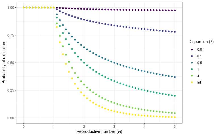
The probability that an infectious disease will go extinct for a given
value of
and
.
This is calculated using probability_extinct() function.
This plot is reproduced from Lloyd-Smith et al.
(2005)
figure 2B.
Superspreading in decision making
One of the first tasks in an outbreak is to establish whether estimates of individual-level transmission variability have been reported, either for this outbreak or a previous outbreak of the same pathogen. Alternatively, if it is an outbreak of a novel pathogen, parameters for similar pathogens can be searched for.
This is accomplished by another Epiverse-TRACE R package: {epiparameter}. This package contains a library of epidemiological parameters included offspring distribution parameter estimates and uncertainty obtained from published literature. This aids the collation and establishes a baseline understanding of transmission. Similar to the collation of transmission clusters for COVID-19.
Equipped with these parameter estimates, metrics that provide an
intuitive understanding of transmission patterns can be tabulated. For
example the proportion of transmission events in a given cluster size
can be calculated using the {superspreading} function
proportion_cluster_size().
This calculates the proportion of new cases that originate within a transmission cluster of a given size. In other words, what proportion of all transmission events were part of secondary case clusters (i.e. from the same primary case) of at least, for example, five cases. This calculation is useful to inform backwards contact tracing efforts.
In this example we look at clusters of at least 5, 10 and 25 secondary cases, at different numbers of initial infections and for two reproduction numbers to see how this affects cluster sizes.
# For R = 0.8
proportion_cluster_size(
  R = 0.8,
  k = seq(0.1, 1, 0.1),
  cluster_size = c(5, 10, 25)
)
#>      R   k prop_5 prop_10 prop_25
#> 1  0.8 0.1  66.8%   38.7%   7.36%
#> 2  0.8 0.2  48.6%     18%  0.786%
#> 3  0.8 0.3  37.7%   9.37%  0.197%
#> 4  0.8 0.4  30.3%   5.24% 0.0324%
#> 5  0.8 0.5  24.5%   3.07%      0%
#> 6  0.8 0.6  21.2%   1.68%      0%
#> 7  0.8 0.7  18.2%   1.11%      0%
#> 8  0.8 0.8    16%  0.925%      0%
#> 9  0.8 0.9  14.5%    0.6%      0%
#> 10 0.8 1.0  12.7%  0.445%      0%

# For R = 3
proportion_cluster_size(
  R = 3,
  k = seq(0.1, 1, 0.1),
  cluster_size = c(5, 10, 25)
)
#>    R   k prop_5 prop_10 prop_25
#> 1  3 0.1  90.3%   78.4%   50.5%
#> 2  3 0.2  84.1%   64.8%   27.1%
#> 3  3 0.3  79.5%   55.2%   15.8%
#> 4  3 0.4  75.9%   47.6%   9.35%
#> 5  3 0.5  73.1%   42.1%   6.09%
#> 6  3 0.6  70.5%   36.8%   3.57%
#> 7  3 0.7  68.2%   32.7%   2.04%
#> 8  3 0.8  66.3%   29.6%   1.63%
#> 9  3 0.9  64.7%   26.7%   0.95%
#> 10 3 1.0  63.1%   23.9%  0.695%
These results show that as the level of heterogeneity in individual-level transmission increases, a larger percentage of cases come from larger cluster sizes, and that large clusters can be produced when is higher even with low levels of transmission variation.
It indicates whether preventing gatherings of a certain size can reduce the epidemic by preventing potential superspreading events.
When data on the settings of transmission is known, priority can be given to restricting particular types of gatherings to most effectively bring down the reproduction number.
Controls on transmission
In their work on identifying the prevalence of overdispersion in
individual-level transmission, Lloyd-Smith et al.
(2005)
also showed the effect of control measures on the probability of
containment. They defined containment as the size of a transmission
chain not reaching 100 cases. They assumed the implementation of control
measures at the individual or population level. {superspreading}
provides probability_contain() to calculate the probability
that an outbreak will go extinct before reaching a threshold size.
contain_params <- expand.grid(
  R = 3, k = c(0.1, 0.5, 1, Inf), num_init_infect = 1, control = seq(0, 1, 0.05)
)
prob_contain <- apply(contain_params, 1, function(x) {
  probability_contain(
    R = x[["R"]],
    k = x[["k"]],
    num_init_infect = x[["num_init_infect"]],
    pop_control = x[["control"]]
  )
})
contain_params <- cbind(contain_params, prob_contain)
# plot probability of epidemic across introductions for multiple k
ggplot(data = contain_params) +
  geom_point(
    mapping = aes(
      x = control,
      y = prob_contain,
      colour = factor(k)
    )
  ) +
  scale_y_continuous(
    name = "Probability of containment",
    limits = c(0, 1)
  ) +
  scale_x_continuous(name = "Control measures (*c*)", n.breaks = 6) +
  labs(colour = "Dispersion (*k*)") +
  scale_colour_viridis_d() +
  theme_bw() +
  theme(
    axis.title.x = element_markdown(),
    legend.title = element_markdown()
  )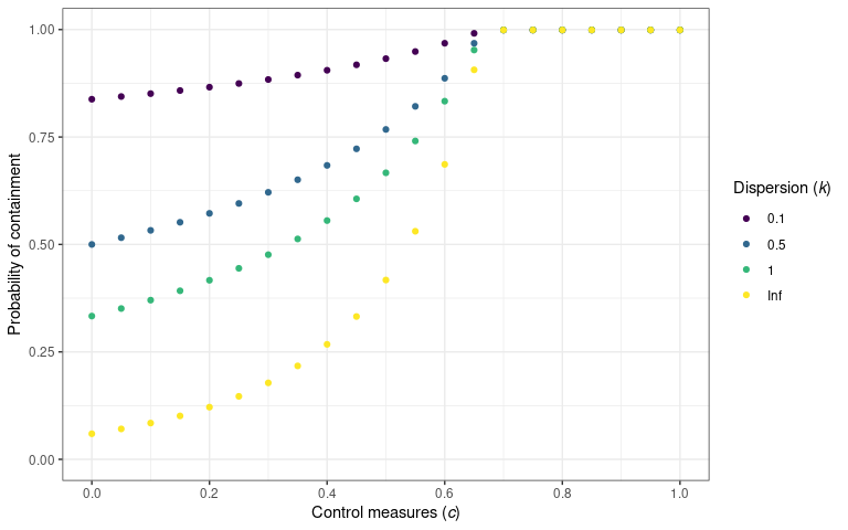
The probability that an outbreak will be contained (i.e. not exceed 100
cases) for a variety of population-level control measures. The
probability of containment is calculated using
probability_contain(). This plot is reproduced from
Lloyd-Smith et al. (2005) figure 3C.