Aggregate and visualize
Last updated on 2026-06-15 | Edit this page
Overview
Questions
- How to aggregate and summarise case data?
- How to visualize aggregated data?
- What is distribution of cases across time, space, gender, and age?
Objectives
- Simulate synthetic outbreak data
- Convert linelist data into incidence over time
- Create epidemic curves from incidence data
Introduction
In an analytic pipeline, exploratory data analysis (EDA) is an important step before formal modelling. EDA helps determine relationships between variables and summarize their main characteristics, often by means of data visualization.
This episode focuses on EDA of outbreak data using R packages. A key aspect of EDA in epidemic analysis is ‘person, place and time’. It is useful to identify how observed events - such as confirmed cases, hospitalizations, deaths, and recoveries - change over time, and how these vary across different locations and demographic factors, including gender, age, and more.
Let’s start by loading the incidence2 package to
aggregate the linelist data according to specific characteristics, and
visualize the resulting epidemic curves (epicurves) that plot the number
of new events (i.e. case incidence over time). We’ll use the
simulist package to simulate the outbreak data to
analyse, and {tracetheme} for figure formatting. We’ll use
the pipe operator (%>%) to connect some of their
functions, including others from the dplyr and
ggplot2 packages, so let’s also call to the {tidyverse}
package.
R
# Load packages
library(incidence2) # For aggregating and visualising
library(simulist) # For simulating linelist data
library(tracetheme) # For formatting figures
library(tidyverse) # For {dplyr} and {ggplot2} functions and the pipe |>
Synthetic outbreak data
To illustrate the process of conducting EDA on outbreak data, we will generate a line list for a hypothetical disease outbreak utilizing the simulist package. simulist generates simulated data for outbreak according to a given configuration. Its minimal configuration can generate a linelist, as shown in the below code chunk:
R
# Simulate linelist data for an outbreak with size between 1000 and 1500
set.seed(1) # Set seed for reproducibility
sim_data <- simulist::sim_linelist(outbreak_size = c(1000, 1500)) %>%
  dplyr::as_tibble() # for a simple data frame output
WARNING
Warning: Number of cases exceeds maximum outbreak size.
Returning data early with 1546 cases and 3059 total contacts (including cases).
R
# Display the simulated dataset
sim_data
OUTPUT
# A tibble: 1,546 × 13
      id case_name         case_type sex     age date_onset date_reporting
   <int> <chr>             <chr>     <chr> <int> <date>     <date>
 1     1 Travis Kurek      confirmed m        37 2023-01-01 2023-01-01
 2     3 Courtney Mccoy    probable  f        12 2023-01-11 2023-01-11
 3     6 Andrea Alarid     confirmed f        53 2023-01-18 2023-01-18
 4     8 Salwa el-Sharifi  suspected f        36 2023-01-23 2023-01-23
 5    11 Azza al-Noorani   suspected f        77 2023-01-30 2023-01-30
 6    14 Olivya Pinto      probable  f        37 2023-01-24 2023-01-24
 7    15 Acineth Briones   suspected f        67 2023-01-31 2023-01-31
 8    16 Mahuroos el-Javed confirmed m        80 2023-01-30 2023-01-30
 9    20 Awad el-Idris     probable  m        70 2023-01-27 2023-01-27
10    21 Matthew Friend    confirmed m        87 2023-02-09 2023-02-09
# ℹ 1,536 more rows
# ℹ 6 more variables: date_admission <date>, outcome <chr>,
#   date_outcome <date>, date_first_contact <date>, date_last_contact <date>,
#   ct_value <dbl>
This linelist dataset has simulated entries on individual-level events during an outbreak.
The above is the default configuration of simulist. It
includes a number of assumptions about the transmissibility and severity
of the pathogen. If you want to know more about the
simulist::sim_linelist() function and other functionalities
check the documentation
website.
You can also find data sets from past real outbreaks within the {outbreaks}
R package.
Aggregating the data
Often we want to analyse and visualise the number of events that
occur on a particular day or week, rather than focusing on individual
cases. This requires grouping the linelist data into incidence data. The
{incidence2}
package offers a useful function called
incidence2::incidence() for grouping case data, usually
based around dated events and/or other characteristics. The code chunk
provided below demonstrates the creation of an
<incidence2> class object from the simulated Ebola
linelist data based on the date of onset.
R
# Create an incidence object by aggregating case data based on the date of onset
daily_incidence <- incidence2::incidence(
  sim_data,
  date_index = "date_onset",
  interval = "day" # Aggregate by daily intervals
)

# View the incidence data
daily_incidence
OUTPUT
# incidence: 232 x 3
# count vars: date_onset
date_index count_variable count
<date> <chr> <int>
1 2023-01-01 date_onset 1
2 2023-01-11 date_onset 1
3 2023-01-18 date_onset 1
4 2023-01-23 date_onset 1
5 2023-01-24 date_onset 1
6 2023-01-27 date_onset 2
7 2023-01-29 date_onset 1
8 2023-01-30 date_onset 2
9 2023-01-31 date_onset 2
10 2023-02-01 date_onset 1
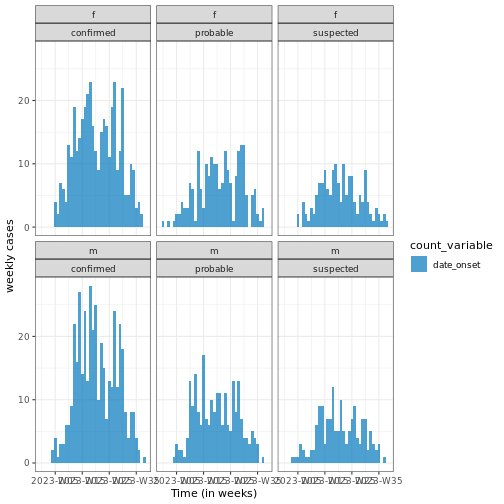
# ℹ 222 more rowsWith the incidence2 package, you can specify the desired interval (e.g. day, week) and categorize cases by one or more factors. Below is a code snippet demonstrating weekly cases grouped by the date of onset, sex, and type of case.
R
# Group incidence data by week, accounting for sex and case type
weekly_incidence <- incidence2::incidence(
  sim_data,
  date_index = "date_onset",
  interval = "week", # Aggregate by weekly intervals
  groups = c("sex", "case_type") # Group by sex and case type
)

# View the incidence data
weekly_incidence
OUTPUT
# incidence:  199 x 5
# count vars: date_onset
# groups:     sex, case_type
   date_index sex   case_type count_variable count
   <isowk>    <chr> <chr>     <chr>          <int>
 1 2022-W52   m     confirmed date_onset         1
 2 2023-W02   f     probable  date_onset         1
 3 2023-W03   f     confirmed date_onset         1
 4 2023-W04   f     probable  date_onset         1
 5 2023-W04   f     suspected date_onset         1
 6 2023-W04   m     confirmed date_onset         1
 7 2023-W04   m     probable  date_onset         2
 8 2023-W05   f     confirmed date_onset         5
 9 2023-W05   f     probable  date_onset         2
10 2023-W05   f     suspected date_onset         2
# ℹ 189 more rowsDates Completion
When cases are grouped by different factors, it’s possible that the
events involving these groups may have different date ranges in the
resulting incidence2 object. The incidence2
package provides a function called
incidence2::complete_dates() to ensure that an incidence
object has the same range of dates for each group. By default, missing
counts for a particular group will be filled with 0 for that date.
This functionality is also available within the
incidence2::incidence() function by setting the value of
the complete_dates to TRUE.
R
# Create a daily incidence object grouped by sex
daily_incidence_2 <- incidence2::incidence(
  sim_data,
  date_index = "date_onset",
  groups = "sex",
  interval = "day", # Aggregate by daily intervals
  complete_dates = TRUE # Complete missing dates in the incidence object
)
Challenge 1: Can you do it?
-
Task: Calculate the incidence of cases
every 2 weeks from the
sim_datalinelist based on their admission date and outcome. Save the result in an object calledbiweekly_incidence.
Visualization
The incidence2 objects can be visualized using the
plot() function from the base R package. The resulting
graph is referred to as an epidemic curve, or epi-curve for short. The
following code snippets generate epi-curves for the
daily_incidence and weekly_incidence incidence
objects mentioned above.
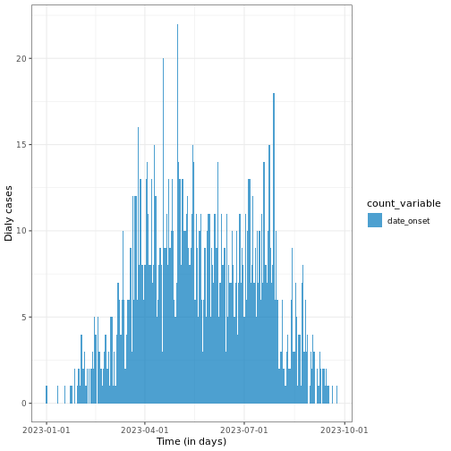
R
# Plot daily incidence data
base::plot(daily_incidence) +
  ggplot2::labs(
    x = "Time (in days)", # x-axis label
    y = "Dialy cases" # y-axis label
  ) +
  theme_bw()
R
# Plot weekly incidence data
base::plot(weekly_incidence) +
  ggplot2::labs(
    x = "Time (in weeks)", # x-axis label
    y = "weekly cases" # y-axis label
  ) +
  theme_bw()
Easy aesthetics
We invite you to take a look at the incidence2 package
vignette. Find how you can use the arguments within the
plot() function to provide aesthetics to your incidence2
class objects.
R
base::plot(weekly_incidence, fill = "sex")
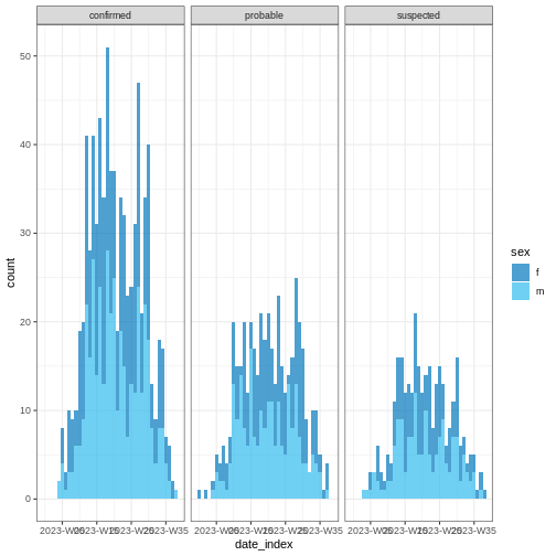
Some of them include show_cases = TRUE,
angle = 45, and n_breaks = 5. Try them and see
how they impact on the resulting plot.
Challenge 2: Can you do it?
-
Task: Visualize the
biweekly_incidenceobject.
Curve of cumulative cases
The cumulative number of cases can be calculated using the
incidence2::cumulate() function on an
incidence2 object and visualized it, as in the example
below.
R
# Calculate cumulative incidence
cum_df <- incidence2::cumulate(daily_incidence)

# Plot cumulative incidence data using ggplot2
base::plot(cum_df) +
  ggplot2::labs(
    x = "Time (in days)", # x-axis label
    y = "weekly cases" # y-axis label
  ) +
  theme_bw()
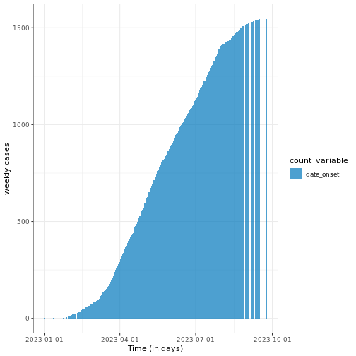
Note that this function preserves grouping, i. e. , if the
incidence2 object contains groups, it will accumulate the
cases accordingly.
Challenge 3: Can you do it?
-
Task: Visulaize the cumulative cases from the
biweekly_incidenceobject.
Peak time estimation
You can estimate the peak – the time with the highest number of
recorded cases – using the incidence2::estimate_peak()
function from the {incidence2} package. This function uses a
bootstrapping method to determine the peak time (i. e. by resampling
dates with replacement, resulting in a distribution of estimated peak
times).
R
# Estimate the peak of the daily incidence data
peak <- incidence2::estimate_peak(
  daily_incidence,
  n = 100,         # Number of simulations for the peak estimation
  alpha = 0.05,    # Significance level for the confidence interval
  first_only = TRUE, # Return only the first peak found
  progress = FALSE  # Disable progress messages
)

# Display the estimated peak
print(peak)
OUTPUT
# A tibble: 1 × 7
  count_variable observed_peak observed_count bootstrap_peaks lower_ci
  <chr>          <date>                 <int> <list>          <date>
1 date_onset     2023-05-01                22 <df [100 × 1]>  2023-03-26
# ℹ 2 more variables: median <date>, upper_ci <date>
This example demonstrates how to estimate the peak time using the
incidence2::estimate_peak() function at \(95%\) confidence interval and using 100
bootstrap samples.
Challenge 4: Can you do it?
-
Task: Estimate the peak time from the
biweekly_incidenceobject.
Visualization with ggplot2
incidence2 produces basic plots for epicurves, but additional work is required to create well-annotated graphs. However, using the ggplot2 package, you can generate more sophisticated epicurves, with more flexibility in annotation. ggplot2 is a comprehensive package with many functionalities. However, we will focus on three key elements for producing epicurves: histogram plots, scaling date axes and their labels, and general plot theme annotation. The example below demonstrates how to configure these three elements for a simple incidence2 object.
R
# Define date breaks for the x-axis
breaks <- seq.Date(
  from = min(as.Date(daily_incidence$date_index, na.rm = TRUE)),
  to = max(as.Date(daily_incidence$date_index, na.rm = TRUE)),
  by = 20 # every 20 days
)

# Create the plot
ggplot2::ggplot(data = daily_incidence) +
  geom_histogram(
    mapping = aes(
      x = as.Date(date_index),
      y = count
    ),
    stat = "identity",
    color = "blue", # bar border color
    fill = "lightblue", # bar fill color
    width = 1 # bar width
  ) +
  theme_minimal() + # apply a minimal theme for clean visuals
  theme(
    plot.title = element_text(face = "bold",
                              hjust = 0.5), # center and bold title
    plot.subtitle = element_text(hjust = 0.5), # center subtitle
    plot.caption = element_text(face = "italic",
                                hjust = 0), # italicized caption
    axis.title = element_text(face = "bold"), # bold axis titles
    axis.text.x = element_text(angle = 45, vjust = 0.5) # rotated x-axis text
  ) +
  labs(
    x = "Date", # x-axis label
    y = "Number of cases", # y-axis label
    title = "Daily Outbreak Cases", # plot title
    subtitle = "Epidemiological Data for the Outbreak", # plot subtitle
    caption = "Data Source: Simulated Data" # plot caption
  ) +
  scale_x_date(
    breaks = breaks, # set custom breaks on the x-axis
    labels = scales::label_date_short() # shortened date labels
  )
WARNING
Warning in geom_histogram(mapping = aes(x = as.Date(date_index), y = count), :
Ignoring unknown parameters: `binwidth` and `bins`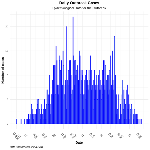
Use the group option in the mapping function to
visualize an epicurve with different groups. If there is more than one
grouping factor, use the facet_wrap() option, as
demonstrated in the example below:
R
# Plot daily incidence faceted by sex
ggplot2::ggplot(data = daily_incidence_2) +
  geom_histogram(
    mapping = aes(
      x = as.Date(date_index),
      y = count,
      group = sex,
      fill = sex
    ),
    stat = "identity"
  ) +
  theme_minimal() + # apply minimal theme
  theme(
    plot.title = element_text(face = "bold",
                              hjust = 0.5), # bold and center the title
    plot.subtitle = element_text(hjust = 0.5), # center the subtitle
    plot.caption = element_text(face = "italic", hjust = 0), # italic caption
    axis.title = element_text(face = "bold"), # bold axis labels
    axis.text.x = element_text(angle = 45,
                               vjust = 0.5) # rotate x-axis text for readability
  ) +
  labs(
    x = "Date", # x-axis label
    y = "Number of cases", # y-axis label
    title = "Daily Outbreak Cases by Sex", # plot title
    subtitle = "Incidence of Cases Grouped by Sex", # plot subtitle
    caption = "Data Source: Simulated Data" # caption for additional context
  ) +
  facet_wrap(~sex) + # create separate panels by sex
  scale_x_date(
    breaks = breaks, # set custom date breaks
    labels = scales::label_date_short() # short date format for x-axis labels
  ) +
  scale_fill_manual(values = c("lightblue",
                               "lightpink")) # custom fill colors for sex
WARNING
Warning in geom_histogram(mapping = aes(x = as.Date(date_index), y = count, :
Ignoring unknown parameters: `binwidth` and `bins`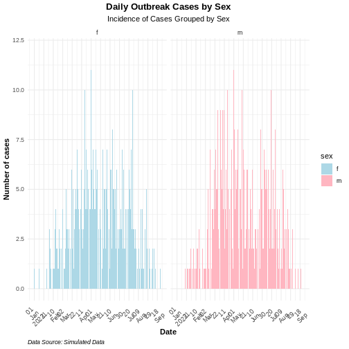
Challenge 5: Can you do it?
-
Task: Produce an annotated figure for the
biweekly_incidenceobject using the ggplot2 package.
- Use simulist package to generate synthetic outbreak data
- Use incidence2 package to aggregate case data based on a date event, and other variables to produce epidemic curves.
- Use ggplot2 package to produce better annotated epicurves.