Aggregate and visualize
Last updated on 2026-07-07 | Edit this page
Estimated time: 30 minutes
Overview
Questions
- How to aggregate and summarize case data?
- How to visualize aggregated data?
- What is the distribution of cases across time, space, gender, and age?
Objectives
- Simulate synthetic outbreak data
- Convert linelist data into incidence over time
- Create epidemic curves from incidence data
Install these packages if they are not already installed
R
if (!base::require("pak")) install.packages("pak")
pak::pak(c("incidence2", "simulist", "tidyverse"))
If you have any error message, go to the main setup page.
Introduction
In an analytic pipeline, exploratory data analysis (EDA) is an important step before formal modeling. EDA helps determine relationships between variables and summarize their main characteristics, often by means of data visualization.
This episode focuses on EDA of outbreak data using R packages. A key aspects of EDA in epidemic analysis are person, place, and time. It is useful to identify how observed events–such as confirmed cases, hospitalizations, deaths, and recoveries–change over time, and how these vary across different locations and demographic factors, including gender, age, and more.
Let’s start by loading the incidence2 package to
aggregate the linelist data according to specific characteristics, and
visualize the resulting epidemic curves (epicurves) that plot the number
of new events (i.e. case incidence over time). We’ll use the
simulist package to simulate the outbreak data to
analyze. We’ll use the pipe operator (%>%) to connect
some of their functions, including others from the dplyr
and ggplot2 packages, so let’s also load the {tidyverse}
package.
R
# Load packages
library(incidence2) # For aggregating and visualizing
library(simulist) # For simulating linelist data
library(tidyverse) # For {dplyr} and {ggplot2} functions and the pipe %>%
Synthetic outbreak data
To illustrate the process of conducting EDA on outbreak data, we will generate a line list for a hypothetical disease outbreak utilizing the simulist package. simulist generates simulated data for an outbreak according to a given configuration. Its minimal configuration can generate a linelist, as shown in the code chunk below:
R
# Set seed for reproducibility
set.seed(1)

# Simulate linelist data for an outbreak with size between 1000 and 1500
sim_data <- simulist::sim_linelist(outbreak_size = c(1000, 1500)) %>%
  dplyr::as_tibble() # for a simple data frame output

# Display the simulated dataset
sim_data
OUTPUT
# A tibble: 1,546 × 13
      id case_name         case_type sex     age date_onset date_reporting
   <int> <chr>             <chr>     <chr> <int> <date>     <date>
 1     1 Travis Kurek      confirmed m        37 2023-01-01 2023-01-01
 2     3 Courtney Mccoy    probable  f        12 2023-01-11 2023-01-11
 3     6 Andrea Alarid     confirmed f        53 2023-01-18 2023-01-18
 4     8 Salwa el-Sharifi  suspected f        36 2023-01-23 2023-01-23
 5    11 Azza al-Noorani   suspected f        77 2023-01-30 2023-01-30
 6    14 Olivya Pinto      probable  f        37 2023-01-24 2023-01-24
 7    15 Acineth Briones   suspected f        67 2023-01-31 2023-01-31
 8    16 Mahuroos el-Javed confirmed m        80 2023-01-30 2023-01-30
 9    20 Awad el-Idris     probable  m        70 2023-01-27 2023-01-27
10    21 Matthew Friend    confirmed m        87 2023-02-09 2023-02-09
# ℹ 1,536 more rows
# ℹ 6 more variables: date_admission <date>, outcome <chr>,
#   date_outcome <date>, date_first_contact <date>, date_last_contact <date>,
#   ct_value <dbl>
This linelist dataset contains simulated individual-level records of events during an outbreak.
The above is the default configuration of simulist. It
includes a number of assumptions about the transmissibility and severity
of the pathogen. If you want to know more about the
simulist::sim_linelist() function and other
functionalities, check the documentation
website.
You can also find datasets from past real outbreaks within the outbreaks R package.
Aggregating linelist
Often we want to analyze and visualize the number of events that
occur on a particular day or week, rather than focusing on individual
cases. This requires converting the linelist data into incidence data.
The {incidence2}
package offers a useful function called
incidence2::incidence() for aggregating case data around
dated events. It can also aggregate data on other characteristics (e.g.,
sex). The code chunk provided below demonstrates the creation of an
<incidence2> class object from the simulated Ebola
linelist data based on the date of onset.
R
# Create an incidence object by aggregating case data based on the date of onset
daily_incidence <- incidence2::incidence(
  sim_data,
  date_index = "date_onset",
  interval = "day" # Aggregate by daily intervals
)

# View the incidence data
daily_incidence
OUTPUT
# incidence:  232 x 3
# count vars: date_onset
   date_index count_variable count
   <date>     <chr>          <int>
 1 2023-01-01 date_onset         1
 2 2023-01-11 date_onset         1
 3 2023-01-18 date_onset         1
 4 2023-01-23 date_onset         1
 5 2023-01-24 date_onset         1
 6 2023-01-27 date_onset         2
 7 2023-01-29 date_onset         1
 8 2023-01-30 date_onset         2
 9 2023-01-31 date_onset         2
10 2023-02-01 date_onset         1
# ℹ 222 more rows
You can use numeric values, as number of days to group, or text
string such day, week, epiweek,
months, and more to setup the aggregating interval:
R
# Create an incidence object by aggregating case data based on the date of onset
weekly_incidence <- incidence2::incidence(
  sim_data,
  date_index = "date_onset",
  interval = "week" # Aggregate by weekly intervals
)

# View the incidence data
weekly_incidence
OUTPUT
# incidence: 38 x 3
# count vars: date_onset
date_index count_variable count
<isowk> <chr> <int>
1 2022-W52 date_onset 1
2 2023-W02 date_onset 1
3 2023-W03 date_onset 1
4 2023-W04 date_onset 5
5 2023-W05 date_onset 16
6 2023-W06 date_onset 10
7 2023-W07 date_onset 22
8 2023-W08 date_onset 16
9 2023-W09 date_onset 19
10 2023-W10 date_onset 44
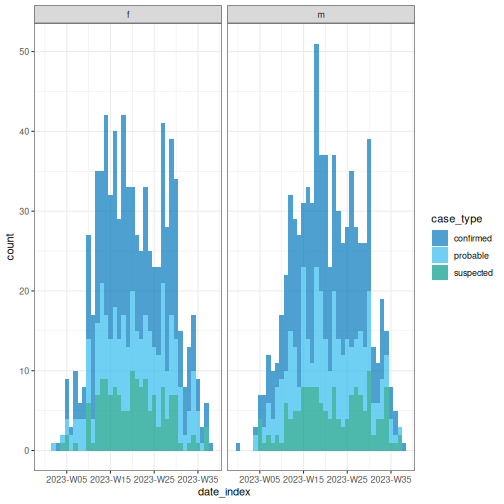
# ℹ 28 more rowsWith the incidence2 package, you can specify the desired time interval (e.g., day, week, etc.) and categorize cases by one or more factors. Below is a code snippet demonstrating weekly cases grouped by the date of onset, sex, and type of case.
R
# Group incidence data by week, accounting for sex and case type
weekly_group_incidence <- incidence2::incidence(
  sim_data,
  date_index = "date_onset",
  interval = "week", # Aggregate by weekly intervals
  groups = c("sex", "case_type") # Group by sex and case type
)

# View the incidence data
weekly_group_incidence
OUTPUT
# incidence:  199 x 5
# count vars: date_onset
# groups:     sex, case_type
   date_index sex   case_type count_variable count
   <isowk>    <chr> <chr>     <chr>          <int>
 1 2022-W52   m     confirmed date_onset         1
 2 2023-W02   f     probable  date_onset         1
 3 2023-W03   f     confirmed date_onset         1
 4 2023-W04   f     probable  date_onset         1
 5 2023-W04   f     suspected date_onset         1
 6 2023-W04   m     confirmed date_onset         1
 7 2023-W04   m     probable  date_onset         2
 8 2023-W05   f     confirmed date_onset         5
 9 2023-W05   f     probable  date_onset         2
10 2023-W05   f     suspected date_onset         2
# ℹ 189 more rowsDates completion
When cases are grouped by different factors, it’s possible that the
events involving these groups may have different date ranges in the
resulting incidence2 object. For example:
R
# Create a daily incidence object grouped by sex
incidence2::incidence(
  sim_data,
  date_index = "date_onset",
  groups = "sex",
  interval = "week",
  complete_dates = FALSE # Default
)
OUTPUT
# incidence:  73 x 4
# count vars: date_onset
# groups:     sex
   date_index sex   count_variable count
   <isowk>    <chr> <chr>          <int>
 1 2022-W52   m     date_onset         1
 2 2023-W02   f     date_onset         1
 3 2023-W03   f     date_onset         1
 4 2023-W04   f     date_onset         2
 5 2023-W04   m     date_onset         3
 6 2023-W05   f     date_onset         9
 7 2023-W05   m     date_onset         7
 8 2023-W06   f     date_onset         3
 9 2023-W06   m     date_onset         7
10 2023-W07   f     date_onset        10
# ℹ 63 more rows
The incidence2 package provides a function called
incidence2::complete_dates() to ensure that an incidence
object has the same range of dates for each group. By default, missing
counts for a particular group will be filled with 0 for
that date.
This functionality is also available within the
incidence2::incidence() function by setting the value of
the complete_dates to TRUE.
R
# Create a daily incidence object grouped by sex
incidence2::incidence(
  sim_data,
  date_index = "date_onset",
  groups = "sex",
  interval = "week",
  complete_dates = TRUE # Complete dates and missing counts
)
OUTPUT
# incidence:  78 x 4
# count vars: date_onset
# groups:     sex
   date_index sex   count_variable count
   <isowk>    <chr> <chr>          <int>
 1 2022-W52   f     date_onset         0
 2 2022-W52   m     date_onset         1
 3 2023-W01   f     date_onset         0
 4 2023-W01   m     date_onset         0
 5 2023-W02   f     date_onset         1
 6 2023-W02   m     date_onset         0
 7 2023-W03   f     date_onset         1
 8 2023-W03   m     date_onset         0
 9 2023-W04   f     date_onset         2
10 2023-W04   m     date_onset         3
# ℹ 68 more rows
Challenge
Use the sim_data linelist to:
- Calculate the incidence of cases every 2 weeks for two different dates, the date of symptom onset and the date of outcome, and two different categories, sex and case type.
- Save the result in one
<incidence2>object calledbiweekly_incidence.
As mentioned above, to setup the aggregrating interval we can use
numeric values or text strings. Or review the reference manual of the
function incidence2::incidence() either offline using
?incidence2::incidence() or online.
To aggregate by two or more date index, find one example in this how-to guide entry on Simulate, Clean, Validate linelist, and plot Epidemic curves. There we count the incidence for three different dates in the same object.
Why to convert linelist to incidence?
-
To analyze data by person, place, and time:
- Track how events (cases, hospitalizations, deaths, recoveries) change over time (by day or week).
- Compare patterns across locations and demographic groups (e.g., age, sex, location).
Also describe and prepare data before modelling. (More on this in the next set of tutorials!)
Visualization
The incidence2 objects can be visualized using the
plot() function from the base R package. The resulting
graph is referred to as an epidemic curve, or epicurve for short. The
following code snippets generate epicurves for the
daily_incidence and weekly_group_incidence
incidence objects mentioned above.
R
# Plot daily incidence data
plot(daily_incidence)
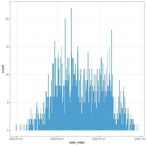
You can opt for the most appropriate aggregation time unit that describe the spread or transmission pattern.
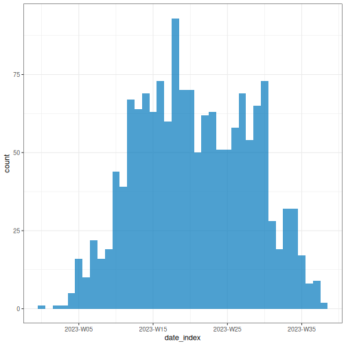
R
# Plot weekly incidence data
plot(weekly_incidence)
Plotting an <incidence2> object relies on the
ggplot2 package, so ggplot
layers can be added to the plot as shown below.
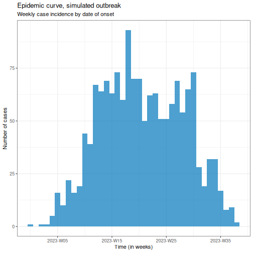
R
# Plot weekly incidence data
plot(weekly_incidence) +
  ggplot2::labs(
    x = "Time (in weeks)", # x-axis label
    y = "Number of cases", # y-axis label
    title = "Epidemic curve, simulated outbreak",
    subtitle = "Weekly case incidence by date of onset"
  )
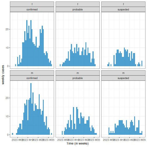
Also, provide an stratified plot by categories to compare transmission patterns across different demographic groups.
R
# Plot weekly incidence data
plot(weekly_group_incidence) +
  ggplot2::labs(
    x = "Time (in weeks)", # x-axis label
    y = "weekly cases" # y-axis label
  )
Easy aesthetics
Find out how you can use the arguments within the plot()
function to provide aesthetics to your <incidence2>
objects.
R
weekly_group_incidence %>%
  plot(fill = "case_type")
Some of them include show_cases = TRUE,
angle = 45, and n_breaks = 5. Try them and see
how they impact on the resulting plot.
R
weekly_group_incidence %>%
  plot(fill = "sex", angle = 45)
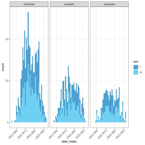
We invite you to take a look at the reference
manual of the funcion plot().
Challenge
Use the biweekly_incidence created in the previous
challenge to:
- Visualize the incidence curve.
- Identify what combination of arguments in
plot()work best.
Test if arguments like fill, nrow,
show_cases, angle, or n_breaks
improve the plot.
Find one more example in this how-to guide entry on Plot age-stratified incidence data by month from date of birth
What are common challenges when aggregating linelist to incidence?
-
Aggregate by one or more variables jointly:
- By date (e.g., date of report and date of death) for outbreak severity analysis.
- By groups (e.g., age, sex, or location) for stratified analyses of transmission or severity.
Get a complete time series to have the same range of dates for each grouping.
How to describe an epidemic curve?
We can describe epicurves by comparing the trend of new cases over time between demographic groups. Some features we can compare are:
- Size of peak or plateau,
- Time to peak (if any),
- Growth rate.
For example, in the figure below, we have two epidemic curves for the same outbreak stratified by sex. In the population, most cases were observed in females.
- The size of the peak in females was ~70 incident cases; in males this was ~22 incident cases.
- The peak in females occurred around epiweek 15; in males this was around epiweek 20.
- The growth rate in females may be higher than in males. In a same period of time (about 15 weeks), cases in females were more than 3 times the cases in males.
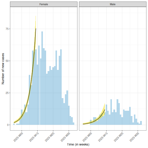
You can estimate the peak – the time with the highest number of
recorded cases – using incidence2::estimate_peak(). Also
you can convert the count of new or incident cases to cumulative using
incidence2::cumulate() if needed for your downstream
analysis. Find examples about them on the incidence2
vignette section about “Bootstrapping and estimating peaks”
Reporting delay
Recent cases are likely undercounted. If there is a lag between an event occurring and it being recorded, the most recent time periods will appear artificially low simply because many cases have not been logged yet. This can make it look like there is a recent decline when it is really just a reporting delay (also known as a right-censoring effect).
While not an issue for the resolved outbreak above, this is a key consideration for ongoing or growing outbreaks, where an apparent recent decline may simply reflect delayed reporting rather than a true slowdown.
Why we use epidemic curves?
Generally, to describe the size and time trend of outbreak, and differences between groups (e.g., demographics). It could provide evidence to give an answer to a question like: Should we consider targeted over mass interventions?
It also can help us to determine the pattern of spread (like point source, propagated source, or others), and investigate an outbreak based on disease parameters (like determine the exposure time based on the incubation period).
We recommend you read the section on “Analysing and epi curve”. It describes some patterns of spread we summarize here:
| Type | Description | Shape of Epidemic Curve | Example |
|---|---|---|---|
| Point Source | Single shared exposure over a brief period | Sharp rise → peak → sharp fall (reflects incubation period) | Food poisoning from a single meal |
| Continuous Source | Prolonged exposure to the same source | Gradual rise, no clear peak, extended duration | Contaminated water supply over several days |
| Propagated Source | Person-to-person transmission | Successive waves or multiple peaks | Measles, COVID-19 |
| Intermittent Source | Repeated but irregular exposure to the same source | Multiple peaks at irregular intervals and varying sizes | A restaurant periodically serving contaminated food |
You can also complete this Quick-Learn Lesson on “Using an Epi Curve to Determine Mode of Spread” to train on how to determine the outbreak’s likely mode of spread by analyzing an epidemic curve.
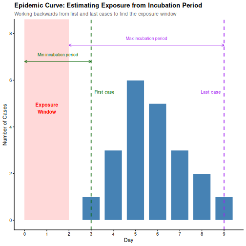
From an epicurve of incident cases by date on symptom onset, we can determine:
- The incubation period, if the exposure time is known; or
- The exposure time, if the incubation period is known.
The incubation period is defined as the average time from infection to first clinical symptoms (Figure 2 at On Kwok, et al.). This varies from individual to individual for the same disease.
For example, measles has an incubation period with a range of 7-20 days (minimum/maximum), and a median of 12.5 days.
OUTPUT
Using Lessler J, Reich N, Brookmeyer R, Perl T, Nelson K, Cummings D (2009).
"Incubation periods of acute respiratory viral infections: a systematic
review." _The Lancet Infectious Diseases_.
doi:10.1016/S1473-3099(09)70069-12
<https://doi.org/10.1016/S1473-3099%2809%2970069-12>..
To retrieve the citation use the 'get_citation' function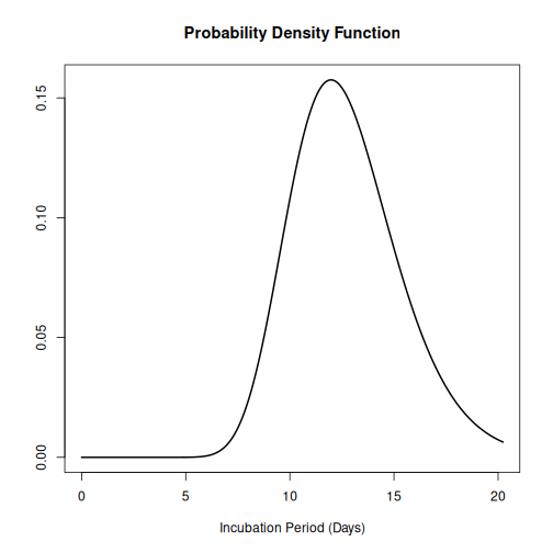
Knowing the incubation period of the pathogen allows us to estimate when exposure occurred by working backwards from symptom onset on the epidemic curve:
- The start of exposure can be estimated by subtracting the minimum incubation period from the date of the first case.
- The end of exposure can be estimated by subtracting the maximum incubation period from the date of the last case.
An outbreak can be described using:
- Incidence plots or epidemic curves from linelist (using incidence2)
- Contact networks from contact data (using epicontacts).
- Delays between dated events from linelist (using cleanepi or tidyverse)
In the next set of tutorials we will learn how to inform an outbreak assessment based on estimated parameters of transmission (growth rate and reproduction number), severity (case fatality risk) using more comprenhensive models and statistical distributions.
For a refresher on delays and probability distributions, you can review introductory concepts with some episodes introducing delays for outbreak data.
Challenge
Which combination of time unit, case categories, and arguments in
plot() best captures the outbreak pattern of
sim_data and why?
Write some sentences describing your learnings.
Lastly, incidence2 produces basic plots for epicurves, but additional work is required to create well-annotated graphs. However, using the ggplot2 package, you can generate more sophisticated epicurves, with more flexibility in annotation. Find alternatives about how to improve your epicurves in the spoiler below:
We will focus on three key elements for producing epicurves: histogram plots, scaling date axes and their labels, and general plot theme annotation. The example below demonstrates how to configure these three elements for a simple incidence2 object.
R
# Define date breaks for the x-axis
breaks <- seq.Date(
  from = min(as.Date(daily_incidence$date_index, na.rm = TRUE)),
  to = max(as.Date(daily_incidence$date_index, na.rm = TRUE)),
  by = 20 # every 20 days
)

# Create the plot
ggplot2::ggplot(data = daily_incidence) +
  geom_histogram(
    mapping = aes(
      x = as.Date(date_index),
      y = count
    ),
    stat = "identity",
    color = "blue", # bar border color
    fill = "lightblue", # bar fill color
    width = 1 # bar width
  ) +
  theme_minimal() + # apply a minimal theme for clean visuals
  theme(
    plot.title = element_text(face = "bold", hjust = 0.5), # title center + bold
    plot.subtitle = element_text(hjust = 0.5), # center subtitle
    plot.caption = element_text(face = "italic", hjust = 0), # italic caption
    axis.title = element_text(face = "bold"), # bold axis titles
    axis.text.x = element_text(angle = 45, vjust = 0.5) # rotated x-axis text
  ) +
  labs(
    x = "Date", # x-axis label
    y = "Number of new cases", # y-axis label
    title = "Daily Outbreak Cases", # plot title
    subtitle = "Epidemiological Data for the Outbreak", # plot subtitle
    caption = "Data Source: Simulated Data" # plot caption
  ) +
  scale_x_date(
    breaks = breaks, # set custom breaks on the x-axis
    labels = scales::label_date_short() # shortened date labels
  )
WARNING
Warning in geom_histogram(mapping = aes(x = as.Date(date_index), y = count), :
Ignoring unknown parameters: `binwidth` and `bins`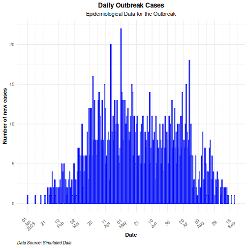
Use the group option in the mapping function to
visualize an epicurve with different groups. If there is more than one
grouping factor, use the facet_wrap() option, as
demonstrated in the example below:
R
# Create a daily incidence object grouped by sex
daily_incidence_2 <- incidence2::incidence(
  sim_data,
  date_index = "date_onset",
  groups = "sex",
  interval = "day", # Aggregate by daily intervals
  complete_dates = TRUE # Complete missing dates
)
R
# Plot daily incidence faceted by sex
ggplot2::ggplot(data = daily_incidence_2) +
  geom_histogram(
    mapping = aes(
      x = as.Date(date_index),
      y = count,
      group = sex,
      fill = sex
    ),
    stat = "identity"
  ) +
  theme_minimal() + # apply minimal theme
  theme(
    plot.title = element_text(face = "bold", hjust = 0.5), # title bold + center
    plot.subtitle = element_text(hjust = 0.5), # center the subtitle
    plot.caption = element_text(face = "italic", hjust = 0), # italic caption
    axis.title = element_text(face = "bold"), # bold axis labels
    axis.text.x = element_text(angle = 45, vjust = 0.5) # rotate x-axis text
  ) +
  labs(
    x = "Date", # x-axis label
    y = "Number of cases", # y-axis label
    title = "Daily Outbreak Cases by Sex", # plot title
    subtitle = "Incidence of Cases Grouped by Sex", # plot subtitle
    caption = "Data Source: Simulated Data" # caption for additional context
  ) +
  facet_wrap(~sex) + # create separate panels by sex
  scale_x_date(
    breaks = breaks, # set custom date breaks
    labels = scales::label_date_short() # short date format for x-axis labels
  ) +
  scale_fill_manual(values = c("lightblue", "lightpink")) # custom fill colors
WARNING
Warning in geom_histogram(mapping = aes(x = as.Date(date_index), y = count, :
Ignoring unknown parameters: `binwidth` and `bins`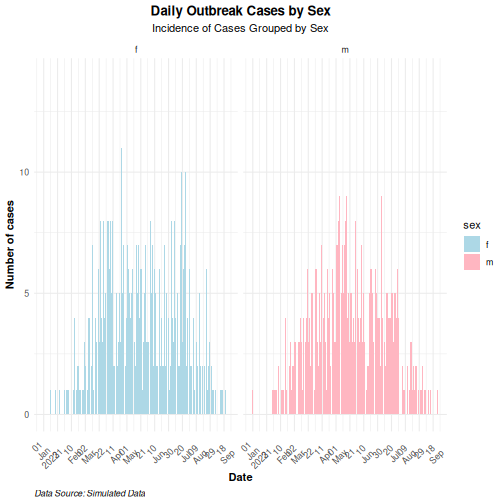
- Use the simulist package to generate synthetic outbreak data
- Use the incidence2 package to aggregate case data based on a date event, and other variables to produce epidemic curves.
- Use the ggplot2 package to produce better annotated epicurves.