All in One View
Content from Access epidemiological delay distributions
Last updated on 2026-07-05 | Edit this page
Estimated time: 30 minutes
Overview
Questions
- How to get access to disease delay distributions from a pre-established database for use in analysis?
Objectives
- Get delays from a literature search database with epiparameter.
- Get distribution parameters and summary statistics of delay distributions.
Prerequisites
This episode requires you to be familiar with:
Data science : Basic programming with R.
Epidemic theory : epidemiological parameters, disease time periods, such as the incubation period, generation time, and serial interval.
Introduction
Infectious diseases follow an infection cycle, which usually includes the following phases: presymptomatic period, symptomatic period and recovery period, as described by their natural history. These time periods can be used to understand transmission dynamics and inform disease prevention and control interventions.
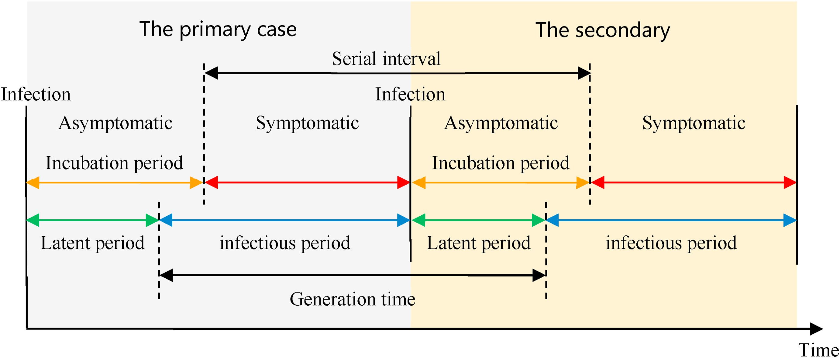
Definitions
Look at the glossary for the definitions of all the time periods of the figure above!
However, early in an epidemic, efforts to understand the epidemic and implications for control can be delayed by the lack of an easy way to access key parameters for the disease of interest (Nash et al., 2023). Projects like epiparameter and epireview are building online catalogues following literature synthesis protocols that can help inform analysis and parametrise models by providing a library of previously estimated epidemiological parameters from past outbreaks.
Early models for COVID-19 used parameters from other coronaviruses. https://www.thelancet.com/article/S1473-3099(20)30144-4/fulltext
To illustrate how to use the epiparameter R package in your analysis pipeline, our goal in this episode will be to access one specific set of epidemiological parameters from the literature, instead of extracting from papers and copying and pasting them by hand. We will then plug them into an EpiNow2 analysis workflow.
Let’s start by loading the epiparameter package. We’ll
use the pipe %>% to connect some of its functions, some
tibble and dplyr functions, so let’s also
load the tidyverse package:
R
library(epiparameter)
library(tidyverse)
The double-colon
The double-colon :: in R lets you call a specific
function from a package without loading the entire package into the
current environment.
For example, dplyr::filter(data, condition) uses
filter() from the dplyr package.
This helps us remember package functions and avoid namespace conflicts.
The problem
If we want to estimate the transmissibility of an infection, it’s common to use a package such as EpiEstim or EpiNow2.
The EpiEstim package allows real-time estimation of the reproduction number using case data over time, reflecting how transmission changes based on when symptoms appear.
For estimating transmission based on when people were actually infected (rather than symptom onset), the EpiNow2 package extends this idea by combining it with a model that accounts for delays in observed data.
Both packages require some epidemiological information as an input.
For example, in EpiNow2 we can use
EpiNow2::Gamma() to specify a generation time as a Gamma
probability distribution adding its mean, standard
deviation (sd), and maximum value (max).
To specify a generation_time that follows a
Gamma distribution with mean \(\mu =
4\), standard deviation \(\sigma =
2\), and a maximum value of 20, we write:
R
generation_time <-
  EpiNow2::Gamma(
    mean = 4,
    sd = 2,
    max = 20
  )
It is a common practice for analysts to manually search the available literature and copy and paste the summary statistics or the distribution parameters from scientific publications. A challenge that is often faced is that the reporting of different statistical distributions is not consistent across the literature (e.g. a paper may only report the mean, rather than the full underlying distribution). epiparameter’s objective is to facilitate the access to reliable estimates of distribution parameters for a range of infectious diseases, so that they can easily be implemented in outbreak analytic pipelines.
In this episode, we will access the summary statistics of a generation time for COVID-19 from the library of epidemiological parameters provided by epiparameter. These metrics can be used to estimate the transmissibility of this disease using EpiNow2 in subsequent episodes.
Let’s start by looking at how many entries are currently available in
the epidemiological distributions database in
epiparameter using epiparameter_db() for the
epidemiological distribution epi_name called generation
time with the string "generation":
R
epiparameter::epiparameter_db(
  epi_name = "generation"
)
OUTPUT
Returning 3 results that match the criteria (2 are parameterised).
Use subset to filter by entry variables or single_epiparameter to return a single entry.
To retrieve the citation for each use the 'get_citation' function
OUTPUT
# List of 3 <epiparameter> objects
Number of diseases: 2
❯ Chikungunya ❯ Influenza
Number of epi parameters: 1
❯ generation time
[[1]]
Disease: Influenza
Pathogen: Influenza-A-H1N1
Epi Parameter: generation time
Study: Lessler J, Reich N, Cummings D, New York City Department of Health and
Mental Hygiene Swine Influenza Investigation Team (2009). "Outbreak of
2009 Pandemic Influenza A (H1N1) at a New York City School." _The New
England Journal of Medicine_. doi:10.1056/NEJMoa0906089
<https://doi.org/10.1056/NEJMoa0906089>.
Distribution: weibull (days)
Parameters:
  shape: 2.360
  scale: 3.180

[[2]]
Disease: Chikungunya
Pathogen: Chikungunya Virus
Epi Parameter: generation time
Study: Salje H, Cauchemez S, Alera M, Rodriguez-Barraquer I, Thaisomboonsuk B,
Srikiatkhachorn A, Lago C, Villa D, Klungthong C, Tac-An I, Fernandez
S, Velasco J, Roque Jr V, Nisalak A, Macareo L, Levy J, Cummings D,
Yoon I (2015). "Reconstruction of 60 Years of Chikungunya Epidemiology
in the Philippines Demonstrates Episodic and Focal Transmission." _The
Journal of Infectious Diseases_. doi:10.1093/infdis/jiv470
<https://doi.org/10.1093/infdis/jiv470>.
Parameters: <no parameters>
Mean: 14 (days)

[[3]]
Disease: Chikungunya
Pathogen: Chikungunya Virus
Epi Parameter: generation time
Study: Guzzetta G, Vairo F, Mammone A, Lanini S, Poletti P, Manica M, Rosa R,
Caputo B, Solimini A, della Torre A, Scognamiglio P, Zumla A, Ippolito
G, Merler S (2020). "Spatial modes for transmission of chikungunya
virus during a large chikungunya outbreak in Italy: a modeling
analysis." _BMC Medicine_. doi:10.1186/s12916-020-01674-y
<https://doi.org/10.1186/s12916-020-01674-y>.
Distribution: gamma (days)
Parameters:
  shape: 8.633
  scale: 1.447

# ℹ Use `parameter_tbl()` to see a summary table of the parameters.
# ℹ Explore database online at: https://epiverse-trace.github.io/epiparameter/articles/database.html
In the library of epidemiological parameters, we may not have a
"generation" time entry for our disease of interest.
Instead, we can look at the serial intervals for COVID-19.
Let’s find what we need to consider for this!
Systematic review data for priority pathogens
The {epireview} R
package has parameters on Ebola, Marburg, Lassa, SARS, Zika and
Nipah from recent systematic reviews, with more priority pathogens
planned for future releases. Have a look at this
vignette for more information on how to use these parameters with
epiparameter.
Generation time vs serial interval
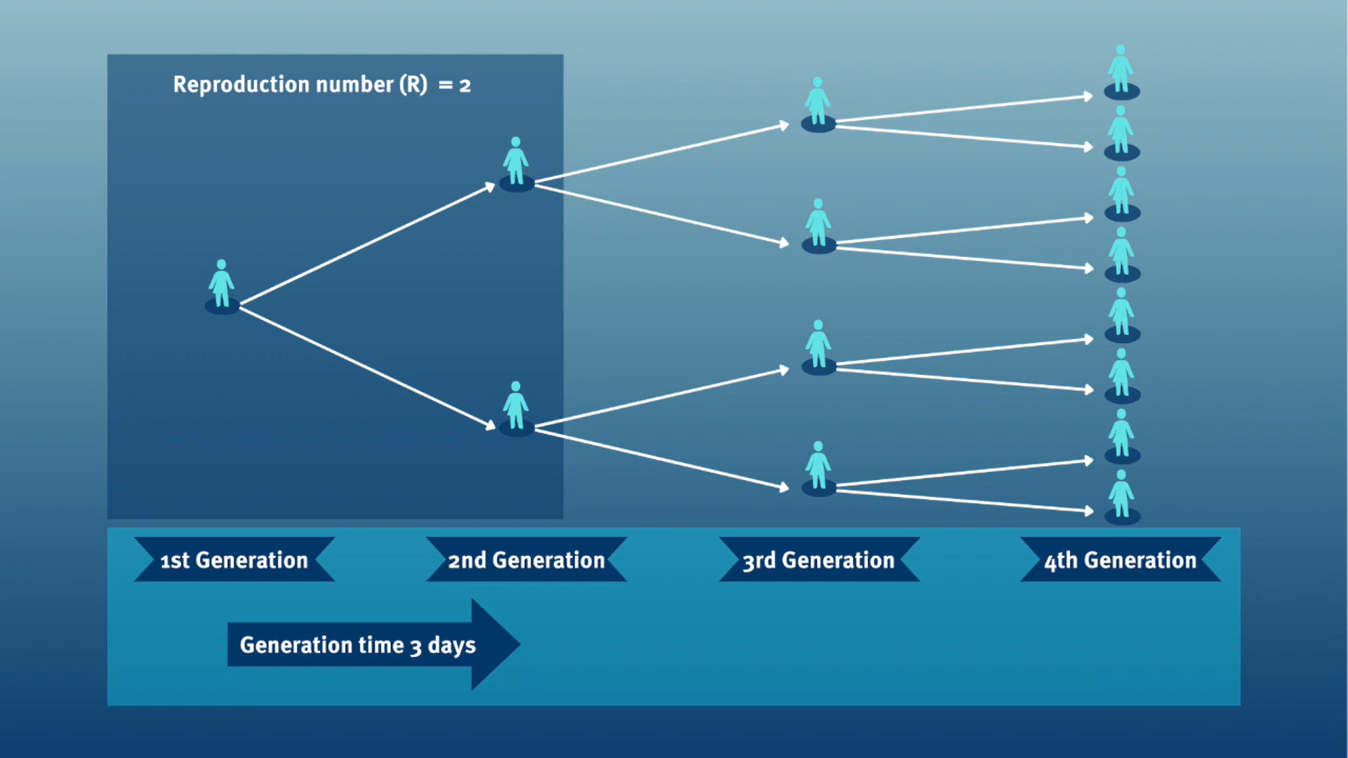
The generation time, jointly with the reproduction number (\(R\)), can provide valuable insights into the likely growth rate of the epidemic, and hence inform the implementation of control measures. The larger the value of \(R\) and/or the shorter the generation time, the more new infections that we would expect per day, and hence the faster the incidence of disease cases will grow.
In calculating the effective reproduction number (\(R_{t}\)), the generation time distribution (i.e. delay from one infection to the next) is often approximated by the serial interval distribution (i.e. delay from onset of symptoms in the infector to onset in the infectee). This approximation is frequently used because it is easier to observe and record the onset of symptoms than the exact time of infection.
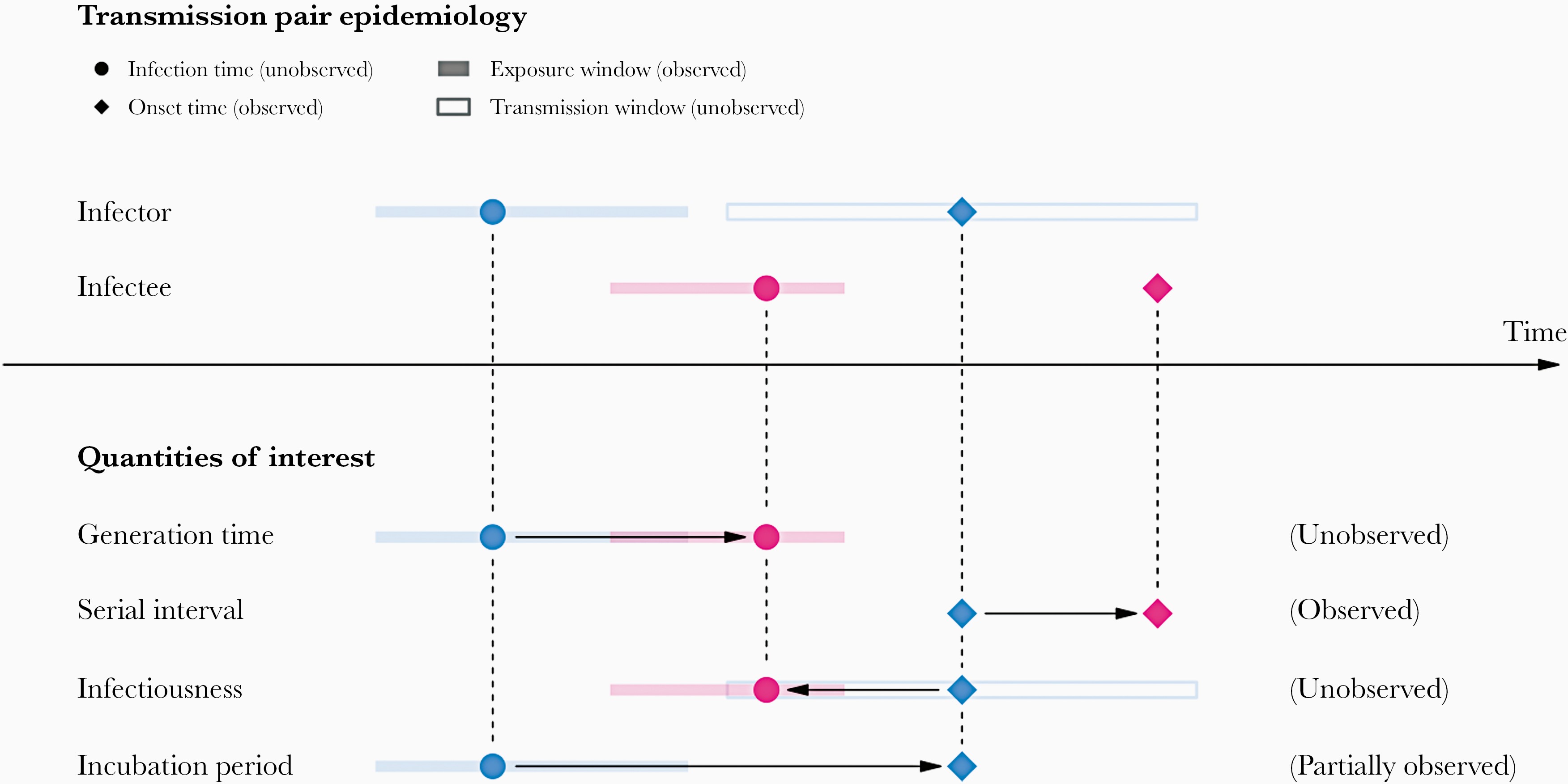
However, using the serial interval as an approximation of the generation time is most appropriate for diseases in which infectiousness starts after symptom onset (Chung Lau et al., 2021). In cases where infectiousness starts before symptom onset, the serial intervals can have negative values, which occurs when the infectee develops symptoms before the infector in a transmission pair (Nishiura et al., 2020).
From mean delays to probability distributions
If we measure the serial interval in real data, we typically see that not all case pairs have the same delay from onset-to-onset. We can observe this variability for other key epidemiological delays as well, including the incubation period and infectious period.
To summarise these data on paired individuals (time periods between infector and infectee symptom onset times), it is therefore useful to quantify the statistical distribution of delays that best fits the data, rather than just focusing on the mean (McFarland et al., 2023).
Statistical distributions are summarised in terms of their summary statistics like the location (mean and percentiles) and spread (variance or standard deviation) of the distribution, or with their distribution parameters that inform about the form (shape and rate/scale) of the distribution. These estimated values can be reported with their uncertainty (95% confidence intervals).
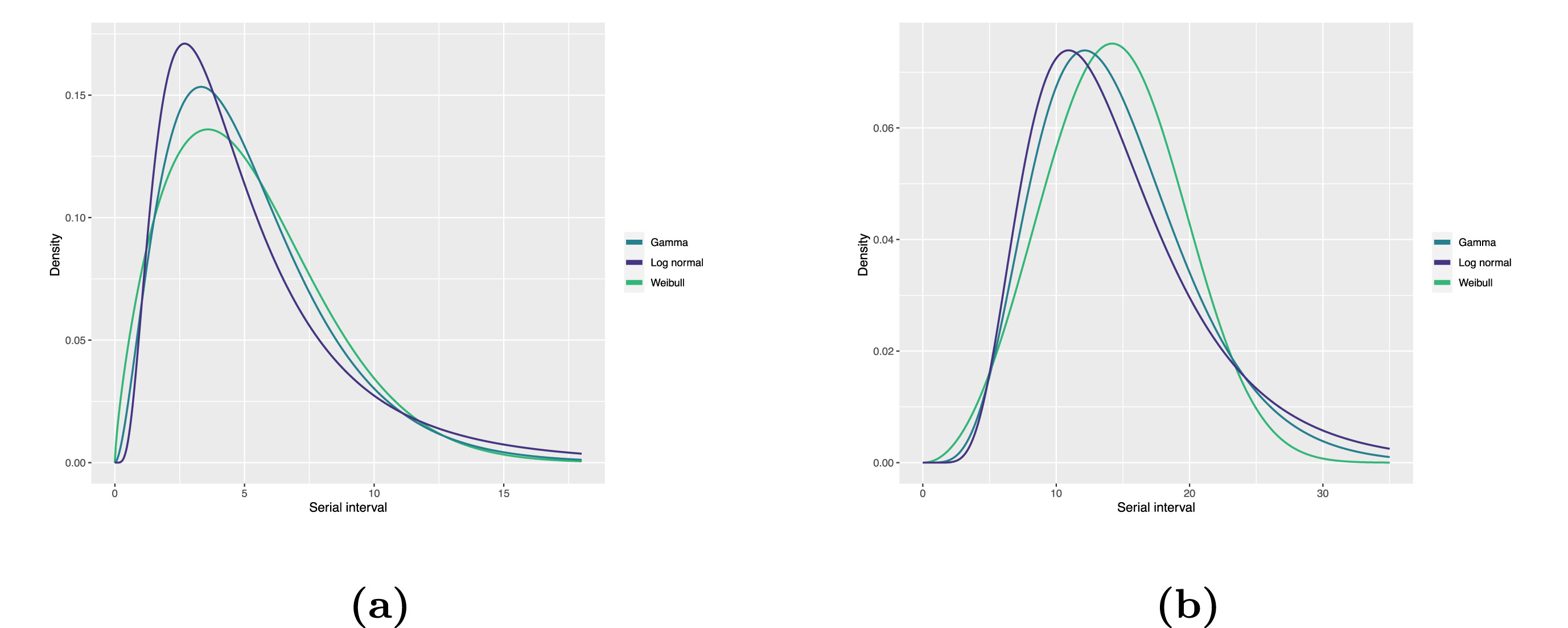
| Gamma | mean | shape | rate/scale |
|---|---|---|---|
| MERS-CoV | 14.13(13.9–14.7) | 6.31(4.88–8.52) | 0.43(0.33–0.60) |
| COVID-19 | 5.1(5.0–5.5) | 2.77(2.09–3.88) | 0.53(0.38–0.76) |
| Weibull | mean | shape | rate/scale |
|---|---|---|---|
| MERS-CoV | 14.2(13.3–15.2) | 3.07(2.64–3.63) | 16.1(15.0–17.1) |
| COVID-19 | 5.2(4.6–5.9) | 1.74(1.46–2.11) | 5.83(5.08–6.67) |
| Log normal | mean | mean-log | sd-log |
|---|---|---|---|
| MERS-CoV | 14.08(13.1–15.2) | 2.58(2.50–2.68) | 0.44(0.39–0.5) |
| COVID-19 | 5.2(4.2–6.5) | 1.45(1.31–1.61) | 0.63(0.54–0.74) |
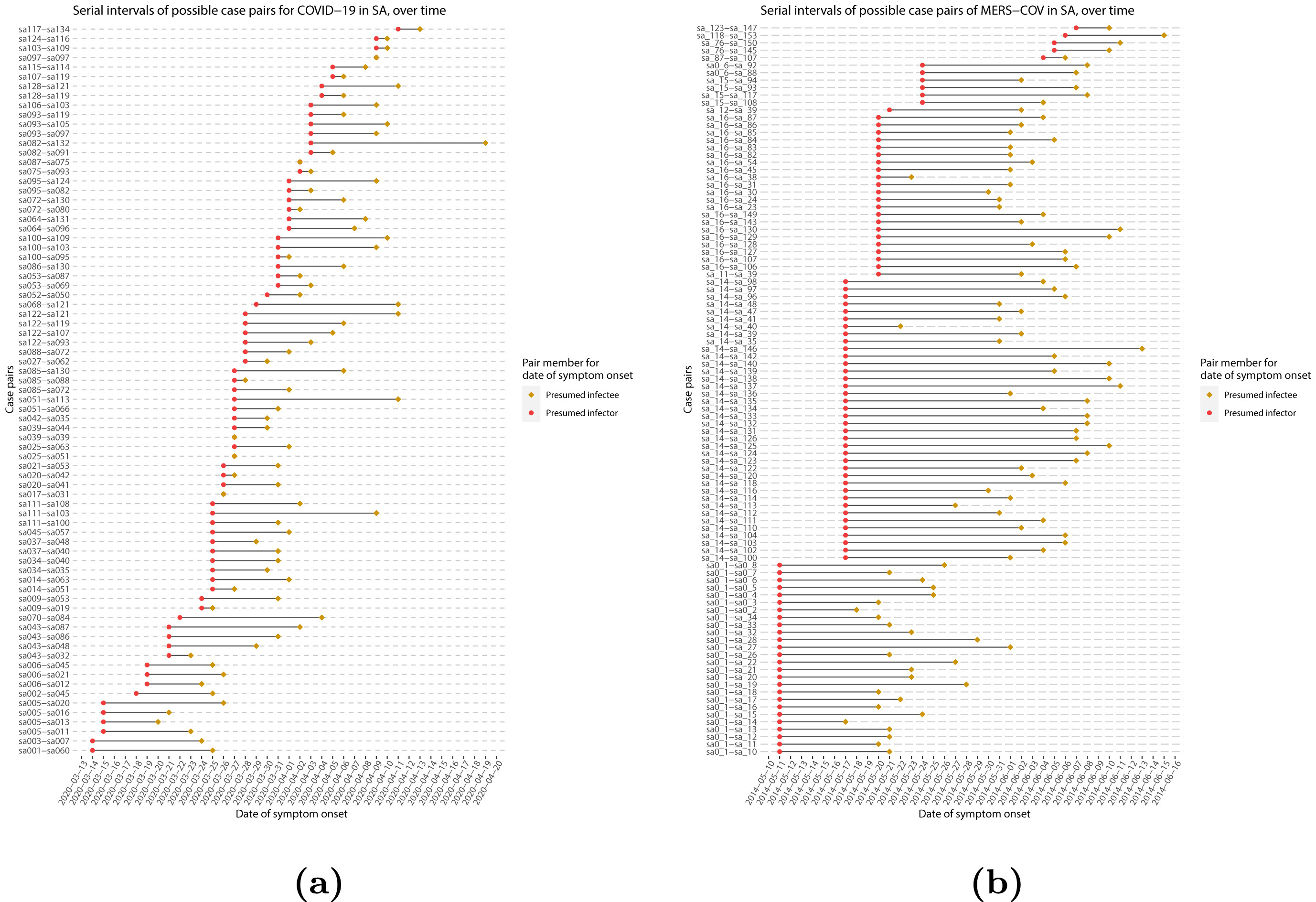
Serial interval
Given the serial interval of both infections in the figure below:
- Which one would have a larger number of generations in less time?
- Why do you conclude that?
Assume that the serial interval approximates the generation time.
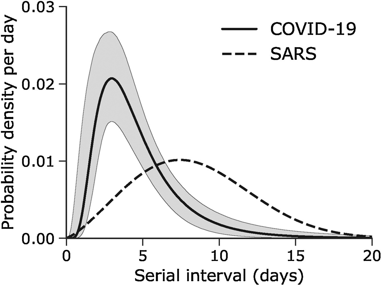
The peak of each curve can inform you about the location of the mean of each distribution. A larger mean indicates a longer expected delay between symptom onset in the infector and infectee.
Which one would have a larger number of generations in less time?
COVID-19
Why do you conclude that?
Because COVID-19 has a shorter mean serial interval. The approximate mean serial interval for COVID-19 is around 4 days, compared to approximately 7 days for SARS. Therefore, if many infections are present in the population, COVID-19 will on average produce more generations of infection in less time than SARS. A short serial interval can make contact tracing difficult due to the rapid emergence of new generations of cases. This means far more resources would be required to keep up with the epidemic.
The objective of the assessment above is to assess the interpretation of a larger or shorter generation time.
The generation time distribution is the delay from one infection to the next, often approximated by the serial interval which is easier to observe.
It can be used to estimate the transmissibility of a disease by calculating the effective reproduction number (\(R_{t}\)).
If you want to gain familiarity with how this distribution feeds into that calculation, you can read the complementary resource on Introduction to the Renewal equation.
Choosing epidemiological parameters
In this section, we will use epiparameter to obtain the serial interval for COVID-19, as an alternative to the generation time.
First, let’s see how many parameters we have in the epidemiological
distributions database (epiparameter_db()) with the
disease named covid. Run this code:
R
epiparameter::epiparameter_db(
  disease = "covid"
)
From the epiparameter package, we can use the
epiparameter_db() function to ask for any
disease and also for a specific epidemiological
distribution (epi_name). Run this in your console:
R
epiparameter::epiparameter_db(
  disease = "COVID",
  epi_name = "serial"
)
With this query combination, we get more than one delay distribution
(because the database has multiple entries). When several entries match,
the output is a list of <epiparameter> objects.
CASE-INSENSITIVE
epiparameter_db is case-insensitive.
This means that you can use strings with letters in upper or lower case
interchangeably. Strings like "serial",
"serial interval" or "serial_interval" are
also valid.
As suggested in the outputs, to summarise an
<epiparameter> object and get the column names from
the underlying parameter database, we can add the
epiparameter::parameter_tbl() function to the previous code
using the pipe %>%:
R
epiparameter::epiparameter_db(
  disease = "covid",
  epi_name = "serial"
) %>%
  epiparameter::parameter_tbl()
OUTPUT
Returning 4 results that match the criteria (3 are parameterised).
Use subset to filter by entry variables or single_epiparameter to return a single entry.
To retrieve the citation for each use the 'get_citation' function
OUTPUT
# Parameter table:
# A data frame:    4 × 7
  disease  pathogen   epi_name        prob_distribution author  year sample_size
  <chr>    <chr>      <chr>           <chr>             <chr>  <dbl>       <dbl>
1 COVID-19 SARS-CoV-2 serial interval <NA>              Alene…  2021        3924
2 COVID-19 SARS-CoV-2 serial interval lnorm             Nishi…  2020          28
3 COVID-19 SARS-CoV-2 serial interval weibull           Nishi…  2020          18
4 COVID-19 SARS-CoV-2 serial interval norm              Yang …  2020         131
In the epiparameter::parameter_tbl() output, we can also
find different types of probability distributions (e.g., Log-normal,
Weibull, Normal).
epiparameter uses the base R naming
convention for distributions. This is why Log normal is
called lnorm.
Entries with a missing value (<NA>) in the
prob_distribution column are non-parameterised
entries. They have summary statistics (e.g. a mean and standard
deviation) but no probability distribution specified. Compare these two
outputs:
R
# get an <epiparameter> object
distribution <-
  epiparameter::epiparameter_db(
    disease = "covid",
    epi_name = "serial"
  )

distribution %>%
  # pluck the first entry in the object class <list>
  pluck(1) %>%
  # check if <epiparameter> object have distribution parameters
  is_parameterised()

# check if the second <epiparameter> object
# have distribution parameters
distribution %>%
  pluck(2) %>%
  is_parameterised()
Parameterised entries have an inference method
As detailed in ?is_parameterised, a parameterised
distribution is the entry that has a probability distribution associated
with it provided by an inference_method as shown in
metadata:
R
distribution[[1]]$metadata$inference_method
distribution[[2]]$metadata$inference_method
distribution[[4]]$metadata$inference_method
Run the chunks above to get the outputs.
Find your delay distributions!
Take 2 minutes to explore the epiparameter library.
Choose a disease of interest (e.g., influenza, measles, etc.) and a delay distribution (e.g., the incubation period, onset to death, etc.).
Find:
How many delay distributions are there for that disease?
How many types of probability distribution (e.g., gamma, log normal) are there for a given delay in that disease?
Ask:
Do you recognise the papers?
Should epiparameter literature review consider any other paper?
The epiparameter_db() function with disease
alone counts the number of entries like:
- studies, and
- delay distributions.
The epiparameter_db() function with disease
and epi_name gets a list of all entries with:
- the complete citation,
- the type of a probability distribution, and
- distribution parameter values.
The combo of epiparameter_db() plus
parameter_tbl() gets a data frame of all entries with
columns like:
- the type of the probability distribution per delay, and
- author and year of the study.
We choose to explore Ebola’s delay distributions:
R
# we expect 17 delay distributions for Ebola
epiparameter::epiparameter_db(
  disease = "ebola"
)
OUTPUT
Returning 17 results that match the criteria (17 are parameterised).
Use subset to filter by entry variables or single_epiparameter to return a single entry.
To retrieve the citation for each use the 'get_citation' function
OUTPUT
# List of 17 <epiparameter> objects
Number of diseases: 1
❯ Ebola Virus Disease
Number of epi parameters: 9
❯ hospitalisation to death ❯ hospitalisation to discharge ❯ incubation period ❯ notification to death ❯ notification to discharge ❯ offspring distribution ❯ onset to death ❯ onset to discharge ❯ serial interval
[[1]]
Disease: Ebola Virus Disease
Pathogen: Ebola Virus
Epi Parameter: offspring distribution
Study: Lloyd-Smith J, Schreiber S, Kopp P, Getz W (2005). "Superspreading and
the effect of individual variation on disease emergence." _Nature_.
doi:10.1038/nature04153 <https://doi.org/10.1038/nature04153>.
Distribution: nbinom (No units)
Parameters:
  mean: 1.500
  dispersion: 5.100

[[2]]
Disease: Ebola Virus Disease
Pathogen: Ebola Virus-Zaire Subtype
Epi Parameter: incubation period
Study: Eichner M, Dowell S, Firese N (2011). "Incubation period of ebola
hemorrhagic virus subtype zaire." _Osong Public Health and Research
Perspectives_. doi:10.1016/j.phrp.2011.04.001
<https://doi.org/10.1016/j.phrp.2011.04.001>.
Distribution: lnorm (days)
Parameters:
  meanlog: 2.487
  sdlog: 0.330

[[3]]
Disease: Ebola Virus Disease
Pathogen: Ebola Virus-Zaire Subtype
Epi Parameter: onset to death
Study: The Ebola Outbreak Epidemiology Team, Barry A, Ahuka-Mundeke S, Ali
Ahmed Y, Allarangar Y, Anoko J, Archer B, Abedi A, Bagaria J, Belizaire
M, Bhatia S, Bokenge T, Bruni E, Cori A, Dabire E, Diallo A, Diallo B,
Donnelly C, Dorigatti I, Dorji T, Waeber A, Fall I, Ferguson N,
FitzJohn R, Tengomo G, Formenty P, Forna A, Fortin A, Garske T,
Gaythorpe K, Gurry C, Hamblion E, Djingarey M, Haskew C, Hugonnet S,
Imai N, Impouma B, Kabongo G, Kalenga O, Kibangou E, Lee T, Lukoya C,
Ly O, Makiala-Mandanda S, Mamba A, Mbala-Kingebeni P, Mboussou F,
Mlanda T, Makuma V, Morgan O, Mulumba A, Kakoni P, Mukadi-Bamuleka D,
Muyembe J, Bathé N, Ndumbi Ngamala P, Ngom R, Ngoy G, Nouvellet P, Nsio
J, Ousman K, Peron E, Polonsky J, Ryan M, Touré A, Towner R, Tshapenda
G, Van De Weerdt R, Van Kerkhove M, Wendland A, Yao N, Yoti Z, Yuma E,
Kalambayi Kabamba G, Mwati J, Mbuy G, Lubula L, Mutombo A, Mavila O,
Lay Y, Kitenge E (2018). "Outbreak of Ebola virus disease in the
Democratic Republic of the Congo, April–May, 2018: an epidemiological
study." _The Lancet_. doi:10.1016/S0140-6736(18)31387-4
<https://doi.org/10.1016/S0140-6736%2818%2931387-4>.
Distribution: gamma (days)
Parameters:
  shape: 2.400
  scale: 3.333

# ℹ 14 more elements
# ℹ Use `print(n = ...)` to see more elements.
# ℹ Use `parameter_tbl()` to see a summary table of the parameters.
# ℹ Explore database online at: https://epiverse-trace.github.io/epiparameter/articles/database.html
Now, from the output of epiparameter::epiparameter_db(),
what is an offspring
distribution?
We choose to search for incubation period estimates for Ebola. This output lists all the papers and parameters found. Run this locally if needed:
R
epiparameter::epiparameter_db(
  disease = "ebola",
  epi_name = "incubation"
)
We use parameter_tbl() to get a summary display of
all:
R
# we expect 2 different types of delay distributions
# for ebola incubation period
epiparameter::epiparameter_db(
  disease = "ebola",
  epi_name = "incubation"
) %>%
  parameter_tbl()
OUTPUT
Returning 5 results that match the criteria (5 are parameterised).
Use subset to filter by entry variables or single_epiparameter to return a single entry.
To retrieve the citation for each use the 'get_citation' function
OUTPUT
# Parameter table:
# A data frame:    5 × 7
  disease           pathogen epi_name prob_distribution author  year sample_size
  <chr>             <chr>    <chr>    <chr>             <chr>  <dbl>       <dbl>
1 Ebola Virus Dise… Ebola V… incubat… lnorm             Eichn…  2011         196
2 Ebola Virus Dise… Ebola V… incubat… gamma             WHO E…  2015        1798
3 Ebola Virus Dise… Ebola V… incubat… gamma             WHO E…  2015          49
4 Ebola Virus Dise… Ebola V… incubat… gamma             WHO E…  2015         957
5 Ebola Virus Dise… Ebola V… incubat… gamma             WHO E…  2015         792
We find two types of probability distributions for this query: log normal and gamma.
How does epiparameter do the collection and review of peer-reviewed literature? We invite you to read the vignette on “Data Collation and Synthesis Protocol”!
Select a single distribution
The epiparameter::epiparameter_db() function works as a
filtering or subset function. We can use the author
argument to keep parameters reported in papers where the first author is
Nishiura, or the subset argument to keep
parameters from studies with a sample size higher than 10:
R
epiparameter::epiparameter_db(
  disease = "covid",
  epi_name = "serial",
  author = "Nishiura",
  subset = sample_size > 10
) %>%
  epiparameter::parameter_tbl()
We still get more than one epidemiological parameter. Instead, we can
set the single_epiparameter argument to TRUE
for only one:
R
epiparameter::epiparameter_db(
  disease = "covid",
  epi_name = "serial",
  single_epiparameter = TRUE
)
OUTPUT
Using Nishiura H, Linton N, Akhmetzhanov A (2020). "Serial interval of novel
coronavirus (COVID-19) infections." _International Journal of
Infectious Diseases_. doi:10.1016/j.ijid.2020.02.060
<https://doi.org/10.1016/j.ijid.2020.02.060>..
To retrieve the citation use the 'get_citation' function
OUTPUT
Disease: COVID-19
Pathogen: SARS-CoV-2
Epi Parameter: serial interval
Study: Nishiura H, Linton N, Akhmetzhanov A (2020). "Serial interval of novel
coronavirus (COVID-19) infections." _International Journal of
Infectious Diseases_. doi:10.1016/j.ijid.2020.02.060
<https://doi.org/10.1016/j.ijid.2020.02.060>.
Distribution: lnorm (days)
Parameters:
  meanlog: 1.386
sdlog: 0.568How does ‘single_epiparameter’ work?
Looking at the help documentation for
?epiparameter::epiparameter_db():
- If multiple entries match the arguments supplied and
single_epiparameter = TRUE, then the parameterised<epiparameter>with the largest sample size will be returned. - If multiple entries are equal after this sorting, the first entry in the list will be returned.
What is a parametrised <epiparameter>?
Look at ?is_parameterised.
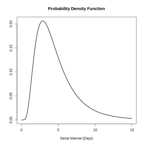
Let’s assign this <epiparameter> class object to
the covid_serialint object.
R
covid_serialint <-
  epiparameter::epiparameter_db(
    disease = "covid",
    epi_name = "serial",
    single_epiparameter = TRUE
  )
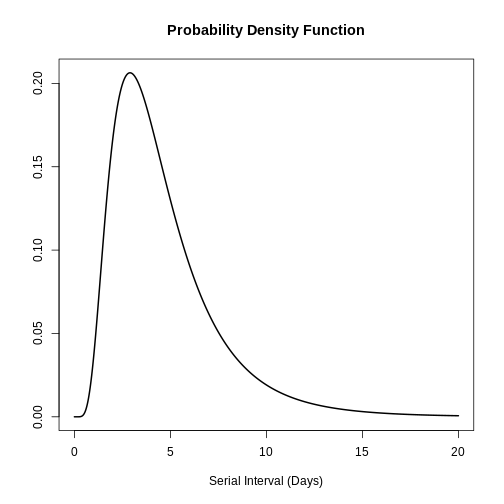
You can use plot() on <epiparameter>
objects to visualise:
- the Probability Density Function (PDF) and
- the Cumulative Distribution Function (CDF).
R
# plot <epiparameter> object
plot(covid_serialint)
With the xlim argument, you can change the length or
number of days in the x axis. Explore what this looks
like:
R
# plot <epiparameter> object
plot(covid_serialint, xlim = c(1, 60))
Extract the summary statistics
We can get the mean and standard deviation
(sd) from this <epiparameter> object by
diving into the summary_stats element:
R
# get the mean
covid_serialint$summary_stats$mean
OUTPUT
[1] 4.7Now, we have an epidemiological parameter we can reuse! Given that
the covid_serialint is a lnorm or log normal
distribution, we can replace the summary statistics
numbers we plug into the EpiNow2::LogNormal() function:
R
generation_time <-
  EpiNow2::LogNormal(
    mean = covid_serialint$summary_stats$mean, # replaced!
    sd = covid_serialint$summary_stats$sd, # replaced!
    max = 20
  )
In the next episode we’ll learn how to use EpiNow2 to
correctly specify distributions and estimate transmissibility. We’ll
also learn how to use distribution functions to get a
maximum value (max) for EpiNow2::LogNormal()
and use epiparameter in your analysis.
Log normal distributions
If you need the log normal distribution parameters
instead of the summary statistics, we can use
epiparameter::get_parameters():
R
covid_serialint_parameters <-
  epiparameter::get_parameters(covid_serialint)

covid_serialint_parameters
OUTPUT
  meanlog     sdlog
1.3862617 0.5679803
This gets a vector of class <numeric> ready to use
as input for any other package!
Consider that EpiNow2 functions also accept
distribution parameters as inputs. Run ?EpiNow2::LogNormal
to read the Probability
distributions reference manual.
Challenges
Ebola’s serial interval
Take 1 minute to:
Get access to the Ebola serial interval with the highest sample size.
Answer:
What is the
sdof the epidemiological distribution?What is the
sample_sizeused in that study?
R
# ebola serial interval
ebola_serial <-
  epiparameter::epiparameter_db(
    disease = "ebola",
    epi_name = "serial",
    single_epiparameter = TRUE
  )
OUTPUT
Using WHO Ebola Response Team, Agua-Agum J, Ariyarajah A, Aylward B, Blake I,
Brennan R, Cori A, Donnelly C, Dorigatti I, Dye C, Eckmanns T, Ferguson
N, Formenty P, Fraser C, Garcia E, Garske T, Hinsley W, Holmes D,
Hugonnet S, Iyengar S, Jombart T, Krishnan R, Meijers S, Mills H,
Mohamed Y, Nedjati-Gilani G, Newton E, Nouvellet P, Pelletier L,
Perkins D, Riley S, Sagrado M, Schnitzler J, Schumacher D, Shah A, Van
Kerkhove M, Varsaneux O, Kannangarage N (2015). "West African Ebola
Epidemic after One Year — Slowing but Not Yet under Control." _The New
England Journal of Medicine_. doi:10.1056/NEJMc1414992
<https://doi.org/10.1056/NEJMc1414992>..
To retrieve the citation use the 'get_citation' function
R
ebola_serial
OUTPUT
Disease: Ebola Virus Disease
Pathogen: Ebola Virus
Epi Parameter: serial interval
Study: WHO Ebola Response Team, Agua-Agum J, Ariyarajah A, Aylward B, Blake I,
Brennan R, Cori A, Donnelly C, Dorigatti I, Dye C, Eckmanns T, Ferguson
N, Formenty P, Fraser C, Garcia E, Garske T, Hinsley W, Holmes D,
Hugonnet S, Iyengar S, Jombart T, Krishnan R, Meijers S, Mills H,
Mohamed Y, Nedjati-Gilani G, Newton E, Nouvellet P, Pelletier L,
Perkins D, Riley S, Sagrado M, Schnitzler J, Schumacher D, Shah A, Van
Kerkhove M, Varsaneux O, Kannangarage N (2015). "West African Ebola
Epidemic after One Year — Slowing but Not Yet under Control." _The New
England Journal of Medicine_. doi:10.1056/NEJMc1414992
<https://doi.org/10.1056/NEJMc1414992>.
Distribution: gamma (days)
Parameters:
  shape: 2.188
  scale: 6.490
R
# get the sd
ebola_serial$summary_stats$sd
OUTPUT
[1] 9.6R
# get the sample_size
ebola_serial$metadata$sample_size
OUTPUT
[1] 305Try to visualise this distribution using plot().
Also, explore all the other nested elements within the
<epiparameter> object.
Share about:
- What elements do you find useful for your analysis?
- What other elements would you like to see in this object? How?
An interesting element is the method_assess nested
entry, which refers to the methods used by the study authors to assess
for bias while estimating the serial interval distribution.
R
covid_serialint$method_assess
OUTPUT
$censored
[1] TRUE

$right_truncated
[1] TRUE

$phase_bias_adjusted
[1] FALSE
We will explore these concepts in the following episodes!
Ebola’s severity parameter
A severity parameter like the duration of hospitalisation could add to the information needed about the bed capacity in response to an outbreak (Cori et al., 2017).
For Ebola:
- What is the reported point estimate of the mean duration of health care and case isolation?
An informative delay should measure the time from symptom onset to recovery or death.
Find a way to access the whole epiparameter database
and find how that delay may be stored. The parameter_tbl()
output is a dataframe.
R
# one way to get the list of all the available parameters
epiparameter_db(disease = "all") %>%
  parameter_tbl() %>%
  as_tibble() %>%
  distinct(epi_name)
OUTPUT
Returning 125 results that match the criteria (100 are parameterised).
Use subset to filter by entry variables or single_epiparameter to return a single entry.
To retrieve the citation for each use the 'get_citation' function
OUTPUT
# A tibble: 13 × 1
   epi_name
   <chr>
 1 incubation period
 2 serial interval
 3 generation time
 4 onset to death
 5 offspring distribution
 6 hospitalisation to death
 7 hospitalisation to discharge
 8 notification to death
 9 notification to discharge
10 onset to discharge
11 onset to hospitalisation
12 onset to ventilation
13 case fatality risk
R
ebola_severity <- epiparameter_db(
  disease = "ebola",
  epi_name = "onset to discharge"
)
OUTPUT
Returning 1 results that match the criteria (1 are parameterised).
Use subset to filter by entry variables or single_epiparameter to return a single entry.
To retrieve the citation for each use the 'get_citation' function
R
# point estimate
ebola_severity$summary_stats$mean
OUTPUT
[1] 15.1Check that for some epiparameter entries you will also have the uncertainty around the point estimate of each summary statistic:
R
# 95% confidence intervals
ebola_severity$summary_stats$mean_ci
OUTPUT
[1] 95R
# limits of the confidence intervals
ebola_severity$summary_stats$mean_ci_limits
OUTPUT
[1] 14.6 15.6The distribution zoo
Explore this shinyapp called The Distribution Zoo!
Follow these steps to reproduce the form of the COVID serial interval
distribution from epiparameter
(covid_serialint object):
- Access the https://ben18785.shinyapps.io/distribution-zoo/ shiny app website,
- Go to the left panel,
- Keep the Category of distribution:
Continuous Univariate, - Select a new Type of distribution:
Log-Normal, - Move the sliders, i.e. the graphical control
element that allows you to adjust a value by moving a handle along a
horizontal track or bar to the
covid_serialintparameters.
Replicate these with the distribution object and all its
list elements: [[2]], [[3]], and
[[4]]. Explore how the shape of a distribution changes when
its parameters change.
Share about:
- What other features of the website do you find helpful?
In the context of user interfaces and graphical user interfaces (GUIs), like the Distribution Zoo shiny app, a slider is a graphical control element that allows users to adjust a value by moving a handle along a track or bar. Conceptually, it provides a way to select a numeric value within a specified range by visually sliding or dragging a pointer (the handle) along a continuous axis.
- Use epiparameter to access the literature catalogue of epidemiological delay distributions.
- Use
epiparameter_db()to select single delay distributions. - Use
parameter_tbl()for an overview of multiple delay distributions. - Reuse known estimates for unknown disease in the early stage of an outbreak when no contact tracing data is available.
Content from Quantifying transmission
Last updated on 2026-07-09 | Edit this page
Estimated time: 30 minutes
Overview
Questions
- How can I estimate the time-varying reproduction number (\(R_t\)) and growth rate from a time series of case data?
- How can I quantify geographical heterogeneity from these transmission metrics?
Objectives
- Learn how to estimate transmission metrics from a time series of
case data using the R package
EpiNow2
Prerequisites
Learners should familiarise themselves with following concepts before working through this tutorial:
Statistics: probability distributions, principle of Bayesian analysis.
Epidemic theory: Generation time, Effective reproduction number.
Data science: Data transformation and visualization. You can review the episode on Aggregate and visualize incidence data.
R packages installed: EpiNow2, incidence2, tidyverse.
Install packages if they are not already installed
R
if (!base::require("pak")) install.packages("pak")
pak::pak(c("EpiNow2", "incidence2", "tidyverse"))
If you have any error message, go to the main setup page.
Reminder: the Effective Reproduction Number, \(R_t\)
The basic reproduction number, \(R_0\), is the average number of cases caused by one infectious individual in an entirely susceptible population.
But in an ongoing outbreak, the population does not remain entirely susceptible as those that recover from infection are typically immune. Moreover, there can be changes in behaviour or other factors that affect transmission.
When we are interested in monitoring changes in transmission we are therefore more interested in the value of the effective reproduction number, \(R_t\), which represents the average number of cases caused by one infectious individual in the population at time \(t\), given the current state of the population (including immunity levels and control measures).
Introduction
The transmission intensity of an outbreak is quantified using two key metrics: the reproduction number, which informs on the strength of the transmission by indicating how many new cases are expected from each existing case; and the growth rate, which informs on the speed of the transmission by indicating how rapidly the outbreak is spreading or declining (doubling/halving time) within a population. For more details on the distinction between speed and strength of transmission and implications for control, review Dushoff & Park, 2021.
To estimate these key metrics using case data we must account for delays between the date of infections and date of reported cases. In an outbreak situation, data are usually available on reported dates only, therefore we must use estimation methods to account for these delays when trying to understand changes in transmission over time.
In the next tutorials we will focus on how to use the functions in EpiNow2 to estimate transmission metrics of case data. We will not cover the theoretical background of the models or inference framework, for details on these concepts see the vignette.
In this tutorial we are going to learn how to use the
EpiNow2 package to estimate the time-varying reproduction
number. We’ll get input data from incidence2. We’ll use
the tidyr and dplyr packages to arrange
some of its outputs, ggplot2 to visualise case
distribution, and the pipe %>% to connect some of their
functions, so let’s also load the tidyverse package:
R
library(EpiNow2)
library(incidence2)
library(tidyverse)
The double-colon
The double-colon :: in R lets you call a specific
function from a package without loading the entire package into the
current environment.
For example, dplyr::filter(data, condition) uses
filter() from the dplyr package.
This helps us remember package functions and avoid namespace conflicts.
This tutorial illustrates the usage of epinow() to
estimate the time-varying reproduction number and infection times.
Learners should understand the necessary inputs to the model and the
limitations of the model output.
Bayesian inference
The R package EpiNow2 uses a Bayesian inference framework to
estimate reproduction numbers and infection times based on reporting
dates. In other words, it estimates transmission based on when people
were actually infected (rather than symptom onset), by accounting for
delays in observed data. In contrast, the EpiEstim
package allows faster and simpler real-time estimation of the
reproduction number using only case data over time, reflecting how
transmission changes based on when symptoms appear.
In Bayesian inference, we use prior knowledge (prior distributions) with data (in a likelihood function) to find the posterior probability:
\(Posterior \, probability \propto likelihood \times prior \, probability\)
Refer to the prior probability distribution and the posterior probability distribution.
In the “Expected change in reports”
callout, by “the posterior probability that \(R_t < 1\)”, we refer specifically to the
area
under the posterior probability distribution curve.
Delay distributions and case data
Case data
To illustrate the functions of EpiNow2 we will use
outbreak data of the start of the COVID-19 pandemic from the United
Kingdom, but only with the first 90 days observed. The data are
available in the R package incidence2.
R
dplyr::as_tibble(incidence2::covidregionaldataUK)
OUTPUT
# A tibble: 6,370 × 13
   date       region   region_code cases_new cases_total deaths_new deaths_total
   <date>     <chr>    <chr>           <dbl>       <dbl>      <dbl>        <dbl>
 1 2020-01-30 East Mi… E12000004          NA          NA         NA           NA
 2 2020-01-30 East of… E12000006          NA          NA         NA           NA
 3 2020-01-30 England  E92000001           2           2         NA           NA
 4 2020-01-30 London   E12000007          NA          NA         NA           NA
 5 2020-01-30 North E… E12000001          NA          NA         NA           NA
 6 2020-01-30 North W… E12000002          NA          NA         NA           NA
 7 2020-01-30 Norther… N92000002          NA          NA         NA           NA
 8 2020-01-30 Scotland S92000003          NA          NA         NA           NA
 9 2020-01-30 South E… E12000008          NA          NA         NA           NA
10 2020-01-30 South W… E12000009          NA          NA         NA           NA
# ℹ 6,360 more rows
# ℹ 6 more variables: recovered_new <dbl>, recovered_total <dbl>,
#   hosp_new <dbl>, hosp_total <dbl>, tested_new <dbl>, tested_total <dbl>
To use the data, we must format the data to have two columns:
-
date: the date (as a date object, see?is.Date()), -
confirm: number of disease reports (confirm) on that date.
Let’s use tidyr and incidence2 for this:
R
cases_incidence <- incidence2::covidregionaldataUK %>%
  tibble::as_tibble() %>%
  # Preprocess missing values
  tidyr::replace_na(base::list(cases_new = 0)) %>%
  # Compute the daily incidence
  incidence2::incidence(
    date_index = "date",
    counts = "cases_new",
    count_values_to = "confirm",
    date_names_to = "date",
    complete_dates = TRUE
  )
With incidence2::incidence() we aggregate cases in
different time intervals (i.e., days, weeks or months) or per
group categories. Also we can have complete dates for all the
range of dates per group category using
complete_dates = TRUE. Explore later the incidence2::incidence()
reference manual.
Can we replicate {incidence2} with {dplyr}?
We can get an object similar to cases from the
incidence2::covidregionaldataUK data frame using the
dplyr package.
R
incidence2::covidregionaldataUK %>%
  dplyr::select(date, cases_new) %>%
  dplyr::group_by(date) %>%
  dplyr::summarise(confirm = sum(cases_new, na.rm = TRUE)) %>%
  dplyr::ungroup()
However, the incidence2::incidence() function contains
convenient arguments like complete_dates that facilitate
getting an incidence object with the same range of dates for each
grouping without the need of extra code lines or a time-series
package.
We’ll frame this episode under the context of an ongoing outbreak with only the first 90 days of data observed (chosen here for illustration, not a required step).
R
# Assume we only have the first 90 days of this data
cases_sliced <- cases_incidence %>%
  dplyr::slice_head(n = 90)

plot(cases_sliced)
To pass the outputs from incidence2 to
EpiNow2 we need to drop one column from the
cases_sliced object:
R
# Drop column for {EpiNow2} input format
cases <- cases_sliced %>%
  dplyr::select(-count_variable)

cases
OUTPUT
# A tibble: 90 × 2
   date       confirm
   <date>       <dbl>
 1 2020-01-30       3
 2 2020-01-31       0
 3 2020-02-01       0
 4 2020-02-02       0
 5 2020-02-03       0
 6 2020-02-04       0
 7 2020-02-05       2
 8 2020-02-06       0
 9 2020-02-07       0
10 2020-02-08       8
# ℹ 80 more rows
Delay distributions
We assume there are delays from the time of infection until the time a case is reported. We specify these delays as distributions to account for the uncertainty in individual level differences. The delay may involve multiple types of processes. A typical delay from time of infection to case reporting may consist of:
time from infection to symptom onset (the incubation period) + time from symptom onset to case notification (the reporting time).
The delay distribution for each of these processes can either be estimated from data or obtained from the literature. We can express uncertainty about the correct parameters of the distributions by assuming the distributions have either fixed parameters or variable parameters. To understand the difference between fixed and variable distributions, let’s consider the incubation period.
Delays and data
The number of delays and type of delay are a flexible input that depend on the data. The examples below highlight how the delays can be specified for different data sources:
| Data source | Delay(s) |
|---|---|
| Time of symptom onset | Incubation period |
| Time of case report | Incubation period + time from symptom onset to case notification |
| Time of hospitalisation | Incubation period + time from symptom onset to hospitalisation |
Incubation period distribution
The incubation period distribution for many diseases can usually be obtained from the literature. The package epiparameter contains a library of epidemiological parameters for different diseases obtained from the literature.
We specify a (fixed) gamma distribution with mean \(\mu = 4\) and standard deviation \(\sigma = 2\) (shape = \(4\), scale = \(1\)) using the function
Gamma() as follows:
R
incubation_period_fixed <- EpiNow2::Gamma(
  mean = 4,
  sd = 2,
  max = 20
)

incubation_period_fixed
OUTPUT
- gamma distribution (max: 20):
  shape:
    4
  rate:
    1
Here you configure the incubation period using summary statistics
(mean = 4, sd = 2) as input, but
EpiNow2 converts these into the shape and
rate parameters of a Gamma probability distribution and
print them as output. The argument max is the maximum value
the distribution can take; in this example, 20 days.
We can plot distributions generated by EpiNow2 using
plot():
R
plot(incubation_period_fixed)
Why a gamma distribution?
The incubation period must be a positive value. Therefore we must specify a distribution in EpiNow2 which is for positive values only.
Gamma() supports Gamma distributions and
LogNormal() Log-normal distributions, which are
distributions for positive values only.
For all types of delay, we will need to use distributions for positive values only - we don’t want to include delays of negative days in our analysis!
Including distribution uncertainty
To specify a variable distribution, we include uncertainty around the mean \(\mu\) and standard deviation \(\sigma\) of our gamma distribution. If our incubation period distribution has a mean \(\mu\) and standard deviation \(\sigma\), then we can assume the mean (\(\mu\)) follows a Normal distribution with standard deviation \(\sigma_{\mu}\):
\[\mbox{Normal}(\mu,\sigma_{\mu}^2)\]
and the standard deviation (\(\sigma\)) follows a Normal distribution with standard deviation \(\sigma_{\sigma}\):
\[\mbox{Normal}(\sigma,\sigma_{\sigma}^2).\]
We specify this using Normal() for each argument: the
mean (\(\mu = 4\) with \(\sigma_{\mu} = 0.5\)) and standard
deviation (\(\sigma = 2\) with \(\sigma_{\sigma} = 0.5\)).
R
incubation_period_variable <- EpiNow2::Gamma(
  mean = EpiNow2::Normal(mean = 4, sd = 0.5),
  sd = EpiNow2::Normal(mean = 2, sd = 0.5),
  max = 20
)

incubation_period_variable
OUTPUT
- gamma distribution (max: 20):
  shape:
    - normal distribution:
      mean:
        4
      sd:
        0.61
  rate:
    - normal distribution:
      mean:
        1
      sd:
        0.31
Let’s plot the distribution we just configured:
R
plot(incubation_period_variable)
We prefer adding uncertainty to each point estimate when available. Best practice when reporting epidemiological delay distributions recommends adding uncertainty estimates, as it can impact downstream modeling and may signal that more data are needed (Charniga et al., 2024).
Reporting delays
After the incubation period, there will be an additional delay of time from symptom onset to case notification: the reporting delay. We can specify this as a fixed or variable distribution, or estimate a distribution from data.
When specifying a distribution, it is useful to visualise the probability density to see the peak and spread of the distribution, in this case we will use a log normal distribution.
If we want to assume that the mean reporting delay is 2 days (with an
uncertainty of 0.5 days) and a standard deviation of 1 day (with
uncertainty of 0.5 days), we can specify a variable distribution using
LogNormal() as before:
R
reporting_delay_variable <- EpiNow2::LogNormal(
  mean = EpiNow2::Normal(mean = 2, sd = 0.5),
  sd = EpiNow2::Normal(mean = 1, sd = 0.5),
  max = 10
)
How to get the reporting delay from data?
If data is available on the time between symptom onset and reporting,
we can use the function EpiNow2::estimate_delay() to
estimate a log normal distribution from a vector of delays.
The code below illustrates how to use
EpiNow2::estimate_delay() with synthetic Ebola data. We
calculate the reporting delay for each case as the time difference
from date of onset to date of
hospitalisation (date when case was reported).
R
library(tidyverse)

# Steps:
# - get Ebola data from package {outbreaks}
# - keep a subset of columns for this example only
# - calculate the time difference between two dates in linelist
# - extract the time difference as a vector class object
# - estimate the delay parameters using {EpiNow2}

outbreaks::ebola_sim_clean$linelist %>%
  tibble::as_tibble() %>%
  dplyr::select(case_id, date_of_onset, date_of_hospitalisation) %>%
  dplyr::mutate(reporting_delay = date_of_hospitalisation - date_of_onset) %>%
  dplyr::pull(reporting_delay) %>%
  EpiNow2::estimate_delay(
    samples = 1000,
    bootstraps = 10
  )
OUTPUT
- lognormal distribution (max: 22):
  meanlog:
    - normal distribution:
      mean:
        0.23
      sd:
        0.1
  sdlog:
    - normal distribution:
      mean:
        0.98
      sd:
        0.079
Generation time
As we introduced in the previous tutorial episode, we also must specify a distribution for the generation time. Here we will use a log normal distribution with mean 3.6 and standard deviation 3.1 (Ganyani et al. 2020).
R
generation_time_variable <- EpiNow2::LogNormal(
  mean = EpiNow2::Normal(mean = 3.6, sd = 0.5),
  sd = EpiNow2::Normal(mean = 3.1, sd = 0.5),
  max = 20
)
Now we have the distributions needed to quantify transmission from case reports using EpiNow2:
- Generation time: Time between the onset of infectiousness in an index case and its secondary case.
- Delays: Time from infection to case reporting (incubation period + reporting delay).
R
generation_time_variable
incubation_period_variable
reporting_delay_variable
Notice that we can configure summary statistics (e.g.,
mean, sd) as input to
EpiNow2::LogNormal() or EpiNow2::Gamma(), but
EpiNow2 will always convert them to probability
distribution parameters: shape and scale for
Gamma, meanlog and sdlog for LogNormal.
When possible, we prefer specifying the “natural” distribution
parameters (like shape and rate for Gamma,
meanlog and sdlog for LogNormal) directly,
rather than relying on the mean/sd conversion, since this avoids
ambiguity and gives more precise control over the resulting
distribution.
Challenge
Using the incubation period for measles from epiparameter, adapt this output to the EpiNow2 distribution interface.
R
measles_incubation <- epiparameter::epiparameter_db(
  disease = "Measles",
  epi_name = "incubation",
  single_epiparameter = TRUE
)
Use these questions as a guide:
- Does the incubation time follow a LogNormal or Gamma distribution?
- What are the distribution parameters of the incubation time?
- Based on that distribution, which function should we use:
EpiNow2::LogNormal()orEpiNow2::Gamma()? - What could be a maximum number of days for this distribution? Read this from a plot.
You can copy and paste the corresponding parameter values directly from epiparameter’s output into EpiNow2’s input.
Let’s print the output:
R
measles_incubation
OUTPUT
Disease: Measles
Pathogen: Measles Virus
Epi Parameter: incubation period
Study: Lessler J, Reich N, Brookmeyer R, Perl T, Nelson K, Cummings D (2009).
"Incubation periods of acute respiratory viral infections: a systematic
review." _The Lancet Infectious Diseases_.
doi:10.1016/S1473-3099(09)70069-12
<https://doi.org/10.1016/S1473-3099%2809%2970069-12>.
Distribution: lnorm (days)
Parameters:
  meanlog: 2.526
  sdlog: 0.207
It follows a LogNormal distribution (lnorm), with
parameters: meanlog and sdlog, so the
corresponding function is EpiNow2::LogNormal().
R
plot(measles_incubation, xlim = c(0, 25))
From plot, a plausible maximum value for the incubation period could be 20 days.
Then, our EpiNow2 function is:
R
measles_incubation_epinow <- EpiNow2::LogNormal(
  meanlog = 2.526,
  sdlog = 0.207,
  max = 20
)

measles_incubation_epinow
OUTPUT
- lognormal distribution (max: 20):
  meanlog:
    2.5
  sdlog:
    0.21
Or epiparameter::get_parameters(measles_incubation) to
reuse parameters directly.
The plot for {EpiNow2} is:
R
plot(measles_incubation_epinow)
Notice that if we forget to define a maximum value, we will get an error in this step.
Finding estimates
The function epinow() is a wrapper for the function
estimate_infections() used to estimate cases by date of
infection. The generation time distribution and delay distributions must
be passed using the functions generation_time_opts() and
delay_opts() respectively.
There are numerous other inputs that can be passed to
epinow(), see ?EpiNow2::epinow() for more
detail. One optional input is to specify a log normal prior for
the effective reproduction number \(R_t\) at the start of the outbreak. We
specify a mean of 2 and standard deviation of 2 as arguments of
prior within rt_opts():
R
# define Rt prior distribution
rt_prior <- EpiNow2::rt_opts(prior = EpiNow2::LogNormal(mean = 2, sd = 2))
Bayesian inference using Stan
The Bayesian inference is performed using MCMC methods with the
program Stan. There are a number of
default inputs to the Stan functions including the number of chains and
number of samples per chain (see
?EpiNow2::stan_opts()).
To reduce computation time, we can run chains in parallel. To do
this, we must set the number of cores to be used. By default, 4 MCMC
chains are run (see EpiNow2::stan_opts()$chains), so we can
set an equal number of cores to be used in parallel as follows:
R
withr::local_options(base::list(mc.cores = 4))
To find the maximum number of available cores on your machine, use
parallel::detectCores(). If it has less than 4, you can
replace mc.cores = 4 with
mc.cores = parallel::detectCores() - 1.
Note: In the code below *_fixed
distributions are used instead of *_variable (delay
distributions with uncertainty). This is to speed up computation time.
It is generally recommended to use variable distributions that account
for additional uncertainty.
R
# fixed alternatives
generation_time_fixed <- EpiNow2::LogNormal(
  mean = 3.6,
  sd = 3.1,
  max = 20
)

reporting_delay_fixed <- EpiNow2::LogNormal(
  mean = 2,
  sd = 1,
  max = 10
)
Now you are ready to run EpiNow2::epinow() to estimate
the time-varying reproduction number for the first 90 days:
R
estimates <- EpiNow2::epinow(
  # reported cases
  data = cases,
  # delays
  generation_time = EpiNow2::generation_time_opts(generation_time_fixed),
  delays = EpiNow2::delay_opts(incubation_period_fixed + reporting_delay_fixed),
  # prior
  rt = rt_prior
)
Do not wait for this to continue
For the purpose of this tutorial, we can optionally use
EpiNow2::stan_opts() to reduce computation time. We can
specify a fixed number of samples = 1000 and
chains = 2 to the stan argument of the
EpiNow2::epinow() function. We expect this to take
approximately 3 minutes.
R
# you can add the `stan` argument
EpiNow2::epinow(
  ...,
  stan = EpiNow2::stan_opts(samples = 1000, chains = 2)
)
Remember: Using an appropriate number of samples and chains is crucial for ensuring convergence and obtaining reliable estimates in Bayesian computations using Stan. More accurate outputs come at the cost of speed.
Results
We can extract and visualise estimates of the effective reproduction number through time:
R
plot(estimates, type = "R")
The uncertainty in the estimates increases through time. This is because estimates are informed by data in the past - within the delay periods.
The plot distinguishes three categories:
- Estimate (green) uses all available data;
- Estimate based on partial data (orange) is based on less data (because infections around that time are more likely not to have been observed yet) and therefore has increasingly wider intervals towards the date of the last data point; and
- Forecast (purple) is a projection ahead of time.
We can also visualise the growth rate estimate through time:
R
plot(estimates, type = "growth_rate")
To extract a summary of the key transmission metrics at the latest date in the data:
R
summary(estimates)
OUTPUT
                        measure               estimate
                         <char>                 <char>
1:       New infections per day   7973 (4780 -- 12962)
2:   Expected change in reports                 Stable
3:   Effective reproduction no.     0.97 (0.74 -- 1.2)
4:               Rate of growth -0.011 (-0.1 -- 0.077)
5: Doubling/halving time (days)        -63 (9 -- -6.8)
As these estimates are based on partial data, they have a wide uncertainty interval.
From the summary of our analysis we see that the expected change in reports is Stable with the estimated new infections 7973 (4780 – 12962).
The effective reproduction number \(R_t\) estimate (on the last date of the data) is 0.97 (0.74 – 1.2).
The exponential growth rate of case numbers is -0.011 (-0.1 – 0.077).
The doubling time (the time taken for case numbers to double) is -63 (9 – -6.8).
Expected change in reports
A factor describing the expected change in reports based on the posterior probability that \(R_t < 1\).
| Probability (\(p\)) | Expected change |
|---|---|
| \(p < 0.05\) | Increasing |
| \(0.05 \leq p< 0.4\) | Likely increasing |
| \(0.4 \leq p< 0.6\) | Stable |
| \(0.6 \leq p < 0.95\) | Likely decreasing |
| \(0.95 \leq p \leq 1\) | Decreasing |
Credible intervals
In all EpiNow2 output figures, shaded regions reflect 90%, 50%, and 20% credible intervals in order from lightest to darkest.
Challenge
In the output from plot(estimates, type = "R"), what
input parameter delimits the length of the trajectory with an
Estimate based on parial data (orange)?
As we explain above, infections around that time are more likely not to have been observed yet. So the input parameter must inform the probability of observing new infections.
The finite maximum value of the generation time distribution
define the range of the Estimate based on parial data.
The generation time was configured with a maximum value of 20 days.
EpiNow2 can be used to estimate transmission metrics from case data at any time in the course of an outbreak. The reliability of these estimates depends on the quality of the data and appropriate choice of delay distributions.
To directly reuse delays stored in epiparameter, read the next tutorial on use delay distributions in analysis.
To learn how to make forecasts and investigate some of the additional inference options available in EpiNow2, read the following on create a short-term forecast.
How does {EpiNow2} work?
{EpiNow2} contains different models for how infections arise. One of the main models that is used in the default configuration is the Renewal equation model. If you want to gain familiarity with it and learn how delays are accounted for when estimating \(R_t\), you can read the episode on Introduction to the Renewal equation in the “More Resources” section of this tutorial’s website.
Challenge
Challenge
Quantify geographical heterogeneity
The outbreak data of the start of the COVID-19 pandemic from the United Kingdom from the R package incidence2 includes the region in which the cases were recorded. To find regional estimates of the effective reproduction number and cases, we must format the data to have three columns:
-
date: the date, -
region: the region, -
confirm: number of disease reports (confirm) for a region on a given date.
Generate regional Rt estimates from the
incidence2::covidregionaldataUK data frame by:
- use incidence2 to convert aggregated data to
incidence data by the variable
region, - keep the first 90 dates for all regions,
- estimate the Rt per region using the defined generation time and delays in this episode.
R
regional_cases <- incidence2::covidregionaldataUK %>%
  # use {tidyr} to preprocess missing values
  tidyr::replace_na(base::list(cases_new = 0))
To wrangle data, you can:
R
regional_cases <- incidence2::covidregionaldataUK %>%
  # use {tidyr} to preprocess missing values
  tidyr::replace_na(base::list(cases_new = 0)) %>%
  # use {incidence2} to convert aggregated data to incidence data
  incidence2::incidence(
    date_index = "date",
    groups = "region",
    counts = "cases_new",
    count_values_to = "confirm",
    date_names_to = "date",
    complete_dates = TRUE
  ) %>%
  dplyr::select(-count_variable) %>%
  dplyr::filter(date < ymd(20200301))
To learn how to do the regional estimation of Rt, read the Get
started vignette section on regional_epinow() at https://epiforecasts.io/EpiNow2/articles/EpiNow2.html#regional_epinow
To find regional estimates, we use the same inputs as
epinow() to the function
regional_epinow():
R
estimates_regional <- EpiNow2::regional_epinow(
  # cases
  data = regional_cases,
  # delays
  generation_time = EpiNow2::generation_time_opts(generation_time_fixed),
  delays = EpiNow2::delay_opts(incubation_period_fixed + reporting_delay_fixed),
  # prior
  rt = rt_prior
)
Plot the results with:
R
estimates_regional$summary$summarised_results$table

estimates_regional$summary$plots$R
- Transmission metrics can be estimated from case data after accounting for delays
- Uncertainty can be accounted for in delay distributions
Content from Use delay distributions in analysis
Last updated on 2026-07-04 | Edit this page
Estimated time: 30 minutes
Overview
Questions
- How to reuse delays stored in the epiparameter library with my existing analysis pipeline?
Objectives
- Use distribution functions with continuous and discrete
distributions stored as
<epiparameter>objects. - Convert a continuous to a discrete distribution with epiparameter.
- Connect epiparameter outputs with EpiNow2 inputs.
Prerequisites
- Complete tutorial Access epidemiological delay distributions
- Complete tutorial Quantifying transmission
This episode requires you to be familiar with:
Data science : Basic programming with R.
Statistics : Probability distributions.
Epidemic theory : Epidemiological parameters, time periods, Effective reproductive number.
Introduction
This episode will integrate the content of the two previous episodes.
Let’s start by loading the epiparameter and
EpiNow2 package. We’ll use the pipe %>%,
some dplyr verbs and ggplot2, so let’s
also call to the tidyverse package:
R
library(epiparameter)
library(EpiNow2)
library(tidyverse)
To recap, we learned that epiparameter helps us to choose one specific set of epidemiological parameters from the literature, instead of copy/pasting them by hand:
R
covid_serialint <-
  epiparameter::epiparameter_db(
    disease = "covid",
    epi_name = "serial",
    single_epiparameter = TRUE
  )
Now, we have an epidemiological parameter that we can use in our
analysis! However, we can’t use this object directly for
analysis. For example, to quantify transmission, we often use the serial
interval distribution as an approximation of the generation time. To do
this we need to apply additional functions to an
<epiparameter> object to extract its summary
statistics or distribution parameters. These
outputs can then be used as inputs for EpiNow2::LogNormal()
or EpiNow2::Gamma(), just as we did in the previous
episode.
In this episode, we will use the distribution
functions that epiparameter provides to get
descriptive values like the median, maximum value (max),
percentiles, or quantiles. This set of functions can operate on
any distribution that can be included in an
<epiparameter> object: Gamma, Weibull, Lognormal,
Negative Binomial, Geometric, and Poisson, which are mostly used in
outbreak analytics.
You’ll need these outputs in the next episodes to power your analysis pipelines — so let’s make sure you’re comfortable working with them before moving on!
The double-colon
The double-colon :: in R lets you call a specific
function from a package without loading the entire package into the
current environment.
For example, dplyr::filter(data, condition) uses
filter() from the dplyr package.
This helps us remember package functions and avoid namespace conflicts by explicitly specifying which package’s function to use when multiple packages have functions with the same name.
Distribution functions
In R, all the statistical distributions have functions to access the following:
-
density(): Probability Density function (PDF), -
cdf(): Cumulative Distribution function (CDF), -
quantile(): Quantile function, and -
generate(): Random values from the given distribution.
Functions for the Normal distribution
If you need it, read in detail about the R probability functions for the normal distribution, each of its definitions and identify in which part of a distribution they are located!
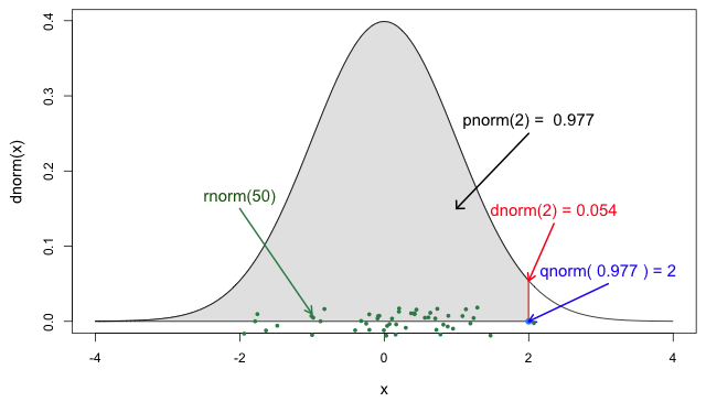
If you look at ?stats::Distributions, each type of
distribution has a unique set of functions. However,
epiparameter gives you the same four functions to access
each of the values above for any <epiparameter>
object you want!
R
# plot this to have a visual reference

# continuous distribution
plot(covid_serialint, xlim = c(0, 20))
R
# the density value at quantile value of 10 (days)
density(covid_serialint, at = 10)
OUTPUT
[1] 0.01911607R
# the cumulative probability at quantile value of 10 (days)
epiparameter::cdf(covid_serialint, q = 10)
OUTPUT
[1] 0.9466605R
# the quantile value (day) at a cumulative probability of 60%
quantile(covid_serialint, p = 0.6)
OUTPUT
[1] 4.618906R
# generate 10 random values (days) given
# the distribution family and its parameters
epiparameter::generate(covid_serialint, times = 10)
OUTPUT
 [1]  4.022843  6.177242  2.579687 17.801526  3.680146  4.829783  4.659798
[8] 3.263045 2.205161 1.414135You can access the reference documentation (help files) for these
functions with the triple-colon notation:
epiparameter:::
?epiparameter:::density.epiparameter()?epiparameter:::cdf.epiparameter()?epiparameter:::quantile.epiparameter()?epiparameter:::generate.epiparameter()
Window for contact tracing and the serial interval
The serial interval is important in the optimisation of contact tracing since it provides a time window for the containment of a disease spread (Fine, 2003). Depending on the serial interval, we can evaluate the need to increase the number of days considered for contact tracing to include more backwards contacts (Davis et al., 2020).
With the COVID-19 serial interval (covid_serialint)
calculate:
- How much would expanding the contact tracing window from 2 to 6 days before symptom onset improve the detection of potential infectors?
The serial interval is the time between symptom onset in an infector and symptom onset in their infectee.
We can use the serial interval distribution to quantify the probability of detecting an infector from a new case. This probability can be calculated directly from the assumed distribution. Refer to Figure 2 in Davis et al., 2020.
For an object class <epiparameter>, the cumulative
probability can be computed using epiparameter::cdf().
R
plot(covid_serialint)
R
# calculate probability of finding backward cases
# with contact tracing window of 2 days
window_2 <- epiparameter::cdf(covid_serialint, q = 2)

window_2
OUTPUT
[1] 0.1111729R
# calculate probability of finding backward cases
# with contact tracing window of 6 days
window_6 <- epiparameter::cdf(covid_serialint, q = 6)

window_6
OUTPUT
[1] 0.7623645R
# calculate the difference
window_6 - window_2
OUTPUT
[1] 0.6511917Given the COVID-19 serial interval:
A contact tracing method considering contacts up to 2 days pre-onset will capture around 11.1% of backward cases.
If this period is extended to 6 days pre-onset, this could include 76.2% of backward contacts.
About 65.1% more backward cases could be captured when extending tracing from 2 to 6 days.
If we exchange the question between days and cumulative probability to:
- When considering secondary cases, within how many days following the symptom onset of primary cases can we expect 55% of secondary symptom onset to occur?
R
quantile(covid_serialint, p = 0.55)
An interpretation could be:
- 55% of secondary cases will have their symptom onset within around 4.3 days of symptom onset in the primary case.
Discretise a continuous distribution
We are getting closer to the end! EpiNow2::LogNormal()
still needs a maximum value (max).
One way to do this is to get the quantile value for the
distribution’s 99th percentile or 0.99 cumulative
probability. For this, we need access to the set of distribution
functions for our <epiparameter> object.
We can use the set of distribution functions for a
continuous distribution (as above). However, these values will
be continuous numbers. We can discretise the
continuous distribution stored in our <epiparameter>
object to get discrete values from a continuous distribution.
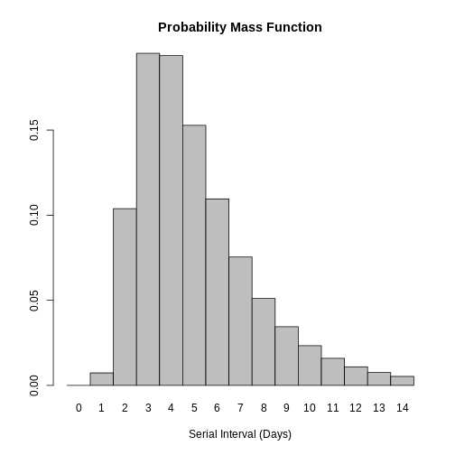
When we epiparameter::discretise() the continuous
distribution we get a discrete distribution:
R
covid_serialint_discrete <-
  epiparameter::discretise(covid_serialint)

covid_serialint_discrete
OUTPUT
Disease: COVID-19
Pathogen: SARS-CoV-2
Epi Parameter: serial interval
Study: Nishiura H, Linton N, Akhmetzhanov A (2020). "Serial interval of novel
coronavirus (COVID-19) infections." _International Journal of
Infectious Diseases_. doi:10.1016/j.ijid.2020.02.060
<https://doi.org/10.1016/j.ijid.2020.02.060>.
Distribution: discrete lnorm (days)
Parameters:
  meanlog: 1.386
  sdlog: 0.568
We identify this change in the Distribution: output line
of the <epiparameter> object. Double check this
line:
Distribution: discrete lnorm (days)While for a continuous distribution, we plot the Probability Density Function (PDF), for a discrete distribution, we plot the Probability Mass Function (PMF):
R
# discrete distribution
plot(covid_serialint_discrete)
To finally get a max value, let’s access the quantile
value of the 99th percentile or 0.99 cumulative probability
of the distribution using the quantile() function, as we
did above for the continuous distribution.
R
covid_serialint_discrete_max <-
  quantile(covid_serialint_discrete, p = 0.99)
Length of quarantine and incubation period
The incubation period distribution is a useful delay to assess the length of active monitoring or quarantine (Lauer et al., 2020). Similarly, delays from symptom onset to recovery (or death) will determine the required duration of health care and case isolation (Cori et al., 2017).
The library of parameters in the package epiparameter contains the parameters reported by Lauer et al., 2020.
Calculate:
- How many days after infection do 99% of people who will develop COVID-19 symptoms actually show symptoms? Get an integer as a response.
What delay distribution measures the time between infection and the onset of symptoms? For a refresher, you can read the tutorial Glossary.
The probability functions for <epiparameter>
discrete distributions are the same that we used for
the continuous ones!
R
# the delay from infection to onset is called incubation period
# access the incubation period for covid
covid_incubation <-
  epiparameter::epiparameter_db(
    disease = "covid",
    epi_name = "incubation",
    author = "lauer",
    single_epiparameter = TRUE
  )

covid_incubation
OUTPUT
Disease: COVID-19
Pathogen: SARS-CoV-2
Epi Parameter: incubation period
Study: Lauer S, Grantz K, Bi Q, Jones F, Zheng Q, Meredith H, Azman A, Reich
N, Lessler J (2020). "The Incubation Period of Coronavirus Disease 2019
(COVID-19) From Publicly Reported Confirmed Cases: Estimation and
Application." _Annals of Internal Medicine_. doi:10.7326/M20-0504
<https://doi.org/10.7326/M20-0504>.
Distribution: lnorm (days)
Parameters:
  meanlog: 1.629
  sdlog: 0.419
R
# to get an integer as a response, discretise the distribution
covid_incubation_discrete <- epiparameter::discretise(covid_incubation)

covid_incubation_discrete
OUTPUT
Disease: COVID-19
Pathogen: SARS-CoV-2
Epi Parameter: incubation period
Study: Lauer S, Grantz K, Bi Q, Jones F, Zheng Q, Meredith H, Azman A, Reich
N, Lessler J (2020). "The Incubation Period of Coronavirus Disease 2019
(COVID-19) From Publicly Reported Confirmed Cases: Estimation and
Application." _Annals of Internal Medicine_. doi:10.7326/M20-0504
<https://doi.org/10.7326/M20-0504>.
Distribution: discrete lnorm (days)
Parameters:
  meanlog: 1.629
  sdlog: 0.419
R
# calculate the quantile or value at the 99th percentile from the distribution
quantile(covid_incubation_discrete, p = 0.99)
OUTPUT
[1] 1399% of those who develop COVID-19 symptoms will do so within 13 days of infection.
Now, is this result consistent with the duration of quarantine recommended in practice during the COVID-19 pandemic?
How to create a distribution plot?
From a maximum value with quantile(), we can create a
sequence of quantile values as a numeric vector and calculate
density() values for each:
R
# create a discrete distribution visualisation
# from a maximum value from the distribution
quantile(covid_serialint_discrete, p = 0.99) %>%
  # generate quantile values
  # as a sequence for each natural number
  seq(1L, to = ., by = 1L) %>%
  # coerce numeric vector to data frame
  as_tibble_col(column_name = "quantile_values") %>%
  mutate(
    # calculate density values
    # for each quantile in the density function
    density_values =
      density(
        x = covid_serialint_discrete,
        at = quantile_values
      )
  ) %>%
  # create plot
  ggplot(
    aes(
      x = quantile_values,
      y = density_values
    )
  ) +
  geom_col()
Remember: In infections with pre-symptomatic transmission, serial intervals can have negative values (Nishiura et al., 2020). When we use the serial interval to approximate the generation time we need to make this distribution with positive values only!
Plug-in {epiparameter} to {EpiNow2}
Now we can plug everything into the EpiNow2::LogNormal()
function!
- the summary statistics
meanandsdof the distribution, - a maximum value
max, - the
distributionname.
When using EpiNow2::LogNormal() to define a log
normal distribution like the one in the
covid_serialint object we can specify the mean and sd as
parameters. Alternatively, to get the “natural” parameters for a log
normal distribution we can convert its summary statistics to
distribution parameters named meanlog and
sdlog. With epiparameter we can directly get
the distribution parameters using
epiparameter::get_parameters():
R
covid_serialint_parameters <-
  epiparameter::get_parameters(covid_serialint)
Then, we have:
R
serial_interval_covid <-
  EpiNow2::LogNormal(
    meanlog = covid_serialint_parameters["meanlog"],
    sdlog = covid_serialint_parameters["sdlog"],
    max = covid_serialint_discrete_max
  )

serial_interval_covid
OUTPUT
- lognormal distribution (max: 14):
  meanlog:
    1.4
  sdlog:
0.57We can stop the livecoding at this stage and move on with the practical.
LogNormal or Gamma?
Let’s say that you need to quantify the transmission of an Ebola outbreak. You will use the serial interval as an approximation of the generation time for EpiNow2. The epiparameter will give you access to the parameter estimated from historical outbreaks.
Follow these steps:
- Get access to the
serial intervaldistribution ofEbolausing epiparameter. - Access one entry from the study with the highest sample size.
- Print the output and read the description.
- Identify which probability distribution (e.g., Gamma, Lognormal, etc.) was used by the authors to model the delay.
- Extract the distribution parameters for the corresponding probability distribution.
- Calculate an exact maximum value for the delay distribution (e.g., the 99th percentile).
- Plug-in the distribution parameters from the
<epiparameter>to the corresponding probability distribution function in EpiNow2 (e.g.,EpiNow2::Gamma(),EpiNow2::LogNormal(), etc.).
When connecting epiparameter and EpiNow2, there is one step that is susceptible to mistakes.
In <epiparameter>, the output line
Distribution: determines the function to use from
EpiNow2:
We choose EpiNow2::Gamma() if in
<epiparameter> we get:
Distribution: gamma (days)
Parameters:
  shape: 2.188
  scale: 6.490
We choose EpiNow2::LogNormal() if in
<epiparameter> we get:
Distribution: lnorm (days)
Parameters:
  meanlog: 1.386
sdlog: 0.568R
# 1. access a serial interval
ebola_serialint <- epiparameter::epiparameter_db(
  disease = "ebola",
  epi_name = "serial",
  single_epiparameter = TRUE
)
R
ebola_serialint
OUTPUT
Disease: Ebola Virus Disease
Pathogen: Ebola Virus
Epi Parameter: serial interval
Study: WHO Ebola Response Team, Agua-Agum J, Ariyarajah A, Aylward B, Blake I,
Brennan R, Cori A, Donnelly C, Dorigatti I, Dye C, Eckmanns T, Ferguson
N, Formenty P, Fraser C, Garcia E, Garske T, Hinsley W, Holmes D,
Hugonnet S, Iyengar S, Jombart T, Krishnan R, Meijers S, Mills H,
Mohamed Y, Nedjati-Gilani G, Newton E, Nouvellet P, Pelletier L,
Perkins D, Riley S, Sagrado M, Schnitzler J, Schumacher D, Shah A, Van
Kerkhove M, Varsaneux O, Kannangarage N (2015). "West African Ebola
Epidemic after One Year — Slowing but Not Yet under Control." _The New
England Journal of Medicine_. doi:10.1056/NEJMc1414992
<https://doi.org/10.1056/NEJMc1414992>.
Distribution: gamma (days)
Parameters:
  shape: 2.188
  scale: 6.490
R
# 2. extract parameters from {epiparameter} object
ebola_serialint_params <- epiparameter::get_parameters(ebola_serialint)

ebola_serialint_params
OUTPUT
   shape    scale
2.187934 6.490141
R
# 3. get a maximum value
ebola_serialint_max <- ebola_serialint %>%
  epiparameter::discretise() %>%
  quantile(p = 0.99)

ebola_serialint_max
OUTPUT
[1] 45R
# 4. adapt {epiparameter} to the {EpiNow2} distribution interface
ebola_generationtime <- EpiNow2::Gamma(
  shape = ebola_serialint_params["shape"],
  scale = ebola_serialint_params["scale"],
  max = ebola_serialint_max
)

ebola_generationtime
OUTPUT
- gamma distribution (max: 45):
  shape:
    2.2
  rate:
    0.15
R
# plot the `epiparameter` class object
plot(ebola_serialint)
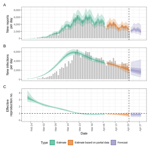
R
# plot the `dist_spec` class object from {EpiNow2}
plot(ebola_generationtime)
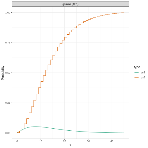
Plotting distributions from the EpiNow2 interface
always gives a discretised output. From the legend: PMF
stands for Probability Mass Function and CMF stands for
Cumulative Mass Function.
Adjusting for reporting delays
Estimating \(R_t\) requires data on the daily number of new infections. Due to lags in the development of detectable viral loads, symptom onset, seeking care, and reporting, these numbers are not readily available. All observations reflect transmission events from some time in the past. In other words, if \(d\) is the delay from infection to observation, then observations at time \(t\) inform \(R_{t−d}\), not \(R_t\). (Gostic et al., 2020)
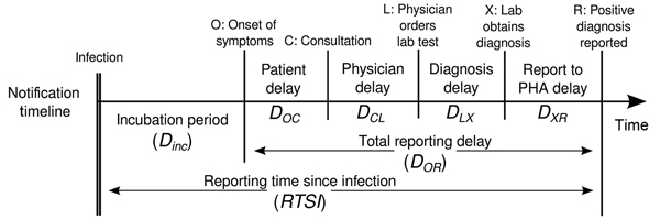
The delay distribution could be inferred jointly
with the underlying times of infection or estimated as the sum of the incubation period distribution and
the distribution of delays from symptom onset to observation from line
list data (reporting delay).
For EpiNow2, we can specify these two complementary delay
distributions in the delays argument.
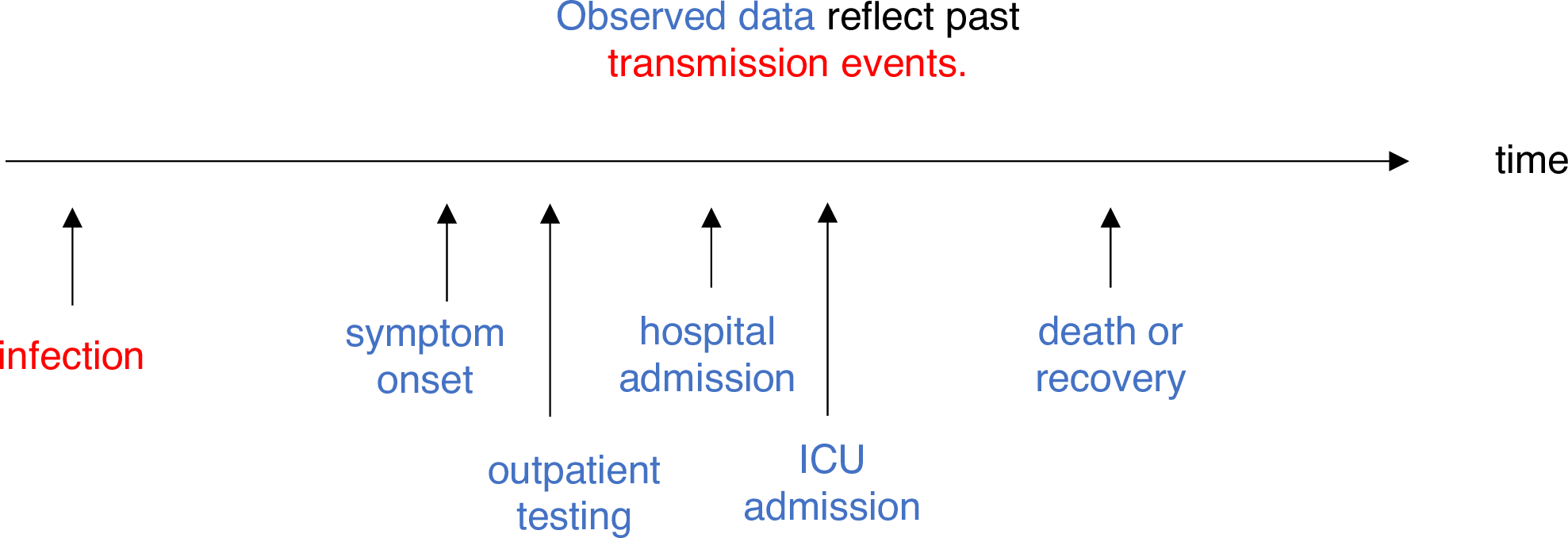
Use an incubation period for COVID-19 to estimate Rt
Estimate the time-varying reproduction number for the first 60 days
of the example_confirmed data set from
EpiNow2. Access to an incubation period for COVID-19 from
epiparameter to use it as a reporting delay.
Use the last epinow() calculation using the
delays argument and the delay_opts() helper
function.
The delays argument and the delay_opts()
helper function are analogous to the generation_time
argument and the generation_time_opts() helper
function.
R
epinow_estimates <- EpiNow2::epinow(
  # cases
  data = example_confirmed[1:60],
  # delays
  generation_time = EpiNow2::generation_time_opts(covid_serial_interval),
  delays = EpiNow2::delay_opts(covid_incubation_time)
)
R
# generation time ---------------------------------------------------------

# get covid serial interval
covid_serialint <-
  epiparameter::epiparameter_db(
    disease = "covid",
    epi_name = "serial",
    single_epiparameter = TRUE
  )

# adapt epiparameter to epinow2
covid_serialint_discrete_max <- covid_serialint %>%
  epiparameter::discretise() %>%
  quantile(p = 0.99)

covid_serialint_parameters <-
  epiparameter::get_parameters(covid_serialint)

covid_serial_interval <-
  EpiNow2::LogNormal(
    meanlog = covid_serialint_parameters["meanlog"],
    sdlog = covid_serialint_parameters["sdlog"],
    max = covid_serialint_discrete_max
  )

# incubation time ---------------------------------------------------------

# get covid incubation period
covid_incubation <- epiparameter::epiparameter_db(
  disease = "covid",
  epi_name = "incubation",
  single_epiparameter = TRUE
)

# adapt epiparameter to epinow2
covid_incubation_discrete_max <- covid_incubation %>%
  epiparameter::discretise() %>%
  quantile(p = 0.99)

covid_incubation_parameters <-
  epiparameter::get_parameters(covid_incubation)

covid_incubation_time <-
  EpiNow2::LogNormal(
    meanlog = covid_incubation_parameters["meanlog"],
    sdlog = covid_incubation_parameters["sdlog"],
    max = covid_incubation_discrete_max
  )

# epinow ------------------------------------------------------------------

# Set 4 cores to be used in parallel computations
withr::local_options(list(mc.cores = parallel::detectCores() - 1))

# run epinow
epinow_estimates_cgi <- EpiNow2::epinow(
  # cases
  data = example_confirmed[1:60],
  # delays
  generation_time = EpiNow2::generation_time_opts(covid_serial_interval),
  delays = EpiNow2::delay_opts(covid_incubation_time)
)

base::plot(epinow_estimates_cgi)
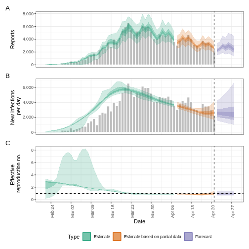
Try to complement the delays argument with a reporting
delay like the reporting_delay_fixed object of the previous
episode.
How much has it changed?
Compare three runs of EpiNow2::epinow():
- Use only the generation time
- Add the incubation time
- Add the incubation time and reporting delay
After adding all delays, discuss:
- Does the trend of the model fit in the “Estimate” section change?
- Has the uncertainty changed?
- How would you explain or interpret any of these changes?
Compare all the EpiNow2 figures generated in the three runs.
Challenges
A code completion tip
If we write the [] next to the object
covid_serialint_parameters[], within [] we can
use the Tab key ↹ for code
completion feature
This gives quick access to
covid_serialint_parameters["meanlog"] and
covid_serialint_parameters["sdlog"].
We invite you to try this out in code chunks and the R console!
Ebola’s effective reproduction number adjusted by reporting delays
Download and read the Ebola dataset:
- Estimate the effective reproduction number using EpiNow2
- Adjust the estimate by the available reporting delays in epiparameter
- Why did you choose that parameter?
To calculate the \(R_t\) using EpiNow2, we need:
- Aggregated incidence
data, with confirmed cases per day, and - The
generationtime distribution. - Optionally, reporting
delaysdistributions when available (e.g., incubation period).
To get delay distribution using epiparameter we can use functions like:
epiparameter::epiparameter_db()epiparameter::parameter_tbl()discretise()quantile()
R
# read data
# e.g.: if path to file is data/raw-data/ebola_cases.csv then:
ebola_confirmed <-
  read_csv(here::here("data", "raw-data", "ebola_cases.csv")) %>%
  incidence2::incidence(
    date_index = "date",
    counts = "confirm",
    count_values_to = "confirm",
    date_names_to = "date",
    complete_dates = TRUE
  ) %>%
  dplyr::select(-count_variable)

# list distributions
epiparameter::epiparameter_db(disease = "ebola") %>%
  epiparameter::parameter_tbl()
R
# generation time ---------------------------------------------------------

# subset one distribution for the generation time
ebola_serial <- epiparameter::epiparameter_db(
  disease = "ebola",
  epi_name = "serial",
  single_epiparameter = TRUE
)

# adapt epiparameter to epinow2
ebola_serial_discrete <- epiparameter::discretise(ebola_serial)

serial_interval_ebola <-
  EpiNow2::Gamma(
    mean = ebola_serial$summary_stats$mean,
    sd = ebola_serial$summary_stats$sd,
    max = quantile(ebola_serial_discrete, p = 0.99)
  )

# incubation time ---------------------------------------------------------

# subset one distribution for delay of the incubation period
ebola_incubation <- epiparameter::epiparameter_db(
  disease = "ebola",
  epi_name = "incubation",
  single_epiparameter = TRUE
)

# adapt epiparameter to epinow2
ebola_incubation_discrete <- epiparameter::discretise(ebola_incubation)

incubation_period_ebola <-
  EpiNow2::Gamma(
    mean = ebola_incubation$summary_stats$mean,
    sd = ebola_incubation$summary_stats$sd,
    max = quantile(ebola_incubation_discrete, p = 0.99)
  )

# epinow ------------------------------------------------------------------

# run epinow
epinow_estimates_egi <- EpiNow2::epinow(
  # cases
  data = ebola_confirmed,
  # delays
  generation_time = EpiNow2::generation_time_opts(serial_interval_ebola),
  delays = EpiNow2::delay_opts(incubation_period_ebola)
)

plot(epinow_estimates_egi)
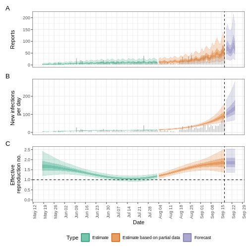
What to do with Weibull distributions?
Use the influenza_england_1978_school dataset from the
outbreaks package to calculate the effective reproduction
number using EpiNow2 adjusting by the available reporting
delays in epiparameter.
EpiNow2::NonParametric() accepts Probability Mass
Functions (PMF) from any distribution family. Read the reference guide
on Probability
distributions.
R
# What parameters are available for Influenza?
epiparameter::epiparameter_db(disease = "influenza") %>%
  epiparameter::parameter_tbl() %>%
  count(epi_name)
OUTPUT
# Parameter table:
# A data frame:    3 × 2
  epi_name              n
  <chr>             <int>
1 generation time       1
2 incubation period    15
3 serial interval       1
R
# generation time ---------------------------------------------------------

# Read the generation time
influenza_generation <-
  epiparameter::epiparameter_db(
    disease = "influenza",
    epi_name = "generation"
  )

influenza_generation
OUTPUT
Disease: Influenza
Pathogen: Influenza-A-H1N1
Epi Parameter: generation time
Study: Lessler J, Reich N, Cummings D, New York City Department of Health and
Mental Hygiene Swine Influenza Investigation Team (2009). "Outbreak of
2009 Pandemic Influenza A (H1N1) at a New York City School." _The New
England Journal of Medicine_. doi:10.1056/NEJMoa0906089
<https://doi.org/10.1056/NEJMoa0906089>.
Distribution: weibull (days)
Parameters:
  shape: 2.360
  scale: 3.180
R
# EpiNow2 currently accepts Gamma or LogNormal
# other can pass the PMF function

influenza_generation_discrete <-
  epiparameter::discretise(influenza_generation)

influenza_generation_max <-
  quantile(influenza_generation_discrete, p = 0.99)

influenza_generation_pmf <-
  density(
    influenza_generation_discrete,
    at = 0:influenza_generation_max
  )

influenza_generation_pmf
OUTPUT
[1] 0.00000000 0.06312336 0.22134988 0.29721220 0.23896828 0.12485164 0.04309454R
# EpiNow2::NonParametric() can also accept the PMF values
generation_time_influenza <-
  EpiNow2::NonParametric(
    pmf = influenza_generation_pmf
  )

# incubation period -------------------------------------------------------

# Read the incubation period
influenza_incubation <-
  epiparameter::epiparameter_db(
    disease = "influenza",
    epi_name = "incubation",
    single_epiparameter = TRUE
  )

# Discretise incubation period
influenza_incubation_discrete <-
  epiparameter::discretise(influenza_incubation)

influenza_incubation_max <-
  quantile(influenza_incubation_discrete, p = 0.99)

influenza_incubation_pmf <-
  density(
    influenza_incubation_discrete,
    at = 0:influenza_incubation_max
  )

influenza_incubation_pmf
OUTPUT
[1] 0.00000000 0.05749151 0.16687705 0.22443092 0.21507632 0.16104546 0.09746609
[8] 0.04841928
R
# EpiNow2::NonParametric() can also accept the PMF values
incubation_time_influenza <-
  EpiNow2::NonParametric(
    pmf = influenza_incubation_pmf
  )

# epinow ------------------------------------------------------------------

# Read data
influenza_cleaned <-
  outbreaks::influenza_england_1978_school %>%
  select(date, confirm = in_bed)

# Run epinow()
epinow_estimates_igi <- EpiNow2::epinow(
  # cases
  data = influenza_cleaned,
  # delays
  generation_time = EpiNow2::generation_time_opts(generation_time_influenza),
  delays = EpiNow2::delay_opts(incubation_time_influenza)
)

plot(epinow_estimates_igi)
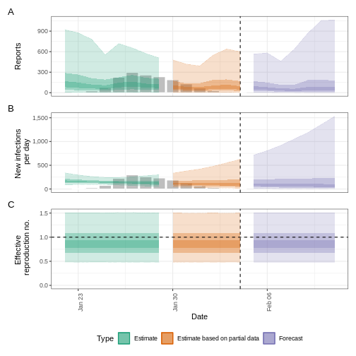
Next steps
How to get distribution parameters from statistical distributions?
How to get the mean and standard deviation from a generation time
with only distribution parameters but no summary statistics
like mean or sd for
EpiNow2::Gamma() or EpiNow2::LogNormal()?
Look at the epiparameter vignette on parameter extraction and conversion and its use cases!
How to estimate delay distributions for Disease X?
Refer to this excellent tutorial on estimating the serial interval and incubation period of Disease X accounting for censoring using Bayesian inference with packages like rstan and coarseDataTools.
- Tutorial in English: https://rpubs.com/tracelac/diseaseX
- Tutorial en Español: https://epiverse-trace.github.io/epimodelac/EnfermedadX.html
Then, after you get your estimated values, you can
manually create your own<epiparameter> class objects
with epiparameter::epiparameter()! Take a look at its reference
guide on “Create an <epiparameter> object”!
Lastly, take a look at the latest R packages {epidist} and {primarycensored}, which provide methods to address key challenges in estimating distributions, including truncation, interval censoring, and dynamical biases.
- Use distribution functions with
<epiparameter>objects to get summary statistics and informative parameters for public health interventions like the Window for contact tracing and Length of quarantine. - Use
discretise()to convert continuous to discrete delay distributions. - Use epiparameter to get reporting delays required in transmissibility estimates.
Content from Create a short-term forecast
Last updated on 2026-07-01 | Edit this page
Estimated time: 60 minutes
Overview
Questions
- How do I create short-term forecasts from case data?
- How do I account for incomplete reporting in forecasts?
Objectives
- Learn how to make forecasts of cases using R package
EpiNow2 - Learn how to include an observation process in estimation
Prerequisites
- Complete tutorial Quantifying transmission
Learners should familiarise themselves with following concept dependencies before working through this tutorial:
Statistics: probability distributions, principle of Bayesian analysis.
Epidemic theory: Effective reproduction number.
Introduction
Given case data of an epidemic, we can create estimates of the current and future number of cases by accounting for both delays in reporting and under reporting. To make predictions about the future course of the epidemic, we need to make an assumption of how observations up to the present are related to what we expect to happen in the future. The simplest way of doing so is to assume “no change”, i.e., the reproduction number remains the same in the future as last observed. In this tutorial we will create short-term forecasts by assuming the reproduction number will remain the same as its estimate was on the final date for which data was available.
In this tutorial we are going to learn how to use the EpiNow2 package to forecast cases accounting for incomplete observations and forecast secondary observations like deaths.
We’ll use the pipe %>% operator to connect functions,
so let’s also call to the tidyverse package:
R
library(EpiNow2)
library(tidyverse)
The double-colon
The double-colon :: in R let you call a specific
function from a package without loading the entire package into the
current environment.
For example, dplyr::filter(data, condition) uses
filter() from the dplyr package.
This helps us remember package functions and avoid namespace conflicts.
Create a short-term forecast
The function epinow() described in the quantifying transmission
episode is a wrapper for the functions:
-
estimate_infections()used to estimate cases by date of infection. -
forecast_infections()used to simulate infections using an existing fit (estimate) to observed cases.
Let’s use the same code used in quantifying transmission episode to get the input data, delays and priors:
R
# Read cases dataset
cases <- incidence2::covidregionaldataUK %>%
  # use {tidyr} to preprocess missing values
  tidyr::replace_na(base::list(cases_new = 0)) %>%
  # use {incidence2} to compute the daily incidence
  incidence2::incidence(
    date_index = "date",
    counts = "cases_new",
    count_values_to = "confirm",
    date_names_to = "date",
    complete_dates = TRUE
  ) %>%
  dplyr::select(-count_variable)  # Drop count_variable as no longer needed

# Incubation period
incubation_period_fixed <- EpiNow2::Gamma(
  mean = 4,
  sd = 2,
  max = 20
)

# Log-tranformed mean
log_mean <- EpiNow2::convert_to_logmean(mean = 2, sd = 1)

# Log-transformed std
log_sd <- EpiNow2::convert_to_logsd(mean = 2, sd = 1)

# Reporting delay
reporting_delay_fixed <- EpiNow2::LogNormal(
  mean = log_mean,
  sd = log_sd,
  max = 10
)

# Generation time
generation_time_fixed <- EpiNow2::LogNormal(
  mean = 3.6,
  sd = 3.1,
  max = 20
)

# define Rt prior distribution
rt_prior <- EpiNow2::rt_opts(prior = EpiNow2::LogNormal(mean = 2, sd = 2))
Now we can extract the short-term forecast using:
R
# Assume we only have the first 90 days of this data
reported_cases <- cases %>%
  dplyr::slice(1:90)

# Estimate and forecast
estimates <- EpiNow2::epinow(
  data = reported_cases,
  generation_time = EpiNow2::generation_time_opts(generation_time_fixed),
  delays = EpiNow2::delay_opts(incubation_period_fixed + reporting_delay_fixed),
  rt = rt_prior
)
Do not wait for this to complete!
This last chunk may take 10 minutes to run. Keep reading this tutorial episode while this runs in the background. For more information on computing time, read the “Bayesian inference using Stan” section within the quantifying transmission episode.
We can visualise the estimates of the effective reproduction number
and the estimated number of cases using plot(). The
estimates are split into three categories:
Estimate (green): utilises all data,
Estimate based on partial data (orange): contains a higher degree of uncertainty because such estimates are based on less data,
Forecast (purple): forecasts into the future.
R
plot(estimates)
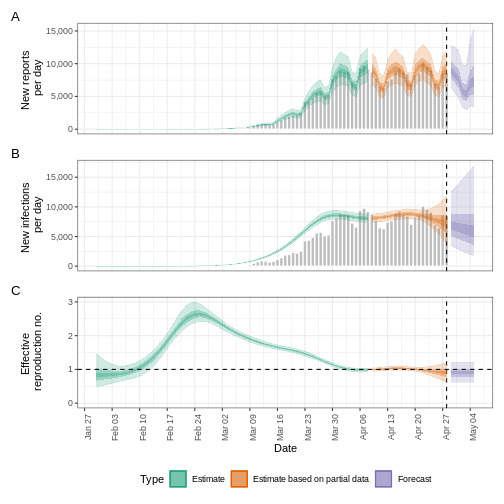
Forecasting with incomplete observations
In the quantifying
transmission episode we accounted for delays in reporting. In
EpiNow2 we also can account for incomplete observations as
in reality, 100% of cases are not reported. We will pass an additional
argument called obs into the epinow() function
to define an observation model. The format of obs is
defined by the obs_opt() function (see
?EpiNow2::obs_opts for more detail).
Let’s say we believe the COVID-19 outbreak data in the
cases object do not include all reported cases. We estimate
that only 40% of actual cases are reported. To specify this in the
observation model, we must pass a scaling factor with a mean and
standard deviation. If we assume that 40% of cases are reported (with
standard deviation 1%), then we specify the scale input to
obs_opts() as follows:
R
obs_scale <- EpiNow2::Normal(mean = 0.4, sd = 0.01)
To run the inference framework with this observation process, we add
obs = obs_opts(scale = obs_scale) to the input arguments of
epinow():
R
# Define observation model
obs_scale <- EpiNow2::Normal(mean = 0.4, sd = 0.01)

# Assume we only have the first 90 days of this data
reported_cases <- cases %>%
  dplyr::slice(1:90)

# Estimate and forecast
estimates <- EpiNow2::epinow(
  data = reported_cases,
  generation_time = EpiNow2::generation_time_opts(generation_time_fixed),
  delays = EpiNow2::delay_opts(incubation_period_fixed + reporting_delay_fixed),
  rt = rt_prior,
  # Add observation model
  obs = EpiNow2::obs_opts(scale = obs_scale)
)

base::summary(estimates)
OUTPUT
                        measure                 estimate
                         <char>                   <char>
1:       New infections per day   20133 (13352 -- 29484)
2:   Expected change in reports        Likely decreasing
3:   Effective reproduction no.       0.97 (0.77 -- 1.2)
4:               Rate of growth -0.012 (-0.092 -- 0.066)
5: Doubling/halving time (days)         -58 (10 -- -7.5)
The estimates of transmission measures such as the effective reproduction number and rate of growth are similar (or the same in value) compared to when we didn’t account for incomplete observations (see quantifying transmission episode in the “Finding estimates” section). However the number of new confirmed cases by infection date has changed substantially in magnitude to reflect the assumption that only 40% of cases are reported.
We can also change the default distribution from Negative Binomial to
Poisson, remove the default week effect (which accounts for weekly
patterns in reporting) and more. See ?EpiNow2::obs_opts for
more details.
What are the implications of this change?
- Compare different percents of observations %
- How are they different in the number of infections estimated?
- What are the public health implications of this change?
Forecasting secondary observations
EpiNow2 also has the ability to estimate and forecast
secondary observations, e.g., deaths and hospitalisations, from a
primary observation, e.g., cases. Here we will illustrate how to
forecast the number of deaths arising from observed cases of COVID-19 in
the early stages of the UK outbreak.
First, we must format our data to have the following columns:
-
date: the date (as a date object see?is.Date()), -
primary: number of primary observations on that date, in this example cases, -
secondary: number of secondary observations date, in this example deaths.
R
reported_cases_deaths <- incidence2::covidregionaldataUK %>%
  # use {tidyr} to preprocess missing values
  tidyr::replace_na(base::list(cases_new = 0, deaths_new = 0)) %>%
  # use {incidence2} to compute the daily incidence
  incidence2::incidence(
    date_index = "date",
    counts = c(primary = "cases_new", secondary = "deaths_new"),
    date_names_to = "date",
    complete_dates = TRUE
  ) %>%
  # rearrange to wide format for {EpiNow2}
  pivot_wider(names_from = count_variable, values_from = count)
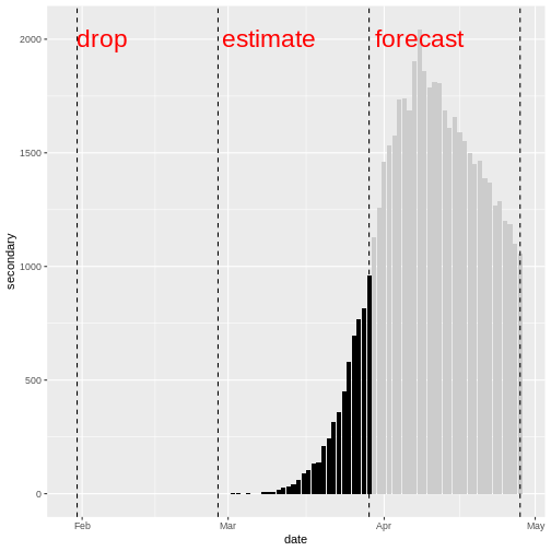
Using the data on cases and deaths between day 31 and day 60, we will
estimate the relationship between the primary and secondary observations
using estimate_secondary(), then forecast future deaths
using forecast_secondary(). For more details on the model
see the model
documentation.
We must specify the type of observation using type in
secondary_opts(), options include:
- “incidence”: secondary observations arise from previous primary observations, i.e., deaths arising from recorded cases.
- “prevalence”: secondary observations arise from a combination current primary observations and past secondary observations, i.e., hospital bed usage arising from current hospital admissions and past hospital bed usage.
In this example we specify
secondary_opts(type = "incidence"). See
?EpiNow2::secondary_opts for more detail.
The final key input is the delay distribution between the primary and
secondary observations. Here this is the delay between case report and
death, we assume this follows a gamma distribution with mean of 14 days
and standard deviation of 5 days (Alternatively, we can use
epiparameter to access
epidemiological delays). Using Gamma() we specify a
fixed gamma distribution.
There are further function inputs to
estimate_secondary() which can be specified, including
adding an observation process, see
?EpiNow2::estimate_secondary for detail on these
options.
To find the model fit between cases and deaths:
R
# Estimate from day 31 to day 60 of this data
cases_to_estimate <- reported_cases_deaths %>%
  slice(31:60)

# Delay distribution between case report and deaths
delay_report_to_death <- EpiNow2::Gamma(
  mean = EpiNow2::Normal(mean = 14, sd = 0.5),
  sd = EpiNow2::Normal(mean = 5, sd = 0.5),
  max = 30
)

# Estimate secondary cases
estimate_cases_to_deaths <- EpiNow2::estimate_secondary(
  data = cases_to_estimate,
  secondary = EpiNow2::secondary_opts(type = "incidence"),
  delays = EpiNow2::delay_opts(delay_report_to_death)
)
Be cautious of time-scale
In the early stages of an outbreak there can be substantial changes in testing and reporting. If there are testing changes from one month to another, then there will be a bias in the model fit. Therefore, you should be cautious of the time-scale of data used in the model fit and forecast.
We plot the model fit (shaded ribbons) with the secondary observations (bar plot) and primary observations (dotted line) as follows:
R
plot(estimate_cases_to_deaths, primary = TRUE)
WARNING
Warning: Removed 14 rows containing missing values or values outside the scale range
(`geom_ribbon()`).
Removed 14 rows containing missing values or values outside the scale range
(`geom_ribbon()`).
Removed 14 rows containing missing values or values outside the scale range
(`geom_ribbon()`).
To use this model fit to forecast deaths, we pass a data frame consisting of the primary observation (cases) for dates not used in the model fit.
Note : in this episode we are using data where we know the deaths and cases, so we create a data frame by extracting the cases. But in practice, this would be a different data set consisting of cases only.
R
# Forecast from day 61 to day 90
cases_to_forecast <- reported_cases_deaths %>%
  dplyr::slice(61:90) %>%
  dplyr::mutate(value = primary)
To forecast, we use the model fit
estimate_cases_to_deaths:
R
# Forecast secondary cases
deaths_forecast <- EpiNow2::forecast_secondary(
  estimate = estimate_cases_to_deaths,
  primary = cases_to_forecast
)

plot(deaths_forecast)
The plot shows the forecast secondary observations (deaths) over the
dates which we have recorded cases for. It is also possible to forecast
deaths using forecast cases, here you would specify primary
as the estimates output from
estimate_infections().
Credible intervals
In all EpiNow2 output figures, shaded regions reflect 90%, 50%, and 20% credible intervals in order from lightest to darkest.
Challenge: Ebola outbreak analysis
Challenge
Download the file ebola_cases.csv and read it
into R. The simulated data consists of the date of symptom onset and
number of confirmed cases of the early stages of the Ebola outbreak in
Sierra Leone in 2014.
Using the first 3 months (120 days) of data:
- Estimate whether cases are increasing or decreasing on day 120 of the outbreak
- Account for a capacity to observe 80% of cases.
- Create a two week forecast of number of cases.
You can use the following parameter values for the delay distribution(s) and generation time distribution.
- Incubation period: Log normal\((2.487,0.330)\) (Eichner et al. 2011 via epiparameter)
- Generation time: Gamma\((15.3, 10.1)\) (WHO Ebola Response Team 2014)
You may include some uncertainty around the mean and standard deviation of these distributions.
We use the effective reproduction number and growth rate to estimate whether cases are increasing or decreasing.
We can use the horizon argument within the
forecast_opts() provided to forecast argument
in epinow() function to extend the time period of the
forecast. The default value is of seven days.
Ensure the data is in the correct format :
-
date: the date (as a date object see?is.Date()), -
confirm: number of confirmed cases on that date.
To estimate the effective reproduction number and growth rate, we
will use the function epinow().
As the data consists of date of symptom onset, we only need to specify a delay distribution for the incubation period and the generation time.
We specify the distributions with some uncertainty around the mean and standard deviation of the log normal distribution for the incubation period and the Gamma distribution for the generation time.
R
epiparameter::epiparameter_db(
  disease = "ebola",
  epi_name = "incubation"
) %>%
  epiparameter::parameter_tbl()
OUTPUT
# Parameter table:
# A data frame:    5 × 7
  disease           pathogen epi_name prob_distribution author  year sample_size
  <chr>             <chr>    <chr>    <chr>             <chr>  <dbl>       <dbl>
1 Ebola Virus Dise… Ebola V… incubat… lnorm             Eichn…  2011         196
2 Ebola Virus Dise… Ebola V… incubat… gamma             WHO E…  2015        1798
3 Ebola Virus Dise… Ebola V… incubat… gamma             WHO E…  2015          49
4 Ebola Virus Dise… Ebola V… incubat… gamma             WHO E…  2015         957
5 Ebola Virus Dise… Ebola V… incubat… gamma             WHO E…  2015         792
R
ebola_eichner <- epiparameter::epiparameter_db(
  disease = "ebola",
  epi_name = "incubation",
  author = "Eichner"
)

ebola_eichner_parameters <- epiparameter::get_parameters(ebola_eichner)

ebola_incubation_period <- EpiNow2::LogNormal(
  meanlog = EpiNow2::Normal(
    mean = ebola_eichner_parameters["meanlog"],
    sd = 0.5
  ),
  sdlog = EpiNow2::Normal(
    mean = ebola_eichner_parameters["sdlog"],
    sd = 0.5
  ),
  max = 20
)

ebola_generation_time <- EpiNow2::Gamma(
  mean = EpiNow2::Normal(mean = 15.3, sd = 0.5),
  sd = EpiNow2::Normal(mean = 10.1, sd = 0.5),
  max = 30
)
We read the data input using readr::read_csv(). This
function recognize that the column date is a
<date> class vector.
R
# read data
# e.g.: if path to file is data/raw-data/ebola_cases.csv then:
ebola_cases_raw <- readr::read_csv(
  here::here("data", "raw-data", "ebola_cases.csv")
)
Preprocess and adapt the raw data for EpiNow2:
R
ebola_cases <- ebola_cases_raw %>%
  # use {tidyr} to preprocess missing values
  tidyr::replace_na(base::list(confirm = 0)) %>%
  # use {incidence2} to compute the daily incidence
  incidence2::incidence(
    date_index = "date",
    counts = "confirm",
    count_values_to = "confirm",
    date_names_to = "date",
    complete_dates = TRUE
  ) %>%
  dplyr::select(-count_variable)

dplyr::as_tibble(ebola_cases)
OUTPUT
# A tibble: 123 × 2
   date       confirm
   <date>       <dbl>
 1 2014-05-18       1
 2 2014-05-19       0
 3 2014-05-20       2
 4 2014-05-21       4
 5 2014-05-22       6
 6 2014-05-23       1
 7 2014-05-24       2
 8 2014-05-25       0
 9 2014-05-26      10
10 2014-05-27       8
# ℹ 113 more rows
We define an observation model to scale the estimated and forecast number of new infections:
R
# Define observation model
# mean of 80% and standard deviation of 1%
ebola_obs_scale <- EpiNow2::Normal(mean = 0.8, sd = 0.01)
As we want to also create a two week forecast, we specify
horizon = 14 to forecast 14 days instead of the default 7
days.
R
ebola_estimates <- EpiNow2::epinow(
  data = ebola_cases %>% dplyr::slice(1:120), # first 3 months of data only
  generation_time = EpiNow2::generation_time_opts(ebola_generation_time),
  delays = EpiNow2::delay_opts(ebola_incubation_period),
  # Add observation model
  obs = EpiNow2::obs_opts(scale = ebola_obs_scale),
  # horizon needs to be 14 days to create two week forecast (default is 7 days)
  forecast = EpiNow2::forecast_opts(horizon = 14)
)

summary(ebola_estimates)
OUTPUT
                        measure                estimate
                         <char>                  <char>
1:       New infections per day          91 (50 -- 186)
2:   Expected change in reports              Increasing
3:   Effective reproduction no.        1.6 (1.2 -- 2.4)
4:               Rate of growth 0.041 (0.0029 -- 0.087)
5: Doubling/halving time (days)         17 (7.9 -- 240)
The effective reproduction number \(R_t\) estimate (on the last date of the data) is 1.6 (1.2 – 2.4). The exponential growth rate of case numbers is 0.041 (0.0029 – 0.087).
Visualize the estimates:
R
plot(ebola_estimates)
Forecasting with estimates of \(R_t\)
By default, the short-term forecasts are created using the latest estimate of the reproduction number \(R_t\). As this estimate is based on partial data, it has considerable uncertainty.
The reproduction number that is projected into the future can be
changed to a less recent estimate based on more data using
rt_opts():
R
EpiNow2::rt_opts(future = "estimate")
The result will be less uncertain forecasts (as they are based on \(R_t\) with a narrower uncertainty interval) but the forecasts will be based on less recent estimates of \(R_t\) and assume no change since then.
Additionally, there is the option to project the value of \(R_t\) into the future using a generic model
by setting future = "project". As this option uses a model
to forecast the value of \(R_t\), the
result will be forecasts that are more uncertain than
estimate, for an example see
here.
Summary
EpiNow2 can be used to create short term forecasts and
to estimate the relationship between different outcomes. There are a
range of model options that can be implemented for different analysis,
including adding an observational process to account for incomplete
reporting. See the vignette
for more details on different model options in EpiNow2 that
aren’t covered in these tutorials.
- We can create short-term forecasts by making assumptions about the future behaviour of the reproduction number
- Incomplete case reporting can be accounted for in estimates
Content from Estimation of outbreak severity
Last updated on 2026-07-05 | Edit this page
Estimated time: 12 minutes
Overview
Questions
Why do we estimate the clinical severity of an epidemic?
How can the Case Fatality Risk (CFR) be estimated early in an ongoing epidemic?
Objectives
Estimate the CFR from aggregated case data using cfr.
Estimate a delay-adjusted CFR using epiparameter and cfr.
Estimate a delay-adjusted severity for an expanding time series using cfr.
Prerequisites
This episode requires you to be familiar with:
Data science: Basic programming with R.
Epidemic theory: Delay distributions.
R packages installed: cfr, epiparameter, outbreaks, tidyverse.
Install packages if they are not already installed
R
if (!base::require("pak")) install.packages("pak")
pak::pak(c("cfr", "epiparameter", "tidyverse", "outbreaks"))
If you have any error message, go to the main setup page.
Introduction
Common questions at the early stage of an epidemic include:
- What is the likely public health impact of the outbreak in terms of clinical severity?
- What are the most severely affected groups?
- Does the outbreak have the potential to cause a very severe pandemic?
We can assess the pandemic potential of an epidemic with two critical measurements: the transmissibility and the clinical severity (Fraser et al., 2009, CDC, 2024).
One epidemiological approach to estimating the clinical severity is quantifying the Case Fatality Risk (CFR). CFR is the conditional probability of death given confirmed diagnosis, calculated as the ratio of the cumulative number of deaths from an infectious disease to the number of confirmed diagnosed cases. However, calculating this directly during the course of an epidemic tends to result in a naive or biased CFR given the time delay from onset to death, varying substantially as the epidemic progresses and stabilising at the later stages of the outbreak (Ghani et al., 2005).
The periods are relevant: Period 1 – 15 days where CFR is zero to indicate this is due to no reported deaths; Period from Mar 15 – Apr 26 where CFR appears to be rising; Period Apr 30 – May 30 where the CFR estimate stabilises.
More generally, estimating severity can be helpful even outside of a pandemic planning scenario and in the context of routine public health. Knowing whether an outbreak has or had a different severity from the historical record can motivate causal investigations, which could be intrinsic to the infectious agent (e.g., a new, more severe strain) or due to underlying factors in the population (e.g. reduced immunity or morbidity factors) (Lipsitch et al., 2015).
In this tutorial we are going to learn how to use the cfr package to calculate and adjust a CFR estimation using delay distributions from epiparameter or elsewhere, based on the methods developed by Nishiura et al., 2009. We will also explore how we can reuse cfr functions for more severity measurements.
We’ll use the pipe %>% operator from the
magrittr package to connect functions from
cfr, including others from the package
dplyr. Hence, we will load the tidyverse
package which contains both magrittr and
dplyr.
R
# load packages
library(cfr)
library(epiparameter)
library(tidyverse)
library(outbreaks)
The double-colon
The double-colon :: in R lets you call a specific
function from a package without loading the entire package into the
current environment.
For example, dplyr::filter(data, condition) uses the
filter() function from the dplyr
package.
This helps us remember package functions and avoid namespace conflicts.
Have you been a member of an epidemic response team? If yes:
- How did you assess the clinical severity of the outbreak?
- What were the primary sources of bias?
- What did you do to take into account the identified bias?
- What complementary analysis would you do to solve the bias?
Data sources for clinical severity
What data sources can we use to estimate the clinical severity of a disease outbreak? Verity et al., 2020 summarises the spectrum of COVID-19 cases:
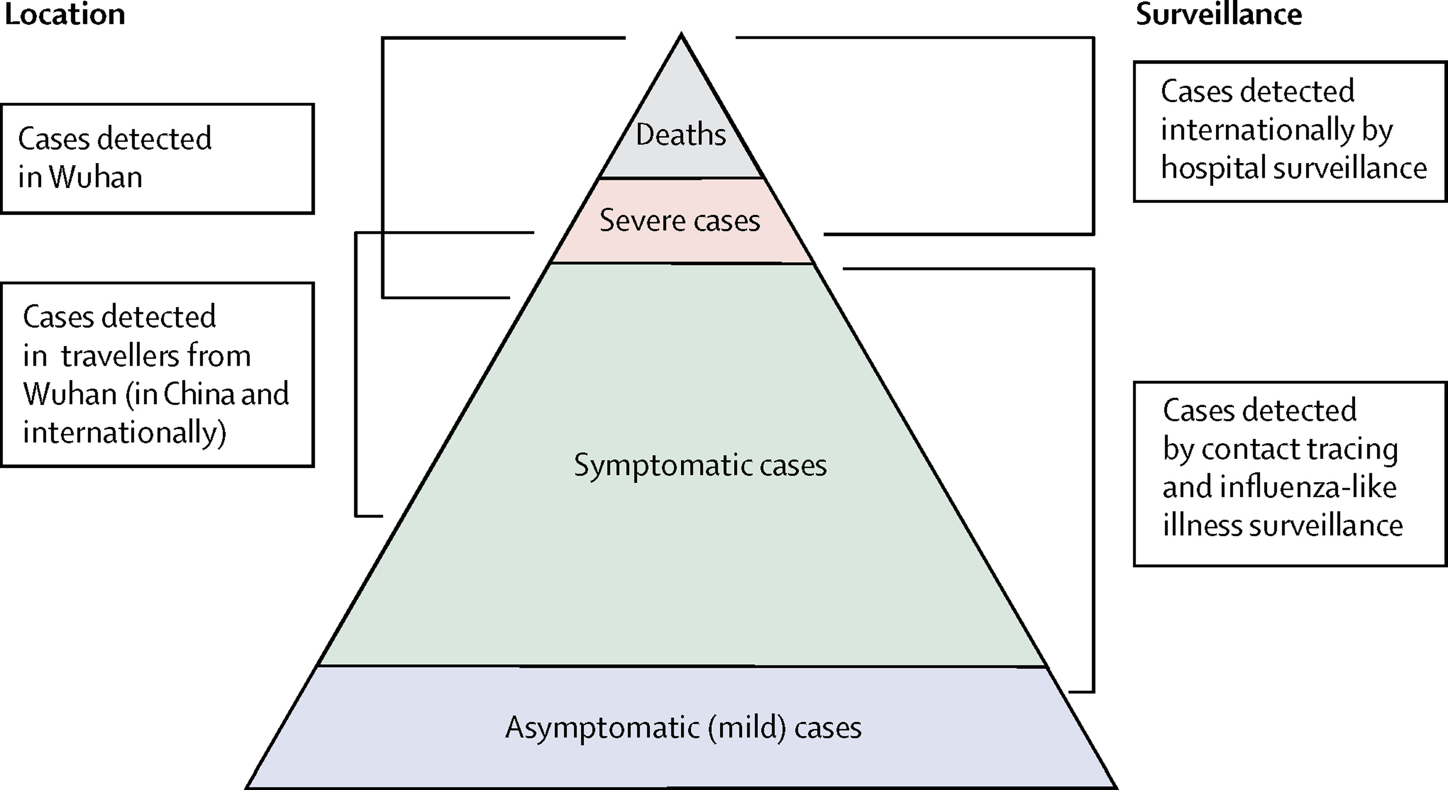
- At the top of the pyramid, those who met the WHO case criteria for severe or critical cases would likely have been identified in the hospital setting, presenting with atypical viral pneumonia. These cases would have been identified in mainland China and among those categorised internationally as local transmission.
- Many more cases are likely to be symptomatic (i.e., with fever, cough, or myalgia) but might not require hospitalisation. These cases would have been identified through links to international travel to high-risk areas and through contact-tracing of contacts of confirmed cases. They might be identifiable through population surveillance of, for example, influenza-like illness.
- The bottom part of the pyramid represents mild (and possibly asymptomatic) cases. These cases might be identifiable through contact tracing and subsequently via serological testing.
Naive CFR
We measure disease severity in terms of case fatality risk (CFR). The CFR is interpreted as the conditional probability of death given confirmed diagnosis, calculated as the ratio of the cumulative number of deaths \(D_{t}\) to the cumulative number of confirmed cases \(C_{t}\) at a certain time \(t\). We can refer it to the naive CFR (also crude or biased CFR, \(b_{t}\)):
\[ naive \, CFR = b_{t} = \frac{D_{t}}{C_{t}} \]
This calculation is naive because it tends to yield a biased and mostly underestimated CFR due to the time-delay from onset to death, only stabilising at the later stages of the outbreak.
To calculate the naive CFR, the cfr package requires an input data frame with three columns named:
datecasesdeaths
Let’s explore the ebola1976 dataset, included in {cfr},
which comes from the first Ebola outbreak in Zaire (now the Democratic
Republic of the Congo) in 1976, as analysed by Camacho et
al. (2014).
R
# Load the Ebola 1976 data provided with the {cfr} package
data("ebola1976")

# Plot the incidence of cases and death reports
ebola1976 %>%
  incidence2::incidence(
    date_index = "date",
    counts = c("cases", "deaths")
  ) %>%
  plot()
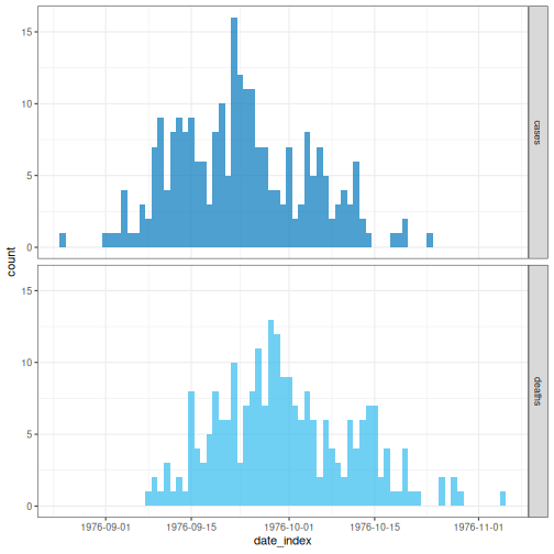
We’ll frame this episode under the context of an ongoing outbreak with only the first 30 days of data observed (chosen here for illustration, not a required step).
R
# Assume we only have the first 30 days of this data
ebola_30days <- ebola1976 %>%
  dplyr::slice_head(n = 30) %>%
  dplyr::as_tibble()

ebola_30days
OUTPUT
# A tibble: 30 × 3
   date       cases deaths
   <date>     <int>  <int>
 1 1976-08-25     1      0
 2 1976-08-26     0      0
 3 1976-08-27     0      0
 4 1976-08-28     0      0
 5 1976-08-29     0      0
 6 1976-08-30     0      0
 7 1976-08-31     0      0
 8 1976-09-01     1      0
 9 1976-09-02     1      0
10 1976-09-03     1      0
# ℹ 20 more rows
In a real-time analysis, always use the latest data available at the moment.
We need aggregated incidence data
cfr reads aggregated incidence data.
This input data should be aggregated by day, which means one observation per day, containing the daily number of reported cases and deaths. Observations with zero or missing values should also be included, as with all time-series data.
Also, cfr currently works for daily data only, but not for other temporal units of data aggregation, e.g., weeks.
When aggregating cases by day with incidence2, you can
adapt the data for cfr using
cfr::prepare_data() on <incidence2>
objects. For details and an example, consult the cfr
reference manual on preparing
common epidemiological data formats for CFR estimation.
When we apply cfr_static() to data
directly, we are calculating the naive CFR:
R
# Calculate the naive CFR for the first 30 days
cfr::cfr_static(data = ebola_30days)
OUTPUT
  severity_estimate severity_low severity_high
1         0.4740741    0.3875497     0.5617606
The naive CFR estimates the overall disease severity, given the latest data available at the moment, as 0.4740741 with a 95% confidence interval between 0.3875497 and 0.5617606.
Challenge
Download the file sarscov2_cases_deaths.csv and read it into R.
Estimate the naive CFR.
Inspect the format of the data input.
- Does it contain daily data?
- Do the column names match those required by
cfr_static()? - How would you rename the columns in a data frame?
We read the data input using readr::read_csv(). This
function recognises that the column date is a
<date> class vector.
R
# read data
# e.g.: if path to file is data/raw-data/ebola_cases.csv then:
sarscov2_input <-
  readr::read_csv(here::here("data", "raw-data", "sarscov2_cases_deaths.csv"))
R
# Inspect data
sarscov2_input
OUTPUT
# A tibble: 93 × 3
   date       cases_jpn deaths_jpn
   <date>         <dbl>      <dbl>
 1 2020-01-20         1          0
 2 2020-01-21         1          0
 3 2020-01-22         0          0
 4 2020-01-23         1          0
 5 2020-01-24         1          0
 6 2020-01-25         3          0
 7 2020-01-26         3          0
 8 2020-01-27         4          0
 9 2020-01-28         6          0
10 2020-01-29         7          0
# ℹ 83 more rows
We can use dplyr::rename() to adapt the external data to
fit the data input for cfr::cfr_static().
R
# Rename columns before estimating the naive CFR
sarscov2_input %>%
  dplyr::rename(
    cases = cases_jpn,
    deaths = deaths_jpn
  ) %>%
  cfr::cfr_static()
OUTPUT
  severity_estimate severity_low severity_high
1        0.01895208   0.01828832    0.01963342
The naive CFR estimates the overall disease severity, given the latest data available at the moment, as 0.0189521 with a 95% confidence interval between 0.0182883 and 0.0196334.
Biases that affect CFR estimation
Two biases that affect CFR estimation
Lipsitch et al., 2015 describe two potential biases that can affect the estimation of CFR (and their potential solutions):
For diseases with a spectrum of clinical presentations, those cases that come to the attention of public health authorities and are registered into surveillance databases will typically be people with the most severe symptoms who seek medical care, are admitted to a hospital, or die.
Therefore, the CFR will typically be higher among detected cases than among the entire population of cases, given that the latter may include individuals with mild, subclinical, and (under some definitions of “case”) asymptomatic presentations.
During an ongoing epidemic, there is a delay between the time someone dies and the time their death is reported. Therefore, at any given moment in time, the list of cases includes people who will die and whose death has not yet occurred or has occurred but not yet been reported. Thus, dividing the cumulative number of reported deaths by the cumulative number of reported cases at a specific time point during an outbreak will underestimate the true CFR.
The key determinants of the magnitude of the bias are the epidemic growth rate and the distribution of delays from case-reporting to death-reporting; the longer the delays and the faster the growth rate, the greater the bias.
In this tutorial episode, we are going to focus on solutions to deal with this specific bias using cfr!
Improving an early epidemiological assessment of a delay-adjusted CFR is crucial for determining virulence, shaping the level and choices of public health intervention, and providing advice to the general public.
In 2009, during the swine-flu outbreak caused by Influenza A (H1N1), Mexico had an early biased estimation of the CFR. Initial reports from the government of Mexico suggested a virulent infection, whereas, in other countries, the same virus was perceived as mild (TIME, 2009).
In the USA and Canada, no deaths were attributed to the virus in the first ten days following the World Health Organization’s declaration of a public health emergency. Even under similar circumstances at the early stage of the global pandemic, public health officials, policymakers and the general public want to know the virulence of an emerging infectious agent.
Garske et al., 2009 assess the challenges to estimate the severity of this pandemic, emphasising that accurately capturing the cases for the denominator can improve the capacity to obtain informative CFR estimates.
We can showcase this last bias using the concept
described in this {cfr} vignette.
Delay-adjusted CFR
Nishiura et al., 2009 developed a method that considers the time delay from the onset of symptoms to death.
Real-time outbreaks may have a number of deaths that are insufficient to determine the time distribution between onset and death. Therefore, we can estimate the distribution delay from historical outbreaks or reuse the ones accessible via R packages like epiparameter or epireview, which collect them from published scientific literature. For a step-by-step guide, read the tutorial episode on how to access epidemiological delays.
Let’s use epiparameter:
R
# Get delay distribution
onset_to_death_ebola <- epiparameter::epiparameter_db(
  disease = "Ebola",
  epi_name = "onset_to_death",
  single_epiparameter = TRUE
)

# Plot <epiparameter> object
plot(onset_to_death_ebola, xlim = c(0, 40))
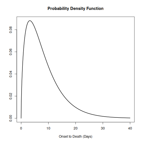
To calculate the delay-adjusted CFR, we can use the
cfr_static() function with the data and
delay_density arguments.
R
# Calculate the delay-adjusted CFR
# for the first 30 days
cfr::cfr_static(
  data = ebola_30days,
  delay_density = function(x) density(onset_to_death_ebola, x)
)
OUTPUT
  severity_estimate severity_low severity_high
1            0.9502        0.881        0.9861
The delay-adjusted CFR estimates the overall disease severity, given the latest data available at the moment, as 0.9502 with a 95% confidence interval between 0.881 and 0.9861, substantially higher than the naive estimate. This larger value reflects the correction for deaths that are still to be reported among the cases observed in the first 30 days.
How does {cfr} work?
If you want to gain familiarity and learn how delays are accounted for when estimating CFR, you can read the episode on How to adjust the CFR for delays in the “More Resources” section of this tutorial’s website.
First, read the guide on How to adjust the CFR for delays. Optionally, review the definition of a probability density function (PDF) in the episode on Use delay distributions in analysis.
You will find that the core calculation is to get the total
expected number of cases with known outcomes by time
t. This is to account for the fact that some
fraction of recent cases haven’t had time to resolve to death/recovery
yet. It is expressed by the term:
\[ \sum_{i = 0}^t\sum_{j = 0}^\infty c_i f_{j - i} \]
where:
- \(c_i\) is the number of new confirmed cases on day i
- \(f_s\) the conditional probability density function for the delay of \(s\) days, from onset to death, given death.
It sums the incident cases \(c_i\) over all onset days \(i\) up to \(t\), and for each one, weights it by \(f_{j-i}\), the probability of the outcome becoming known on day \(j\), summed over all days \(j\).
For each day i, cfr computes the
expected number of outcomes arising from that day’s
newly observed incident cases: the outcomes expected “at” day
i. These per-day expected outcomes are then summed
cumulatively across the full history up to time t to obtain
the total expected number of outcomes “by” time
t.
First step: the expected number of outcomes at day i
When using <epiparameter> class objects, the
function density() can be applied to obtain the
corresponding probability density function for incident cases “at” day
i.
For example, at day 0, the expected outcomes are equal to:
- \(c_0 \times (f_0)\): the number of incident cases on day 0 times the density at day 0.
R
# By Day 0, the expected outcomes are:
ebola_30days$cases[1] *
  density(onset_to_death_ebola, at = 0)
OUTPUT
[1] 0Notice that ebola_30days$cases[1] represent the number
of incident cases on day 0 to fit the notation from the
equation above.
At day 1, the expected outcomes are equal to:
- \(c_0 \times (f_1)\): the number of incident cases on day 0 times the density at day 1, plus
- \(c_1 \times (f_0)\): the number of incident cases on day 1 times the density at day 0.
R
# By Day 1, the expected outcomes are:
ebola_30days$cases[1] *
  density(onset_to_death_ebola, at = 1) +
  ebola_30days$cases[2] *
    density(onset_to_death_ebola, at = 0)
OUTPUT
[1] 0.06495664At day 2, the expected outcomes are equal to:
- \(c_0 \times (f_2)\): the number of incident cases on day 0 times the density at day 2, plus
- \(c_1 \times (f_1)\): the number of incident cases on day 1 times the density at day 1, plus
- \(c_2 \times (f_0)\): the number of incident cases on day 2 times the density at day 0.
R
# By Day 3, the expected outcomes are:
ebola_30days$cases[1] *
  density(onset_to_death_ebola, at = 2) +
  ebola_30days$cases[2] *
    density(onset_to_death_ebola, at = 1) +
  ebola_30days$cases[3] *
    density(onset_to_death_ebola, at = 0)
OUTPUT
[1] 0.08295091Notice that the delay index shifts by one day at a time: the most recent cases (day \(t\)) are weighted by \(f_0\), the previous day’s cases by \(f_1\), and so on, with each earlier day moving one step further along the delay distribution.
Since the input value in at varies by day for incident
cases of a given day (at = 0, at = 1,
at = 2, …), the density() needs to be
expressed as a function of x. cfr will then
draw values accordingly, as shown below:
R
# {cfr} uses the density of the distribution at different values of x
function(x) density(onset_to_death_ebola, at = x)
Internally, for the first 3 days (day 0, day 1, and day 2), the
function cfr::estimate_outcomes() performs this
calculation:
R
cfr::estimate_outcomes(
  data = ebola_30days,
  delay_density = function(x) density(onset_to_death_ebola, at = x)
) %>%
  slice_head(n = 3) %>%
  pull(estimated_outcomes)
OUTPUT
[1] 0.00000000 0.06495664 0.08295091The values printed above are estimate_outcomes for the
corresponding day.
Second step: the total expected number of outcomes “by” time t
These per-day expected outcomes are then summed cumulatively across
the full history up to time t to obtain the total
expected number of outcomes “by” time t.
By day 2, the total expected outcomes are equal to:
- \(c_0 \times (f_0 + f_1 + f_2)\): expected outcomes from day 0’s incident cases, by day 2
- \(c_1 \times (f_0 + f_1)\): expected outcomes from day 1’s incident cases, by day 2
- \(c_2 \times (f_0)\): expected outcomes from day 2’s incident cases, by day 2
Summing these terms gives the total expected outcomes by day 2. This
match the double summation shown above. This total is used to calculate
the underestimation factor (u_t), the
fraction of cases whose outcomes are already known.
Use the epiparameter class
When using an <epiparameter> class object we can
use this expression as a template:
function(x) density(<EPIPARAMETER_OBJECT>, x)
For distribution functions with parameters not available in epiparameter, we suggest two alternatives:
Create an
<epiparameter>class object, to plug into other R packages of the outbreak analytics pipeline. Read the reference documentation ofepiparameter::epiparameter()Read cfr vignette for a primer on working with delay distributions.
For cfr_static() and all functions in the
cfr_*() family, the most appropriate distributions to use
are discrete ones. This is because cfr
operates on count data in discrete time: daily case and death
counts.
We can assume that evaluating the Probability Density Function (PDF) of a continuous distribution is equivalent to the Probability Mass Function (PMF) of the equivalent discrete distribution.
However, this assumption may not be appropriate for distributions
with larger peaks. For instance, diseases with an onset-to-death
distribution that is strongly peaked with a low variance. In such cases,
the average disparity between the PDF and PMF is expected to be more
pronounced compared to distributions with broader spreads. One way to
deal with this is to discretise the continuous distribution using
epiparameter::discretise() to an
<epiparameter> object.
R
onset_to_death_ebola %>%
  epiparameter::discretise() %>%
  plot(xlim = c(0, 40))

Challenge
Use the same file from the previous challenge (sarscov2_cases_deaths.csv).
Estimate the delay-adjusted CFR using the appropriate distribution delay. Then:
- Compare the naive and the delay-adjusted CFR solutions!
- Find the appropriate
<epiparameter>object!
We use epiparameter to access a delay distribution for the SARS-CoV-2 aggregated incidence data:
R
library(epiparameter)

sarscov2_delay <-
  epiparameter::epiparameter_db(
    disease = "covid",
    epi_name = "onset to death",
    single_epiparameter = TRUE
  )
We read the data input using readr::read_csv(). This
function recognises that the column date is a
<date> class vector.
R
# read data
# e.g.: if path to file is data/raw-data/ebola_cases.csv then:
sarscov2_input <-
  readr::read_csv(here::here("data", "raw-data", "sarscov2_cases_deaths.csv"))
R
# Inspect data
sarscov2_input
OUTPUT
# A tibble: 93 × 3
   date       cases_jpn deaths_jpn
   <date>         <dbl>      <dbl>
 1 2020-01-20         1          0
 2 2020-01-21         1          0
 3 2020-01-22         0          0
 4 2020-01-23         1          0
 5 2020-01-24         1          0
 6 2020-01-25         3          0
 7 2020-01-26         3          0
 8 2020-01-27         4          0
 9 2020-01-28         6          0
10 2020-01-29         7          0
# ℹ 83 more rows
We can use the dplyr::rename() to adapt the external
data to fit the data input for cfr_static().
R
# Rename columns before estimating the delay-adjusted CFR
sarscov2_input %>%
  dplyr::rename(
    cases = cases_jpn,
    deaths = deaths_jpn
  ) %>%
  cfr::cfr_static(
    delay_density = function(x) density(sarscov2_delay, x)
  )
OUTPUT
  severity_estimate severity_low severity_high
1            0.0734        0.071        0.0759
Task: Interpret the comparison between the naive and delay-adjusted CFR estimates.
An early-stage CFR estimate
The naive estimate is useful to get an overall severity estimate of the outbreak (so far). Once the outbreak has ended or has progressed such that more deaths are reported, the estimated CFR is then closest to the ‘true’ unbiased CFR.
On the other hand, the delay-adjusted estimate can assess the severity of an emerging infectious disease earlier in an outbreak given a more reliable assessment of the severity than the naive CFR.
We can explore the early determination of the
delay-adjusted CFR using the cfr_rolling()
function.
cfr_rolling() is a utility function that automatically
calculates CFR for each day of the outbreak with the data available up
to that day, saving the user time.
cfr_rolling() shows the estimated CFR on each outbreak
day, given that future data on cases and deaths is unavailable at the
time. The final value of cfr_rolling() estimates is
identical to cfr_static() on the same data.
R
# for all the 73 days in the Ebola dataset
# Calculate the rolling daily naive CFR
rolling_cfr_naive <- cfr::cfr_rolling(data = ebola1976)
OUTPUT
`cfr_rolling()` is a convenience function to help understand how additional data influences the overall (static) severity. Use `cfr_time_varying()` instead to estimate severity changes over the course of the outbreak.R
# for all the 73 days in the Ebola dataset
# Calculate the rolling daily delay-adjusted CFR
rolling_cfr_adjusted <- cfr::cfr_rolling(
  data = ebola1976,
  delay_density = function(x) density(onset_to_death_ebola, x)
)
OUTPUT
`cfr_rolling()` is a convenience function to help understand how additional data influences the overall (static) severity. Use `cfr_time_varying()` instead to estimate severity changes over the course of the outbreak.OUTPUT
Some daily ratios of total deaths to total cases with known outcome are below 0.01%: some CFR estimates may be unreliable.FALSEWith utils::tail(), we view the latest CFR estimates.
The naive and delay-adjusted estimates have overlapping ranges of 95%
confidence intervals.
R
# Print the tail of the data frame
utils::tail(rolling_cfr_naive)
utils::tail(rolling_cfr_adjusted)
Now, let’s visualise both results in a time series. How would the naive and delay-adjusted CFR estimates perform in real time?
R
# bind by rows both output data frames
dplyr::bind_rows(
  list(
    naive = rolling_cfr_naive,
    adjusted = rolling_cfr_adjusted
  ),
  .id = "method"
) %>%
  # visualise both adjusted and unadjusted rolling estimates
  ggplot() +
  geom_ribbon(
    aes(
      date,
      ymin = severity_low,
      ymax = severity_high,
      fill = method
    ),
    alpha = 0.2, show.legend = FALSE
  ) +
  geom_line(
    aes(date, severity_estimate, colour = method)
  )
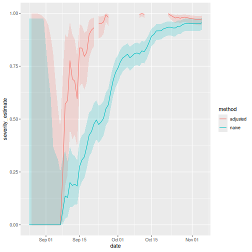
The red and blue lines represent the delay-adjusted and naive CFR, respectively, throughout the outbreak. The bands around them represent the 95% confidence intervals (95% CI).
Notice that this delay-adjusted calculation is particularly useful when an epidemic curve of confirmed cases is the only data available (i.e. when individual data from onset to death are unavailable, especially during the early stage of the epidemic). When there are few deaths or none at all, an assumption has to be made for the delay distribution from onset to death, e.g. from literature based on previous outbreaks. Nishiura et al., 2009 depict this in the figures with data from the SARS outbreak in Hong Kong, 2003.
Figures A and B show the cumulative numbers of cases and deaths of SARS, and Figure C shows the observed (biased) CFR estimates as a function of time, i.e. the cumulative number of deaths over cases at time \(t\). Due to the delay from the onset of symptoms to death, the biased estimate of CFR at time \(t\) underestimates the realised CFR at the end of an outbreak (i.e. 302/1755 = 17.2 %).
Nevertheless, even by only using the observed data for the period
March 19 to April 2, cfr_static() can yield an appropriate
prediction (Figure D), e.g. the delay-adjusted CFR at March 27 is 18.1 %
(95% CI: 10.5, 28.1). An overestimation is seen in the very early stages
of the epidemic, but the 95% confidence limits in the later stages
include the realised CFR (i.e. 17.2 %).
Interpret the early-stage CFR estimate
Based on the figure above of the naive and adjusted rolling CFR:
- How many days apart are the dates on which the 95% CI of the delay-adjusted CFR and the 95% CI of the naive CFR each first cross the CFR estimated at the end of the outbreak?
Discuss:
- What are the Public health policy implications of having a delay-adjusted CFR estimate?
We can either use a visual inspection or analyse the output data frames.
The CFR estimated at the end of the outbreak is:
R
utils::tail(rolling_cfr_naive, n = 1)
OUTPUT
         date severity_estimate severity_low severity_high
73 1976-11-05 0.955102 0.9210866 0.9773771There is almost one month of difference.
Note that the estimate has considerable uncertainty at the beginning of the time series. After two weeks, the delay-adjusted CFR approaches the overall CFR estimate at the outbreak’s end.
Is this pattern similar to other outbreaks? We can use the data sets in this episode’s challenges. We invite you to find it out!
Checklist
With cfr, we estimate the CFR as the proportion of deaths among confirmed cases.
By only using confirmed cases, it is clear that all cases that do not seek medical treatment or are not notified will be missed, as well as all asymptomatic cases. This means that the CFR estimate is higher than the proportion of deaths among the infected.
cfr method aims to obtain an unbiased estimator “well before” observing the entire course of the outbreak. For this, cfr uses the underestimation factor \(u_{t}\) to estimate the unbiased CFR \(p_{t}\) using maximum-likelihood methods, given the sampling process defined by Nishiura et al., 2009.
From aggregated incidence data, at time \(t\) we know the cumulative number of confirmed cases and deaths, \(C_{t}\) and \(D_{t}\), and wish to estimate the unbiased CFR \(\pi\), by way of the factor of underestimation \(u_{t}\).
If we knew the factor of underestimation \(u_{t}\) we could specify the size of the population of confirmed cases no longer at risk (\(u_{t}C_{t}\), shaded), although we do not know which surviving individuals belong to this group. A proportion \(\pi\) of those in the group of cases still at risk (size \((1- u_{t})C_{t}\), unshaded) is expected to die.
Because each case no longer at risk had an independent probability of dying, \(\pi\), the number of deaths, \(D_{t}\), is a sample from a binomial distribution with sample size \(u_{t}C_{t}\), and probability of dying \(p_{t}\) = \(\pi\).
This is represented by the following likelihood function to obtain the maximum likelihood estimate of the unbiased CFR \(p_{t}\) = \(\pi\):
\[ {\sf L}(\pi | C_{t},D_{t},u_{t}) = \log{\dbinom{u_{t}C_{t}}{D_{t}}} + D_{t} \log{\pi} + (u_{t}C_{t} - D_{t})\log{(1 - \pi)}, \]
This estimation is performed by the internal function
?cfr:::estimate_severity().
- The delay-adjusted CFR does not address all sources of error in data like the underdiagnosis of infected individuals.
Challenges
Aggregated data differ from linelists
Aggregated incidence data differs from linelist data, where each observation contains individual-level data.
R
outbreaks::ebola_sierraleone_2014 %>% as_tibble()
OUTPUT
# A tibble: 11,903 × 8
      id   age sex   status    date_of_onset date_of_sample district chiefdom
   <int> <dbl> <fct> <fct>     <date>        <date>         <fct>    <fct>
 1     1    20 F     confirmed 2014-05-18    2014-05-23     Kailahun Kissi Teng
 2     2    42 F     confirmed 2014-05-20    2014-05-25     Kailahun Kissi Teng
 3     3    45 F     confirmed 2014-05-20    2014-05-25     Kailahun Kissi Tonge
 4     4    15 F     confirmed 2014-05-21    2014-05-26     Kailahun Kissi Teng
 5     5    19 F     confirmed 2014-05-21    2014-05-26     Kailahun Kissi Teng
 6     6    55 F     confirmed 2014-05-21    2014-05-26     Kailahun Kissi Teng
 7     7    50 F     confirmed 2014-05-21    2014-05-26     Kailahun Kissi Teng
 8     8     8 F     confirmed 2014-05-22    2014-05-27     Kailahun Kissi Teng
 9     9    54 F     confirmed 2014-05-22    2014-05-27     Kailahun Kissi Teng
10    10    57 F     confirmed 2014-05-22    2014-05-27     Kailahun Kissi Teng
# ℹ 11,893 more rowsHow to rearrange my input data?
Rearranging the input data for data analysis can take most of the time. To get ready-to-analyse aggregated incidence data, we encourage you to use incidence2!
First, in the Get
started vignette from the incidence2 package, explore
how to use the date_index argument when reading a linelist
with dates in multiple column.
Then, refer to the cfr reference manual on Prepare
common epidemiological data formats for CFR estimation on how to use
the cfr::prepare_data() function from incidence2
objects.
R
# Load packages
library(cfr)
library(epiparameter)
library(incidence2)
library(outbreaks)
library(tidyverse)

# Access delay distribution
mers_delay <- epiparameter::epiparameter_db(
  disease = "mers",
  epi_name = "onset to death",
  single_epiparameter = TRUE
)

# Read linelist
mers_korea_2015$linelist %>%
  as_tibble() %>%
  select(starts_with("dt_"))
OUTPUT
# A tibble: 162 × 6
   dt_onset   dt_report  dt_start_exp dt_end_exp dt_diag    dt_death
   <date>     <date>     <date>       <date>     <date>     <date>
 1 2015-05-11 2015-05-19 2015-04-18   2015-05-04 2015-05-20 NA
 2 2015-05-18 2015-05-20 2015-05-15   2015-05-20 2015-05-20 NA
 3 2015-05-20 2015-05-20 2015-05-16   2015-05-16 2015-05-21 2015-06-04
 4 2015-05-25 2015-05-26 2015-05-16   2015-05-20 2015-05-26 NA
 5 2015-05-25 2015-05-27 2015-05-17   2015-05-17 2015-05-26 NA
 6 2015-05-24 2015-05-28 2015-05-15   2015-05-17 2015-05-28 2015-06-01
 7 2015-05-21 2015-05-28 2015-05-16   2015-05-17 2015-05-28 NA
 8 2015-05-26 2015-05-29 2015-05-15   2015-05-15 2015-05-29 NA
 9 NA         2015-05-29 2015-05-15   2015-05-17 2015-05-29 NA
10 2015-05-21 2015-05-29 2015-05-16   2015-05-16 2015-05-29 NA
# ℹ 152 more rows
R
# Use {incidence2} to count daily incidence
mers_incidence <- mers_korea_2015$linelist %>%
  # convert to incidence2 object
  incidence(date_index = c("dt_onset", "dt_death")) %>%
  # complete dates from first to last
  incidence2::complete_dates()

# Inspect incidence2 output
mers_incidence
OUTPUT
# incidence:  72 x 3
# count vars: dt_death, dt_onset
   date_index count_variable count
   <date>     <chr>          <int>
 1 2015-05-11 dt_death           0
 2 2015-05-11 dt_onset           1
 3 2015-05-12 dt_death           0
 4 2015-05-12 dt_onset           0
 5 2015-05-13 dt_death           0
 6 2015-05-13 dt_onset           0
 7 2015-05-14 dt_death           0
 8 2015-05-14 dt_onset           0
 9 2015-05-15 dt_death           0
10 2015-05-15 dt_onset           0
# ℹ 62 more rows
R
# Prepare data from {incidence2} to {cfr}
mers_incidence %>%
  cfr::prepare_data(
    cases_variable = "dt_onset",
    deaths_variable = "dt_death"
  )
OUTPUT
         date deaths cases
1  2015-05-11      0     1
2  2015-05-12      0     0
3  2015-05-13      0     0
4  2015-05-14      0     0
5  2015-05-15      0     0
6  2015-05-16      0     0
7  2015-05-17      0     1
8  2015-05-18      0     1
9  2015-05-19      0     0
10 2015-05-20      0     5
11 2015-05-21      0     6
12 2015-05-22      0     2
13 2015-05-23      0     4
14 2015-05-24      0     2
15 2015-05-25      0     3
16 2015-05-26      0     1
17 2015-05-27      0     2
18 2015-05-28      0     1
19 2015-05-29      0     3
20 2015-05-30      0     5
21 2015-05-31      0    10
22 2015-06-01      2    16
23 2015-06-02      0    11
24 2015-06-03      1     7
25 2015-06-04      1    12
26 2015-06-05      1     9
27 2015-06-06      0     7
28 2015-06-07      0     7
29 2015-06-08      2     6
30 2015-06-09      0     1
31 2015-06-10      2     6
32 2015-06-11      1     3
33 2015-06-12      0     0
34 2015-06-13      0     2
35 2015-06-14      0     0
36 2015-06-15      0     1
R
# Estimate delay-adjusted CFR
mers_incidence %>%
  cfr::prepare_data(
    cases_variable = "dt_onset",
    deaths_variable = "dt_death"
  ) %>%
  cfr::cfr_static(delay_density = function(x) density(mers_delay, x))
OUTPUT
  severity_estimate severity_low severity_high
1 0.1377 0.0716 0.2288Severity heterogeneity
The CFR may differ across populations (e.g. age, space, treatment); quantifying these heterogeneities can help target resources appropriately and compare different care regimens (Cori et al., 2017).
Use the cfr::covid_data data frame to estimate a
delay-adjusted CFR stratified by country.
One way to do a stratified analysis is to apply a model to
nested data. This {tidyr}
vignette shows you how to apply the group_by() +
nest() to nest data, and then mutate() +
map() to apply the model.
R
library(cfr)
library(epiparameter)
library(tidyverse)

covid_data %>% glimpse()
OUTPUT
Rows: 20,786
Columns: 4
$ date    <date> 2020-01-03, 2020-01-03, 2020-01-03, 2020-01-03, 2020-01-03, 2…
$ country <chr> "Argentina", "Brazil", "Colombia", "France", "Germany", "India…
$ cases   <dbl> 0, 0, 0, 0, 0, 0, 0, 0, 0, 0, 0, 0, 0, 0, 0, 0, 0, 0, 0, 0, 0,…
$ deaths  <dbl> 0, 0, 0, 0, 0, 0, 0, 0, 0, 0, 0, 0, 0, 0, 0, 0, 0, 0, 0, 0, 0,…
R
delay_onset_death <-
  epiparameter::epiparameter_db(
    disease = "covid",
    epi_name = "onset to death",
    single_epiparameter = TRUE
  )

covid_data %>%
  group_by(country) %>%
  nest() %>%
  mutate(
    temp =
      map(
        .x = data,
        .f = cfr::cfr_static,
        delay_density = function(x) density(delay_onset_death, x)
      )
  ) %>%
  unnest(cols = temp)
OUTPUT
# A tibble: 19 × 5
# Groups:   country [19]
   country        data     severity_estimate severity_low severity_high
   <chr>          <list>               <dbl>        <dbl>         <dbl>
 1 Argentina      <tibble>            0.0133       0.0133        0.0133
 2 Brazil         <tibble>            0.0195       0.0195        0.0195
 3 Colombia       <tibble>            0.0225       0.0224        0.0226
 4 France         <tibble>            0.0044       0.0044        0.0044
 5 Germany        <tibble>            0.0045       0.0045        0.0045
 6 India          <tibble>            0.0119       0.0119        0.0119
 7 Indonesia      <tibble>            0.024        0.0239        0.0241
 8 Iran           <tibble>            0.0191       0.0191        0.0192
 9 Italy          <tibble>            0.0075       0.0075        0.0075
10 Mexico         <tibble>            0.0461       0.046         0.0462
11 Peru           <tibble>            0.0502       0.0501        0.0504
12 Poland         <tibble>            0.0186       0.0186        0.0187
13 Russia         <tibble>            0.0182       0.0182        0.0182
14 South Africa   <tibble>            0.0254       0.0253        0.0255
15 Spain          <tibble>            0.0087       0.0087        0.0087
16 Turkey         <tibble>            0.006        0.006         0.006
17 Ukraine        <tibble>            0.0204       0.0203        0.0205
18 United Kingdom <tibble>            0.009        0.009         0.009
19 United States  <tibble>            0.0111       0.0111        0.0111
Great! Now you can use similar code for any other stratified analysis like age, regions or more!
But, how can we interpret that there is a country variability of severity from the same diagnosed pathogen?
Local factors like testing capacity, the case definition, and sampling regime can affect the report of cases and deaths, thus affecting case ascertainment. Take a look to the cfr vignette on Estimating the proportion of cases that are ascertained during an outbreak!
Appendix
The cfr package has a function called
cfr_time_varying() with functionality that differs from
cfr_rolling().
When to use cfr_rolling()?
cfr_rolling() shows the estimated CFR on each outbreak
day, given that future data on cases and deaths is unavailable at the
time. The final value of cfr_rolling() estimates is
identical to cfr_static() on the same data.
Remember, as shown above, cfr_rolling() is helpful to
get early-stage CFR estimates and check whether an outbreak’s CFR
estimate has stabilised. Thus, cfr_rolling() is not
sensitive to the length or size of the epidemic.
When to use
cfr_time_varying()?
On the other hand, cfr_time_varying() calculates the CFR
over a moving window and helps to understand changes in CFR due to
changes in the epidemic, e.g. due to a new variant or increased immunity
from vaccination.
However, cfr_time_varying() is sensitive to sampling
uncertainty. Thus, it is sensitive to the size of the outbreak. The
higher the number of cases with expected outcomes on a given day, the
more reasonable estimates of the time-varying CFR we will get.
For example, with 100 cases, the fatality risk estimate will, roughly
speaking, have a 95% confidence interval ±10% of the mean estimate
(binomial CI). So if we have >100 cases with expected outcomes on
a given day, we can get reasonable estimates of the time varying
CFR. But if we only have >100 cases over the course of the whole
epidemic, we probably need to rely on cfr_rolling()
that uses the cumulative data.
We invite you to read this vignette
about the cfr_time_varying() function.
More severity measures
Suppose we need to assess the clinical severity of the epidemic in a context different from surveillance data, like the severity among cases that arrive at hospitals or cases you collected from a representative serological survey.
Using cfr, we can change the inputs for the numerator
(cases) and denominator (deaths) to estimate
more severity measures like the Infection fatality risk (IFR) or the
Hospitalisation Fatality Risk (HFR). We can follow this analogy:
If for a Case fatality risk (CFR), we require:
- case and death incidence data, with a
- case-to-death delay distribution (or close approximation, such as symptom onset-to-death).
Then, the Infection fatality risk (IFR) requires:
- infection and death incidence data, with an
- exposure-to-death delay distribution (or close approximation).
Similarly, the Hospitalisation Fatality Risk (HFR) requires:
- hospitalisation and death incidence data, and a
- hospitalisation-to-death delay distribution.
Yang et al., 2020 summarises different definitions and data sources:
- sCFR symptomatic case-fatality risk,
- sCHR symptomatic case-hospitalisation risk,
- mCFR medically attended case-fatality risk,
- mCHR medically attended case-hospitalisation risk,
- HFR hospitalisation-fatality risk.
Use cfr to estimate severity
Use
cfr_static()to estimate the overall CFR with the latest data available.Use
cfr_rolling()to show what the estimated CFR would be on each day of the outbreak.Use the
delay_densityargument to adjust the CFR by the corresponding delay distribution.
Content from Account for superspreading
Last updated on 2026-07-02 | Edit this page
Estimated time: 32 minutes
Overview
Questions
- How can we estimate individual-level variation in transmission (i.e. superspreading potential) from contact tracing data?
- What are the implications for variation in transmission for decision-making?
Objectives
- Estimate the distribution of onward transmission from infected individuals (i.e. offspring distribution) from outbreak data using epicontacts.
- Estimate the extent of individual-level variation (i.e. the dispersion parameter) of the offspring distribution using fitdistrplus.
- Estimate the proportion of transmission that is linked to ‘superspreading events’ using superspreading.
Learners should familiarise themselves with following concept dependencies before working through this tutorial:
Statistics: common probability distributions, particularly Poisson and negative binomial.
Epidemic theory: The reproduction number, R.
R packages installed: epicontacts, fitdistrplus, superspreading, outbreaks, tidyverse.
Install packages if they are not already installed
R
if (!base::require("pak")) install.packages("pak")
pak::pak(c("epicontacts", "fitdistrplus", "superspreading", "outbreaks", "tidyverse"))
If you have any error message, go to the main setup page.
Introduction
From smallpox to severe acute respiratory syndrome coronavirus 2 (SARS-CoV-2), some infected individuals spread infection to more people than others. Disease transmission is the result of a combination of biological and social factors, and these factors average out to some extent at the population level during a large epidemic. Hence researchers often use population averages to assess the potential for disease to spread. However, in the earlier or later phases of an outbreak, individual differences in infectiousness can be more important. In particular, they increase the chance of superspreading events (SSEs), which can ignite explosive epidemics and also influence the chances of controlling transmission (Lloyd-Smith et al., 2005).
The basic reproduction number, \(R_{0}\), measures the average number of cases caused by one infectious individual in a entirely susceptible population. Estimates of \(R_{0}\) are useful for understanding the average dynamics of an epidemic at the population-level, but can obscure considerable individual variation in infectiousness. This was highlighted during the global emergence of SARS-CoV-2 by numerous ‘superspreading events’ in which certain infectious individuals generated unusually large numbers of secondary cases (Leclerc et al., 2020).
In this tutorial, we are going to quantify individual variation in transmission, and hence estimate the potential for superspreading events. Then we are going to use these estimates to explore the implications of superspreading for contact tracing interventions.
We are going to use data from the outbreaks package, manage the linelist and contacts data using epicontacts, and estimate distribution parameters with fitdistrplus. Lastly, we are going to use superspreading to explore the implications of variation in transmission for decision-making.
We’ll use the pipe %>% to connect some of the
functions from these packages, so let’s also call the
tidyverse package.
R
library(outbreaks)
library(epicontacts)
library(fitdistrplus)
library(superspreading)
library(tidyverse)
The double-colon
The double-colon :: in R lets you call a specific
function from a package without loading the entire package into the
current environment. The package must be installed.
For example, dplyr::filter(data, condition) uses
filter() from the dplyr package.
This help us remember package functions and avoid namespace conflicts.
The individual reproduction number
The individual reproduction number is defined as the number of secondary cases caused by a particular infected individual.
Early in an outbreak we can use contact data to reconstruct transmission chains (i.e. who infected whom) and calculate the number of secondary cases generated by each individual. This reconstruction of linked transmission events from contact data can provide an understanding about how different individuals have contributed to transmission during an epidemic (Cori et al., 2017).
Let’s practice this using the mers_korea_2015 linelist
and contact data from the outbreaks package and integrate
them with the epicontacts package to calculate the
distribution of secondary cases during the 2015 MERS-CoV outbreak in
South Korea (Campbell,
2022):
R
## first, make an epicontacts object
epi_contacts <-
  epicontacts::make_epicontacts(
    linelist = outbreaks::mers_korea_2015$linelist,
    contacts = outbreaks::mers_korea_2015$contacts,
    directed = TRUE
  )
With the argument directed = TRUE we configure a
directed graph. These directions incorporate our hypothesis of the
infector-infectee pair: from the probable source
patient to the secondary case.
R
# visualise contact network
plot(epi_contacts)
Contact data from a transmission chain can provide information on
which infected individuals came into contact with others. We expect to
have the infector (from) and the infectee (to)
plus additional columns of variables related to their contact, such as
location (exposure) and date of contact.
Following tidy data principles, the observation unit in our contact data frame is the infector-infectee pair. Although one infector can infect multiple infectees, from contact tracing investigations we may record contacts linked to more than one infector (e.g. within a household). But we should expect to have unique infector-infectee pairs, because typically each infected person will have acquired the infection from one other.
To ensure these unique pairs, we can check on replicates for infectees:
R
# no infector-infectee pairs are replicated
epi_contacts %>%
  purrr::pluck("contacts") %>%
  dplyr::group_by(to) %>%
  dplyr::filter(dplyr::n() > 1)
OUTPUT
# A tibble: 5 × 4
# Groups:   to [2]
  from  to     exposure       diff_dt_onset
  <chr> <chr>  <fct>                  <int>
1 SK_16 SK_107 Emergency room            17
2 SK_87 SK_107 Emergency room             2
3 SK_14 SK_39  Hospital room             16
4 SK_11 SK_39  Hospital room             13
5 SK_12 SK_39  Hospital room             12
Our goal is to get the number of secondary cases caused by the observed infected individuals. In the contact data frame, when each infector-infectee pair is unique, the number of rows per infector corresponds to the number of secondary cases generated by that individual.
R
# count secondary cases per infector in contacts
epi_contacts %>%
  purrr::pluck("contacts") %>%
  dplyr::count(from, name = "secondary_cases")
OUTPUT
     from secondary_cases
1    SK_1              26
2   SK_11               1
3  SK_118               1
4   SK_12               1
5  SK_123               1
6   SK_14              38
7   SK_15               4
8   SK_16              21
9    SK_6               2
10  SK_76               2
11  SK_87               1
But this output only contains the number of secondary cases for
reported infectors in the contact data, not for all the
individuals in the whole <epicontacts> object.
Instead, from epicontacts we can use the function
epicontacts::get_degree(). The argument
type = "out" gets the out-degree of each
node in the contact network from the
<epicontacts> class object. In a directed network,
the out-degree is the number of outgoing edges (infectees) emanating
from a node (infector) (Nykamp DQ,
accessed: 2025).
Also, the argument only_linelist = TRUE will only
include individuals in the linelist data frame. During outbreak
investigations, we expect a registry of all the
observed infected individuals in the linelist data. However, anyone not
linked with a potential infector or infectee will not appear in the
contact data. Thus, the argument only_linelist = TRUE will
protect us against missing this later set of individuals when counting
the number of secondary cases caused by all the observed infected
individuals. They will appear in the <integer> vector
output as 0 secondary cases.
R
# Count secondary cases per subject in contacts and linelist
all_secondary_cases <- epicontacts::get_degree(
  x = epi_contacts,
  type = "out",
  only_linelist = TRUE
)
At epicontacts::get_degree() we use the argument
only_linelist = TRUE. This is to count the number of
secondary cases caused by all the observed infected individuals, which
includes individuals in contacts and linelist data frames.
The assumption that “the linelist will include all individuals in contacts and linelist” may not work for all situations.
For example, if during the registry of observed infections, the
contact data included more subjects than the ones available in the
linelist data, then you need to consider only the individuals from the
contact data. In that situation, at
epicontacts::get_degree() we use the argument
only_linelist = FALSE.
Find here a printed reproducible example:
R
# Three subjects on linelist
sample_linelist <- tibble::tibble(
  id = c("id1", "id2", "id3")
)

# Four infector-infectee pairs with Five subjects in contact data
sample_contact <- tibble::tibble(
  from = c("id1","id1","id2","id4"),
  to = c("id2","id3","id4","id5")
)

# make an epicontacts object
sample_net <- epicontacts::make_epicontacts(
  linelist = sample_linelist,
  contacts = sample_contact,
  directed = TRUE
)

# count secondary cases per subject from linelist only
epicontacts::get_degree(x = sample_net, type = "out", only_linelist = TRUE)
#> id1 id2 id3
#>   2   1   0

# count secondary cases per subject from contact only
epicontacts::get_degree(x = sample_net, type = "out", only_linelist = FALSE)
#> id1 id2 id4 id3 id5
#>   2   1   1   0   0
From a histogram of the all_secondary_cases object, we
can identify the individual-level variation in the
number of secondary cases. Three cases were related to more than 20
secondary cases, while the complementary cases with less than five or
zero secondary cases.
R
## plot the distribution
all_secondary_cases %>%
  tibble::enframe() %>%
  ggplot(aes(value)) +
  geom_histogram(binwidth = 1) +
  labs(
    x = "Number of secondary cases",
    y = "Frequency"
  )
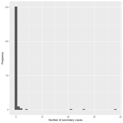
The number of secondary cases can be used to empirically estimate the offspring distribution, which is the number of secondary infections caused by each case. One candidate statistical distribution used to model the offspring distribution is the negative binomial distribution with two parameters:
Mean, which represents the \(R_{0}\), the average number of (secondary) cases produced by a single individual in an entirely susceptible population, and
Dispersion, expressed as \(k\), which represents the individual-level variation in transmission by single individuals.
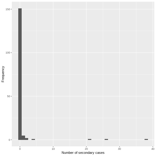
From the histogram and density plot, we can identify that the offspring distribution is highly skewed or overdispersed. In this framework, the superspreading events (SSEs) are not arbitrary or exceptional, but simply realizations from the right-hand tail of the offspring distribution, which we can quantify and analyse (Lloyd-Smith et al., 2005).
Terminology recap
- From linelist and contact-tracing data, we calculate the number of secondary cases caused by the observed infected individuals.
- While \(R_{0}\) captures the average transmission in the population, the individual reproduction number represents the number of secondary infections caused by a specific infected individual, which varies between individuals.
- Because of stochastic effects in transmission, the number of secondary infections caused by each infection is statistically described by the offspring distribution.
- The empirical offspring distribution can be modeled using a negative binomial distribution with mean \(R_{0}\) and dispersion parameter \(k\), estimated from the observed number of secondary cases.
For occurrences of associated discrete events we can use Poisson or negative binomial discrete distributions.
In a Poisson distribution, mean is equal to variance. But when variance is higher than the mean, this is called overdispersion. In biological applications, overdispersion occurs and so a negative binomial may be worth considering as an alternative to Poisson distribution.
The negative binomial distribution is specially useful for discrete data over an unbounded positive range whose sample variance exceeds the sample mean. In such terms, the observations are overdispersed with respect to a Poisson distribution, for which the mean is equal to the variance.
In epidemiology, the negative binomial distribution has been used to model disease transmission for infectious diseases where the likely number of onward infections may vary considerably from individual to individual and from setting to setting, capturing all variation in infectious histories of individuals, including properties of the biological (i.e. degree of viral shedding) and environmental circumstances (e.g. type and location of contact).
Challenge
Calculate the distribution of secondary cases for Ebola using the
ebola_sim_clean object from outbreaks
package.
- Is the offspring distribution of Ebola skewed or overdispersed?
⚠️ Optional step: This dataset has 5829 cases.
Running plot(<epicontacts>) may take several minutes
and use significant memory for large outbreaks such as the Ebola
linelist. If you’re on an older or slower computer, you can skip this
step.
R
## first, make an epicontacts object
ebola_contacts <-
  epicontacts::make_epicontacts(
    linelist = outbreaks::ebola_sim_clean$linelist,
    contacts = outbreaks::ebola_sim_clean$contacts,
    directed = TRUE
  )

# count secondary cases per subject in contacts and linelist
ebola_secondary <- epicontacts::get_degree(
  x = ebola_contacts,
  type = "out",
  only_linelist = TRUE
)

## plot the distribution
ebola_secondary %>%
  tibble::enframe() %>%
  ggplot(aes(value)) +
  geom_histogram(binwidth = 1) +
  labs(
    x = "Number of secondary cases",
    y = "Frequency"
  )
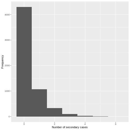
From a visual inspection, the distribution of secondary cases for the
Ebola data set in ebola_sim_clean shows an skewed
distribution with secondary cases equal or lower than 6. We need to
complement this observation with a statistical analysis to evaluate for
overdispersion.
Estimate the dispersion parameter
To empirically estimate the dispersion parameter \(k\), we could fit a negative binomial distribution to the number of secondary cases.
We can fit distributions to data using the fitdistrplus package, which provides maximum likelihood estimates.
R
library(fitdistrplus)
R
## fit distribution
offspring_fit <- all_secondary_cases %>%
  fitdistrplus::fitdist(distr = "nbinom")

offspring_fit
OUTPUT
Fitting of the distribution ' nbinom ' by maximum likelihood
Parameters:
       estimate  Std. Error
size 0.02039807 0.007278299
mu 0.60452947 0.337893199Name of parameters
From the fitdistrplus output:
- The
sizeobject refers to the estimated dispersion parameter \(k\), and - The
muobject refers to the estimated mean, which represents the \(R_{0}\),
From the number secondary cases distribution we estimated a dispersion parameter \(k\) of 0.02, with a 95% Confidence Interval from 0.006 to 0.035. As the value of \(k\) is significantly lower than one, we can conclude that there is considerable potential for superspreading events.
We can overlap the estimated density values of the fitted negative binomial distribution and the histogram of the number of secondary cases:
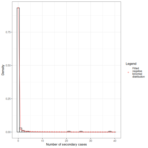
Individual-level variation in transmission
The individual-level variation in transmission is defined by the relationship between the mean (\(R_{0}\)) and dispersion (\(k\)), which together define the variance of a negative binomial distribution.
The negative binomial model has \(variance = R_{0}(1+\frac{R_{0}}{k})\), so smaller values of \(k\) indicate greater variance and, consequently, greater individual-level variation in transmission.
\[\uparrow variance = R_{0}(1+\frac{R_{0}}{\downarrow k})\]
When \(k\) approaches infinity (\(k \rightarrow \infty\)) the variance equals the mean (because \(\frac{R_{0}}{\infty}=0\)). This makes the conventional Poisson model an special case of the negative binomial model.
Challenge
From the previous challenge, use the distribution of secondary cases
from the ebola_sim_clean object from
outbreaks package.
Fit a negative binomial distribution to estimate the mean and dispersion parameter of the offspring distribution. Try to estimate the uncertainty of the dispersion parameter from the Standard Error to 95% Confidence Intervals.
- Does the estimated dispersion parameter of Ebola provide evidence of an individual-level variation in transmission?
Review how we fitted a negative binomial distribution using the
fitdistrplus::fitdist() function.
R
ebola_offspring <- ebola_secondary %>%
  fitdistrplus::fitdist(distr = "nbinom")

ebola_offspring
OUTPUT
Fitting of the distribution ' nbinom ' by maximum likelihood
Parameters:
estimate Std. Error
size 0.8539443 0.072505326
mu 0.3675993 0.009497097R
## extract the "size" parameter
ebola_mid <- ebola_offspring$estimate[["size"]]
## calculate the 95% confidence intervals using the
## standard error estimate and
## the 0.025 and 0.975 quantiles of the normal distribution.
ebola_lower <- ebola_mid + ebola_offspring$sd[["size"]] * qnorm(0.025)
ebola_upper <- ebola_mid + ebola_offspring$sd[["size"]] * qnorm(0.975)
# ebola_mid
# ebola_lower
# ebola_upper
From the number secondary cases distribution we estimated a dispersion parameter \(k\) of 0.85, with a 95% Confidence Interval from 0.71 to 1.
For dispersion parameter estimates higher than one we get low distribution variance, hence, low individual-level variation in transmission.
But does this mean that the secondary case distribution does not have superspreading events (SSEs)? You will later find one additional challenge: How do you define an SSE threshold for Ebola?
We can use the maximum likelihood estimates from
fitdistrplus to compare different models and assess fit
performance using estimators like the AIC and BIC. Read further in the
vignette on Estimate
individual-level transmission and use the
superspreading helper function ic_tbl() for
this!
The dispersion parameter across diseases
Research into sexually transmitted and vector-borne diseases has previously suggested a ‘20/80’ rule, with 20% of individuals contributing at least 80% of the transmission potential (Woolhouse et al., 1997).
On its own, the dispersion parameter \(k\) is hard to interpret intuitively, and hence converting into proportional summary can enable easier comparison. When we consider a wider range of pathogens, we can see there is no hard and fast rule for the percentage that generates 80% of transmission, but variation does emerge as a common feature of infectious diseases
When the 20% most infectious cases contribute to the 80% of transmission (or more), there is a high individual-level variation in transmission, with a highly overdispersed offspring distribution (\(k<0.1\)), e.g., SARS-1.
When the 20% most infectious cases contribute to the ~50% of transmission, there is a low individual-level variation in transmission, with a moderately dispersed offspring distribution (\(k > 0.1\)), e.g. Pneumonic Plague.
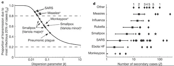
Controlling superspreading with contact tracing
During an outbreak, it is common to try and reduce transmission by identifying people who have come into contact with an infected person, then quarantine them in case they subsequently turn out to be infected. Such contact tracing can be deployed in multiple ways. ‘Forward’ contact tracing targets downstream contacts who may have been infected by a newly identifed infection (i.e. the ‘index case’). ‘Backward’ tracing instead tracks the upstream primary case who infected the index case (or a setting or event at which the index case was infected), for example by retracing history of contact to the likely point of exposure. This makes it possible to identify others who were also potentially infected by this earlier primary case.
In the presence of individual-level variation in transmission, i.e., with an overdispersed offspring distribution, if this primary case is identified, a larger fraction of the transmission chain can be detected by forward tracing each of the contacts of this primary case (Endo et al., 2020).
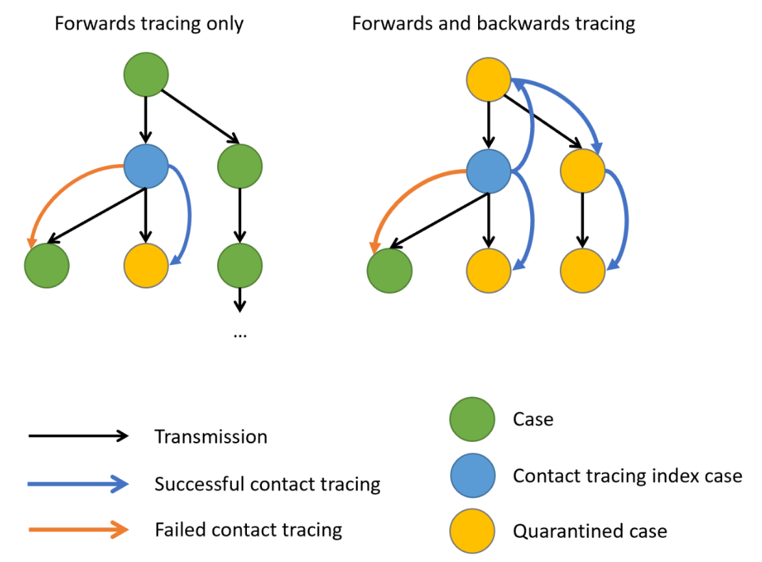
When there is evidence of individual-level variation (i.e. overdispersion), often resulting in so-called superspreading events, a large proportion of infections may be linked to a small proportion of original clusters. As a result, finding and targeting originating clusters in combination with reducing onwards infection may substantially enhance the effectiveness of tracing methods (Endo et al., 2020).
Empirical evidence focused on evaluating the efficiency of backward tracing led to 42% more cases identified than forward tracing supporting its implementation when rigorous suppression of transmission is justified (Raymenants et al., 2022).
Probability of cases in a given cluster
Using superspreading, we can estimate the probability of having a cluster of secondary infections caused by a primary case identified by backward tracing of size \(X\) or larger (Endo et al., 2020).
R
# Set seed for random number generator
set.seed(33)
# estimate the probability of
# having a cluster size of 5, 10, or 25
# secondary cases from a primary case,
# given known reproduction number and
# dispersion parameter.
superspreading::proportion_cluster_size(
R = offspring_fit$estimate["mu"],
k = offspring_fit$estimate["size"],
cluster_size = c(5, 10, 25)
)
OUTPUT
R k prop_5 prop_10 prop_25
1 0.6045295 0.02039807 87.9% 74.6% 46.1%Even though we have an \(R<1\), a highly overdispersed offspring distribution (\(k=0.02\)) means that if we detect a new case, there is a 46.1% probability they originated from a cluster of 25 infections or more. Hence, by following a backwards strategy, contact tracing efforts will increase the probability of successfully contain and quarantining this large number of earlier infected individuals, rather than simply focusing on the new case, who is likely to have infected nobody (because \(k\) is very small).
We can also use this number to prevent gatherings of a certain size to reduce the epidemic by preventing potential superspreading events. Interventions can target to reduce the reproduction number in order to reduce the probability of having clusters of secondary cases.
Backward contact tracing for Ebola
Use the Ebola estimated parameters for ebola_sim_clean
object from outbreaks package.
Calculate the probability of having a cluster of secondary infections caused by a primary case identified by backward tracing of size 5, 10, 15 or larger.
Would implementing a backward strategy at this stage of the Ebola outbreak increase the probability of containing and quarantining more onward cases?
Review how we estimated the probability of having clusters of a fixed
size, given an offspring distribution mean and dispersion parameters,
using the superspreading::proportion_cluster_size()
function.
R
# estimate the probability of
# having a cluster size of 5, 10, or 25
# secondary cases from a primary case,
# given known reproduction number and
# dispersion parameter.
superspreading::proportion_cluster_size(
R = ebola_offspring$estimate["mu"],
k = ebola_offspring$estimate["size"],
cluster_size = c(5, 10, 25)
)
OUTPUT
R k prop_5 prop_10 prop_25
1 0.3675993 0.8539443 2.64% 0% 0%The probability of having clusters of five people is 1.8%. At this stage, given this offspring distribution parameters, a backward strategy may not increase the probability of contain and quarantine more onward cases.
Challenges
Does Ebola have any superspreading event?
‘Superspreading events’ can mean different things to different people, so Lloyd-Smith et al., 2005 proposed a general protocol for defining a superspreading event (SSE). If the number of secondary infections caused by each case, \(Z\), follows a negative binomial distribution (\(R, k\)):
- We define an SSE as any infected individual who infects more than \(Z(n)\) others, where \(Z(n)\) is the nth percentile of the \(Poisson(R)\) distribution.
- A 99th-percentile SSE is then any case causing more infections than would occur in 99% of infectious histories in a homogeneous population
Using the corresponding distribution function, estimate the SSE
threshold to define a SSE for the Ebola offspring distribution estimates
for the ebola_sim_clean object from
outbreaks package.
In a Poisson distribution, the lambda or rate parameter are equal to the estimated mean from a negative binomial distribution. You can explore this in The distribution zoo shiny app.
To get the quantile value for the 99th-percentile we need to use the
density
function for the Poisson distribution dpois().
R
# get mean
ebola_mu_mid <- ebola_offspring$estimate["mu"]
# get 99th-percentile from poisson distribution
# with mean equal to mu
stats::qpois(
p = 0.99,
lambda = ebola_mu_mid
)
OUTPUT
[1] 2Compare this values with the ones reported by Lloyd-Smith et al., 2005. See figure below:
Expected proportion of transmission
What is the proportion of cases responsible for 80% of transmission?
Use superspreading and compare the estimates for MERS using the offspring distributions parameters from this tutorial episode, with SARS-1 and Ebola offspring distributions parameter accessible via the epiparameter R package.
To use superspreading::proportion_transmission() we
recommend to read the Estimate
what proportion of cases cause a certain proportion of transmission
reference manual.
Currently, epiparameter has offspring distributions
for SARS, Smallpox, Mpox, Pneumonic Plague, Hantavirus Pulmonary
Syndrome, Ebola Virus Disease. Let’s access the offspring distribution
mean and dispersion parameters for SARS-1:
R
# Load parameters
sars <- epiparameter::epiparameter_db(
disease = "SARS",
epi_name = "offspring distribution",
single_epiparameter = TRUE
)
sars_params <- epiparameter::get_parameters(sars)
sars_params
OUTPUT
mean dispersion
1.63 0.16 R
#' estimate for ebola --------------
ebola_epiparameter <- epiparameter::epiparameter_db(
disease = "Ebola",
epi_name = "offspring distribution",
single_epiparameter = TRUE
)
ebola_params <- epiparameter::get_parameters(ebola_epiparameter)
ebola_params
OUTPUT
mean dispersion
1.5 5.1 R
# estimate
# proportion of cases that
# generate 80% of transmission
superspreading::proportion_transmission(
R = ebola_params[["mean"]],
k = ebola_params[["dispersion"]],
prop_transmission = 0.8
)
OUTPUT
R k prop_80
1 1.5 5.1 43.2%R
#' estimate for sars --------------
# estimate
# proportion of cases that
# generate 80% of transmission
superspreading::proportion_transmission(
R = sars_params[["mean"]],
k = sars_params[["dispersion"]],
prop_transmission = 0.8
)
OUTPUT
R k prop_80
1 1.63 0.16 13%R
#' estimate for mers --------------
# estimate
# proportion of cases that
# generate 80% of transmission
superspreading::proportion_transmission(
R = offspring_fit$estimate["mu"],
k = offspring_fit$estimate["size"],
prop_transmission = 0.8
)
OUTPUT
R k prop_80
1 0.6045295 0.02039807 2.13%MERS has the lowest percent of cases (2.1%) responsible of the 80% of the transmission, representative of highly overdispersed offspring distributions.
Ebola has the highest percent of cases (43%) responsible of the 80% of the transmission. This is representative of offspring distributions with high dispersion parameters.
inverse-dispersion?
The dispersion parameter \(k\) can be expressed differently across the literature.
- In the Wikipedia page for the negative binomial, this parameter is defined in its reciprocal form (refer to the variance equation).
- In the distribution zoo shiny app, the dispersion parameter \(k\) is named “Inverse-dispersion” but it is equal to parameter estimated in this episode. We invite you to explore this!
heterogeneity?
The individual-level variation in transmission is also referred as
the heterogeneity in the transmission or degree of heterogeneity in Lloyd-Smith et
al., 2005, heterogeneous infectiousness in Campbell
et al., 2018 when introducing the {outbreaker2}
package. Similarly, a contact network can store heterogeneous
epidemiological contacts as in the documentation of the
epicontacts package (Nagraj
et al., 2018).
Read these blog posts
The Tracing monkeypox article from the JUNIPER consortium showcases the usefulness of network models on contact tracing.
The Going viral post from Adam Kucharski shares insides from YouTube virality, disease outbreaks, and marketing campaigns on the conditions that spark contagion online.
- Use epicontacts to calculate the number of secondary cases cause by a particular individual from linelist and contact data.
- Use fitdistrplus to empirically estimate the offspring distribution from the number of secondary cases distribution.
- Use superspreading to estimate the probability of having clusters of a given size from primary cases and inform contact tracing efforts.
Content from Simulate transmission chains
Last updated on 2026-07-17 | Edit this page
Estimated time: 32 minutes
Overview
Questions
- How can we simulate transmission chains based on infection characteristics?
Objectives
- Estimate the potential for large outbreaks following the introduction of a new case using a branching process with epichains.
Prerequisites
Learners should familiarise themselves with the following concept dependencies before working through this tutorial:
Statistics: Common probability distributions, including Poisson and negative binomial.
Epidemic theory: The reproduction number, \(R\).
R packages installed: epichains, epiparameter, tidyverse.
Install packages if they are not already installed
R
if (!base::require("pak")) install.packages("pak")
pak::pak(c("epichains", "epiparameter", "tidyverse"))
If you have any error message, go to the main setup page.
Introduction
Individual variation in transmission can affect both the potential for an epidemic to establish in a population and the ease of control (Cori et al., 2017).
Greater variation reduces the overall probably of a single new case causing a large local outbreak, because most cases infect few others and individuals that generate a large number of secondary cases are relatively rare.
However, if a ‘superspreading event’ does occur and the outbreak gets established, this variation can make an outbreak harder to control using mass interventions (i.e. blanket interventions that implicitly assume everyone contributes equally to transmission), because some cases contribute disproportionality: a single uncontrolled case may generate a large number of secondary cases.
Conversely, variation in transmission may provide opportunities for targeted interventions if the individuals who contribute more to transmission (due to biological or behavioural factors), or the settings in which ‘superspreading events’ occur, share socio-demographic, environmental or geographical characteristics that can be defined.
How can we quantify the potential of a new infection to cause a large outbreak based on its reproduction number \(R\) and the dispersion \(k\) of its offspring distribution?
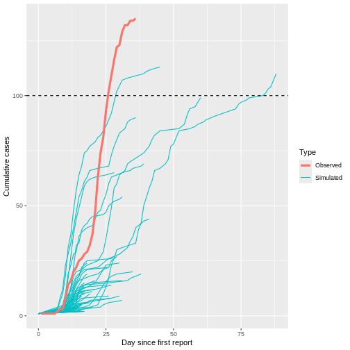
In this episode, we will use the epichains package to simulate transmission chains and estimate the potential for large outbreaks following the introduction of a new case. We are going to use it with functions from epiparameter, dplyr and purrr, so also loading the tidyverse package:
R
library(epichains)
library(epiparameter)
library(tidyverse)
The double-colon
The double-colon :: in R lets you call a specific
function from a package without loading the entire package into the
current environment. The package must be installed.
For example, dplyr::filter(data, condition) uses
filter() from the dplyr package.
This help us remember package functions and avoid namespace conflicts.
Simulation of uncontrolled outbreaks
Infectious disease epidemics spread through populations when a chain of infected individuals transmit the infection to others. Branching processes can be used to model this transmission. A branching process is a stochastic process (i.e. a random process that can be described by a known probability distribution), where each infectious individual gives rise to a random number of individuals in the next generation of infection, starting with the index case in generation 1. The distribution of the number of secondary cases each individual generates is called the offspring distribution (Azam & Funk, 2024).
epichains provides methods to analyse and simulate the size and length of branching processes with an given offspring distribution. epichains implements a rapid and simple model to simulate transmission chains to assess epidemic risk, project cases into the future, and evaluate interventions that change \(R\).
chain size and length
The size of the transmission chain is defined as the total number of individuals infected across all generations of infection, and
the length of the transmission chain is the number of generations from the first case to the last case in the outbreak before the chain ended.
The size calculation includes the first case, and the length calculation contains the first generation when the first case starts the chain (See figure below).
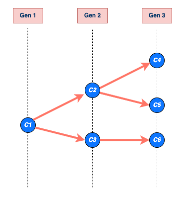
To use epichains, we need to know (or assume) two key epidemiological values:
- the offspring distribution and
- the generation time.
You may recognize these two parameters from the Access epidemiological delay distributions tutorial, where we first introduced generation time and the reproduction number.
Get the offspring distribution
Here we assume the MERS offspring distribution follows a negative
binomial distribution, with mean (reproduction number \(R\)) and dispersion \(k\) values estimated from the linelist and
contact data of mers_korea_2015 in the
outbreaks R package in the previous episode.
R
mers_offspring <- c(mean = 0.60, dispersion = 0.02)
offspring distribution for epichains
We input an offspring distribution to epichains by
referring to the R function that generates random values from the
distribution we want. For a negative binomial distribution, we use
rnbinom with its corresponding mu and
size arguments:
Internally, epichains will draw one random value, given the parameters, to simulate the number of new infections from an infected individual (onward transmission).
R
# generate one random number given the distribution family and its parameters
# (run this line many times to get different values)
rnbinom(n = 1, mu = mers_offspring["mean"], size = mers_offspring["dispersion"])
The reference manual in ?rnbinom tells us our required
specific arguments.
epichains can accept any R function that generates random numbers, so the specified arguments will change depending on the R function used. For more details on the range of possible options, see the function reference manual.
For example, let’s say we want to use a Poisson distribution for the
offspring distribution. First, read the argument required in the
?rpois reference manual. Second, specify the
lambda argument parameter, also known as rate or mean in
the literature. In epichains, this can look like
this:
In this example, we can specify
lambda = mers_offspring["mean"] because the mean number of
secondary cases generated (i.e. \(R\))
should be the same regardless of the distribution we assume. What
changes is the variance of the distribution, and hence the level of
individual-level variation in transmission. When the dispersion
parameter \(k\) approaches infinity
(\(k \rightarrow \infty\)) in a
negative binomial distribution, the variance equals the mean. This makes
the conventional Poisson distribution a special case of the negative
binomial distribution.
Get generation time
The serial interval distribution is often used to approximate the generation time distribution. This approximation is commonly used because it is easier to observe and measure the onset of symptoms in each case than the precise time of infection.
However, using the serial interval as an approximation of the generation time is primarily valid for diseases in which infectiousness starts after symptom onset (Chung Lau et al., 2021). In cases where infectiousness starts before symptom onset, the serial intervals can have negative values, which is the case for diseases with pre-symptomatic transmission (Nishiura et al., 2020).
Let’s use the epiparameter package to access and use the available serial interval for MERS disease.
R
serial_interval <- epiparameter::epiparameter_db(
disease = "mers",
epi_name = "serial",
single_epiparameter = TRUE
)
plot(serial_interval, day_range = 0:25)
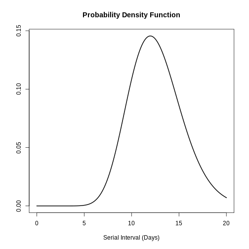
The serial interval for MERS has a mean of 12.6 days and a standard deviation of 2.8 days.
generation time for epichains
In each simulation step, epichains will draw
generation time values for each new infection generated from the
offspring distribution. With <epiparameter> class
objects we can use the distribution function
epiparameter::generate() for this input.
R
# In step one, the number of new infections is 2, then:
# generate 2 random values given the serial interval distribution
generate(x = serial_interval, times = 2)
OUTPUT
[1] 14.60507 15.06471R
# In step two, the number of new infections is 6, then:
# generate 6 random values given the serial interval distribution
generate(x = serial_interval, times = 6)
OUTPUT
[1] 12.522027 16.109812 14.195049 6.875113 15.432142 12.349850Given that the input value in times will vary each step,
we need to embed generate() within a function.
epichains will draw as many random values from the
generation time as number of new infections in that step. This will look
like this:
R
function(x) generate(x = serial_interval, times = x)
This interface is similar to the one cfr uses to link with epiparameter. Read the work with delay distributions vignette for further context.
The function to generate random number from an
<epiparameter> class object can also accept this
notation:
R
as.function(x = serial_interval, func_type = "generate")
Simulate a single chain
Now we are prepared to use the simulate_chains()
function from epichains to create one
transmission chain:
R
epichains::simulate_chains(
n_chains = 1,
statistic = "size",
offspring_dist = rnbinom,
mu = mers_offspring["mean"],
size = mers_offspring["dispersion"],
generation_time = function(x) generate(x = serial_interval, times = x)
)
simulate_chains() requires three sets of arguments as a
minimum:
-
simulation controls (
n_chainsandstatistic), -
offspring distribution (
offspring_distand required distribution parameters), and -
generation time
(
generation_time).
In the lines above, we described how to specify the offspring distribution and generation time. The simulation controls include at least two arguments:
-
n_chains, which defines the number of transmission chains to simulate for and -
statistic, which defines a chain statistic to track (either"size"or"length") as the stopping criteria for each chain being simulated.
Stopping criteria
This is an customisable feature of epichains. By
default, branching process simulations end when they have gone extinct.
For long-lasting transmission chains, in simulate_chains()
you can add the stat_threshold argument.
For example, if we set an stopping criteria for
statistic = "size" of stat_threshold = 500, no
more offspring will be produced after a chain of size 500.
The simulate_chains() output creates a
<epichains> class object, which we can then analyse
further in R.
Simulate multiple chains
We can use simulate_chains() to create multiple chains
and increase the probability of simulating uncontrolled outbreak
projections given an overdispersed offspring distribution.
We need to specify one additional element:
-
set.seed(<integer>)is a function used to initialise a pseudo-random number generator. By specifying a seed value (the<integer>), you ensure that the sequence of numbers produced by subsequent random functions, likernorm()orsimulate_chains(), is identical every time the code is executed.
With this configuration, each chain will represent
one initial case. These cases per chain are
independent, isolated, and without interactions. This means that each
chain will have their own pool of susceptibles, which you can configure
by using the pop or percent_immune
arguments.
Now, let’s simulate 100 transmission chains:
R
# Run all this chunk together to let set.seed() work!
# Set seed for random number generator
set.seed(33)
multiple_epichains <- epichains::simulate_chains(
n_chains = 100,
statistic = "size",
offspring_dist = rnbinom,
mu = mers_offspring["mean"],
size = mers_offspring["dispersion"],
generation_time = function(x) generate(x = serial_interval, times = x)
)
You can inspect the total size of each simulated
chain, equivalent to the cumulative number of cases per chain, using the
summary() to the <epichains> class
object:
R
summary(multiple_epichains)
OUTPUT
`epichains_summary` object
[1] 1 1 1 1 1 1 1 1 1 1 1 1 1 1 1 1 1 1
[19] 7 1 1 1 1 1 1 1 1 1 1 14 1 2 1 1 2 1
[37] 1 1 1 1 1 1 1 1 1 1 1 1 1 1 1 1 1 1
[55] 1 1 1 1 512 1 1 1 1 1 104 1 1 1 1 1 1 1
[73] 1 1 1 1 1 1 1 1 1 4 1 1 1 1 1 1 1 1
[91] 1 1 1 1 1 1 1 1 1 1
Simulated sizes:
Max: 512
Min: 1We can visually count how many chains reach to more than 100 infected cases, with the maximum and minimun counts too.
Challenge
Use the last run of epichains::simulate_chains() for
simulating multiple chains. Change the statistic from
"size" to "length". Run the
summary() function.
- What chain feature does this output show?
If you need help, return to the “Chain size and length” callout box from the beginning.
Read the epichains output
To explore the output format of the <epichains>
class object of name multiple_epichains, let’s look at the
simulated chain number 30.
Let’s use dplyr::filter() for this:
R
chain_to_observe <- 30
R
#### get epichain summary ----------------------------------------------------
multiple_epichains %>%
dplyr::filter(chain == chain_to_observe)
OUTPUT
`<epichains>` object
< epichains head (from first known infector) >
chain infector infectee generation time
2 30 1 2 2 14.100967
3 30 1 3 2 10.640301
4 30 1 4 2 15.608764
5 30 1 5 2 13.515424
6 30 1 6 2 9.967474
7 30 1 7 2 9.376222
Number of chains: 100
Number of infectors (known): 3
Number of generations: 3
Use `as.data.frame(<object_name>)` to view the full output in the console.This output contains two parts:
- A
head()print of the infector-infectee pairs starting from the first known infector. - A summary footer, the piece of text that appears at the bottom:
OUTPUT
Number of infectors (known): 3
Number of generations: 3The simulated chain number 30 has three known infectors
and three generations. These numbers are more visible when printing the
<epichains> objects as a data frame (or
<tibble>).
R
#### infector-infectee data frame --------------------------------------------
multiple_epichains %>%
dplyr::filter(chain == chain_to_observe) %>%
dplyr::as_tibble()
OUTPUT
# A tibble: 14 × 5
chain infector infectee generation time
<int> <dbl> <dbl> <int> <dbl>
1 30 NA 1 1 0
2 30 1 2 2 14.1
3 30 1 3 2 10.6
4 30 1 4 2 15.6
5 30 1 5 2 13.5
6 30 1 6 2 9.97
7 30 1 7 2 9.38
8 30 1 8 2 11.5
9 30 4 9 3 31.0
10 30 4 10 3 25.3
11 30 4 11 3 28.5
12 30 4 12 3 29.6
13 30 4 13 3 25.9
14 30 4 14 3 24.6 Chain 30 tells us a story:
“In the first transmission generation at time = 0, one
subject (ID = NA) infected the subject with
ID = 1. Subject ID = 1 is the first known
infector.
“Then, in the second transmission generation, subject
ID = 1 infected seven subjects, from ID = 2 to
ID = 8. These infections ocurred in time
between day 9 and day 15, after the first known infection.
“Later, in the third transmission generation, subject
ID = 4 infected six new subjects, from ID = 9
to ID = 14. These infections ocurred in time
between day 24 and day 31, after the first known infection.”
The output data frame collects infectees as the observation unit:
- Each infectee has a
infectee“ID”. - Each infectee that behaved as an infector is
registered in the
infectorcolumn usinginfectee“id”. - Each infectee got infected in a specific
generationand (continuous)time. - The simulation number is registered under the
chaincolumn.
Note: The Number of infectors (known)
includes the subject ID = NA under the
infector column. This refers to the infector specified as
index case (in the n_chains argument), which started the
transmission chain to the infectee of ID = 1, at
generation = 1, and time = 0.
Iterate simulations
As before, we can configure the simulation of multiple chains by
simply increasing the number of chains (e.g., from
n_chains = 1 to n_chains = 100). However, if
we need to assume that each initial case starts (being infectious) at a
different time, this can only be configured in one simulation function.
Thus, we need to iterate multiple times over one
specific chain simulation configuration to increase the probability of
simulating uncontrolled outbreak projections. The following table
compares the alternatives:
| Simulation runs | Initial cases | Start time (t0) |
Use |
|---|---|---|---|
| One | 1 | Same |
epichains::simulate_chains() with
n_chains = 1
|
| Multiple (100, e.g.) | 1 | Same |
epichains::simulate_chains() with
n_chains = 100
|
| Multiple (100, e.g.) | More than one | Different | Iterate 100 times using purrr::map() over
epichains::simulate()
|
The key difference of the third configuration is the t0
argument from epichains::simulate_chains(). The argument
t0 defines the start time of each initial case per
chain.
One example of using iteration is available in the epichains vignette on Projecting infectious disease incidence: a COVID-19 example. The aim is to simulate the importation of 13 cases during different moments in time.
R
epichains::covid19_sa[1:5, ] %>%
dplyr::mutate(start_time = date - min(date))
OUTPUT
# A tibble: 5 × 3
date cases start_time
<date> <int> <drtn>
1 2020-03-05 1 0 days
2 2020-03-07 1 2 days
3 2020-03-08 1 3 days
4 2020-03-09 4 4 days
5 2020-03-11 6 6 days Instead of having 100 chains starting on the same Day 0
(t0 = 0, as default), each simulation will create chains
that start at a different moment in time. It will consider day
2020-03-05 as Day 0. The first chain starts on
day 0, one in day 2, one in day 3, four in day 4, and six in day 6. The
argument t0 will have this structure:
R
t0 <- c(0, 2, 3, rep(4, 4), rep(6, 6))
t0
OUTPUT
[1] 0 2 3 4 4 4 4 6 6 6 6 6 6To increase the probability of simulating uncontrolled outbreak projections, this same scenario need to be iterated 100 times. This will help us to provide a projection with uncertainty.
In this section we’ll showcase how to build up the
iteration over epichains step by step.
We’ll conviniently replicate the same simulation as before: 100
transmission chains with 1 initial case each starting at day 0
(t0 = 0). But, instead of using
n_chains = 100, we’ll iterate 100 times over the simulation
of 1 transmission chain with 1 initial case each starting at day 0
(n_chains = 1).
We need to specify two additional elements:
-
number_simulations, which defines the number of simulations to run. -
initial_casesdefines the number of initial cases to input to then_chainsargument explained in the lines above.
R
# Number of simulation runs
number_simulations <- 100
# Number of initial cases
initial_cases <- 1
number_simulations and initial_cases are
conveniently stored in objects to facilitate downstream reuse in the
workflow.
Iteration using purrr
Iteration aims to perform the same action on different objects repeatedly.
Learn how to use the core purrr functions like
map() from the YouTube tutorial on How to purrr by
Equitable Equations.
Or, if you previously used the *apply family of
functions, visit the package vignette on purrr base R,
which shares key differences, direct translations, and examples.
To get multiple chains, we must apply the
simulate_chains() function to each chain defined by a
sequence of numbers from 1 to 100.
purrr and epichains
First, let’s sketch how we use purrr::map() with
epichains::simulate_chains(). The map()
function requires two arguments:
-
.x, with a vector of numbers, and -
.f, a function to iterate to each vector value.
The code chunk below
R
# steps:
# - purrr::map() will run 100 times function(sim).
# - seq_len() creates a vector with sequence of numbers (simulation IDs from 1 to 100) and
# - function(sim) iterates {epichains} to each simulation ID number, then
# - dplyr::mutate() adds a column to the <epichains> output with the simulation ID number.
# - purrr::list_rbind() combines all the list class outputs (for each simulation ID) into a single data frame.
purrr::map(
.x = seq_len(number_simulations),
.f = function(sim) {
epichains::simulate_chains(...) %>% # <-- {epichains}
dplyr::mutate(simulation_id = sim)
}
) %>%
purrr::list_rbind()
# pseudo code: do not run.
The sim element is placed to register the iteration
number (simulation ID) as a new column in the
<epichains> output. The
purrr::list_rbind() function aims to combine all the list
outputs from map().
Why a dot (.) as a prefix before x and f
arguments? In the tidy design
principles book we have a chapter on the dot prefix!
Now, we are prepared to use purrr::map() to repeatedly
simulate from simulate_chains() and store in a vector from
1 to 100:
R
set.seed(33)
simulated_chains_map <-
purrr::map(
.x = seq_len(number_simulations),
.f = function(sim) {
epichains::simulate_chains(
n_chains = initial_cases,
statistic = "size",
offspring_dist = rnbinom,
mu = mers_offspring["mean"],
size = mers_offspring["dispersion"],
generation_time = function(x) generate(x = serial_interval, times = x)
) %>%
dplyr::mutate(simulation_id = sim)
}
) %>%
purrr::list_rbind()
One limitation of the iteration output is that, to summarize the
output, we can not use the summary(<epichains>).
R
simulated_chains_map %>%
dplyr::count(simulation_id) %>%
dplyr::pull(n)
OUTPUT
[1] 1 1 1 1 1 1 1 1 1 1 1 1 1 1 9 1 1 1
[19] 1 1 1 1 113 1 1 1 1 1 1 1 1 1 19 1 1 1
[37] 1 1 1 1 1 1 1 1 1 1 1 1 1 1 1 1 1 1
[55] 1 1 1 1 1 1 1 1 1 1 1 1 1 1 22 1 1 1
[73] 1 1 1 1 1 1 1 1 1 1 1 1 1 1 1 1 1 1
[91] 1 1 1 1 1 1 1 1 1 1Visualize multiple chains
To increase the probability of simulating uncontrolled outbreak projections given an overdispersed offspring distribution, let’s simulate 1000 transmission chains with 1 initial case each starting at day 0.
We will run a simulation with multiple replicates, without iteration for this section:
R
set.seed(33)
multiple_epichains <- epichains::simulate_chains(
n_chains = 1000,
statistic = "size",
offspring_dist = rnbinom,
mu = mers_offspring["mean"],
size = mers_offspring["dispersion"],
generation_time = function(x) generate(x = serial_interval, times = x)
)
To visualize the simulated chains, we need some pre-processing:
- Let’s use dplyr to get round time numbers to resemble surveillance days.
- Count the daily cases in each simulation (by
chain). - Calculate the cumulative number of cases within a simulation.
R
# daily aggregate of cases
aggregate_chains <- multiple_epichains %>%
# use data.frame output from <epichains> object
dplyr::as_tibble() %>%
# get the round number (day) of infection times
dplyr::mutate(day = ceiling(time)) %>%
# count the number of daily incident cases in each chain
dplyr::count(chain, day, name = "cases_new") %>%
# calculate the cumulative number of cases for each chain
dplyr::group_by(chain) %>%
dplyr::mutate(cases_cumsum = cumsum(cases_new)) %>%
dplyr::ungroup()
To better understand the output we just produced, let’s print more lines of it. The relevant columns are:
-
days: the discretized time step of the simulation (continuous time binned into days) -
cases_new: the number of new incident cases on that day -
cases_cumsum: the cumulative sum of cases per day, computed within each transmission chain
R
# Print a couple of chains to better understand the output
aggregate_chains %>%
arrange(chain) %>%
print(n=50)
Before the plot, let’s create a summary table with the total time
duration and size of each chain. We can use the dplyr
“combo” of group_by(), summarise() and
ungroup():
R
# Summarise the chain duration and size
summary_chains <-
aggregate_chains %>%
dplyr::group_by(chain) %>%
dplyr::summarise(
# duration
day_max = max(day),
# size
cases_total = max(cases_cumsum)
) %>%
dplyr::ungroup()
summary_chains
OUTPUT
# A tibble: 1,000 × 3
chain day_max cases_total
<int> <dbl> <int>
1 1 0 1
2 2 0 1
3 3 0 1
4 4 0 1
5 5 0 1
6 6 0 1
7 7 0 1
8 8 0 1
9 9 0 1
10 10 0 1
# ℹ 990 more rowsNow, we are prepared for using the ggplot2 package:
R
# Visualize transmission chains by cumulative cases
ggplot() +
# create grouped chain trajectories
geom_line(
data = aggregate_chains,
mapping = aes(
x = day,
y = cases_cumsum,
group = chain
),
color = "black",
alpha = 0.25,
show.legend = FALSE
) +
# define a 100-case threshold
geom_hline(aes(yintercept = 100), lty = 2) +
labs(
x = "Day",
y = "Cumulative cases"
)
Although most introductions of 1 index case do not generate secondary cases (N = 934) or most outbreaks rapidly become extinct (median duration of 17 and median size of 5.5), only 1 epidemic trajectories among 100 simulations (1%) can reach to more than 100 infected cases. This finding is particularly remarkable because the reproduction number \(R\) is less than 1 (offspring distribution mean of 0.6), but, given an offspring distribution dispersion parameter of 0.02, it shows the potential for explosive outbreaks of MERS disease.
We can count how many chains reached the 100-case threshold using
dplyr functions. This output should give us equivalent
results to summary(multiple_epichains):
R
# number of chains that reached the 100-case threshold
summary_chains %>%
dplyr::filter(cases_total > 100)
OUTPUT
# A tibble: 1 × 3
chain day_max cases_total
<int> <dbl> <int>
1 65 34 103Let’s overlap the cumulative number of observed cases using the
linelist object from the mers_korea_2015 dataset of the
outbreaks R package. To prepare the dataset so we can
plot daily total cases over time, we use incidence2 to
convert the linelist to an <incidence2> object,
complete the missing dates of the time series with
complete_dates()
R
library(outbreaks)
mers_cumcases <- mers_korea_2015$linelist %>%
# incidence2 workflow
incidence2::incidence(date_index = "dt_onset") %>%
incidence2::complete_dates() %>%
# wrangling using {dplyr}
dplyr::mutate(count_cumsum = cumsum(count)) %>%
tibble::rownames_to_column(var = "day") %>%
dplyr::mutate(day = as.numeric(day))
Use plot() to make an incidence plot:
R
# plot the incidence2 object
plot(mers_cumcases)
When plotting the observed number of cumulative cases from the Middle East respiratory syndrome (MERS) outbreak in South Korea in 2015 alongside the previously simulated chains, we see that the observed cases followed a trajectory that is consistent with the simulated explosive outbreak dynamics (which makes sense, given the simulation uses parameters based on this specific outbreak).

When we increase the dispersion parameter from \(k = 0.01\) to \(k = \infty\) - and hence reduce individual-level variation in transmission - and assume a fixed reproduction number \(R = 1.5\), the proportion of simulated outbreaks that reached the 100-case threshold increases. This is because the simulated outbreaks now have more of a consistent, clockwise dynamic, rather than the high level of variability seen previously.
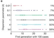
Early spread projections
In the epidemic’s initial phase, you can use epichains to apply a branching process model to project the number of future cases. Even though the model accounts for randomness in transmission and variation in the number of secondary cases, there may be additional local features we have not considered. Analysis of early forecasts made for COVID in different countries using this model structure found that predictions were often overconfident (Pearson et al., 2020). This is likely because the real-time model did not include all the changes in the offspring distribution that were happening at the local level as a result of behaviour change and control measures. You can read more about the importance of local context in COVID-19 models in Eggo et al. (2020).
We invite you to read the vignette on Projecting infectious disease incidence: a COVID-19 example! for more on making predictions using epichains.
Challenges
Monkeypox large outbreak potential
Evaluate the potential for a new Monkey pox (Mpox) case to generate an explosive large outbreak.
- Simulate 1000 transmission chains with 1 initial case each starting at day 0.
- Use the appropriate package to access delay data from previous outbreaks.
- How many simulated trajectories reach more than 100 infected cases?
With epiparameter, you can access and use offspring and delay distributions from previous Ebola outbreaks.
R
library(epiparameter)
library(tidyverse)
epiparameter::epiparameter_db(epi_name = "offspring") %>%
epiparameter::parameter_tbl() %>%
dplyr::count(disease, epi_name)
OUTPUT
# Parameter table:
# A data frame: 6 × 3
disease epi_name n
<chr> <chr> <int>
1 Ebola Virus Disease offspring distribution 1
2 Hantavirus Pulmonary Syndrome offspring distribution 1
3 Mpox offspring distribution 1
4 Pneumonic Plague offspring distribution 1
5 SARS offspring distribution 2
6 Smallpox offspring distribution 4R
epiparameter::epiparameter_db(epi_name = "serial interval") %>%
epiparameter::parameter_tbl() %>%
dplyr::count(disease, epi_name)
OUTPUT
# Parameter table:
# A data frame: 6 × 3
disease epi_name n
<chr> <chr> <int>
1 COVID-19 serial interval 4
2 Ebola Virus Disease serial interval 4
3 Influenza serial interval 1
4 MERS serial interval 2
5 Marburg Virus Disease serial interval 2
6 Mpox serial interval 5Also, given that you only need one chain per iteration starting the same day, it may not be necessary to use iteration for this one.
R
# load packages -----------------------------------------------------------
library(epiparameter)
library(tidyverse)
# delays ------------------------------------------------------------------
mpox_offspring_epiparam <- epiparameter::epiparameter_db(
disease = "mpox",
epi_name = "offspring",
single_epiparameter = TRUE
)
mpox_offspring <- epiparameter::get_parameters(mpox_offspring_epiparam)
mpox_serialint <- epiparameter::epiparameter_db(
disease = "mpox",
epi_name = "serial interval",
single_epiparameter = TRUE
)
# iterate -----------------------------------------------------------------
# Set seed for random number generator
set.seed(33)
simulated_chains_mpox <- epichains::simulate_chains(
n_chains = 1000,
statistic = "size",
offspring_dist = rnbinom,
mu = mpox_offspring["mean"],
size = mpox_offspring["dispersion"],
generation_time = function(x) generate(x = mpox_serialint, times = x)
)
# visualize ---------------------------------------------------------------
# daily aggregate of cases
simulated_chains_mpox_day <- simulated_chains_mpox %>%
# use data.frame output from <epichains> object
as_tibble() %>%
# Count the daily number of cases in each chain
mutate(day = ceiling(time)) %>%
count(chain, day, name = "cases") %>%
# Calculate the cumulative number of cases for each chain
group_by(chain) %>%
mutate(cumulative_cases = cumsum(cases)) %>%
ungroup()
# Visualize transmission chains by cumulative cases
simulated_chains_mpox_day %>%
# Create grouped chain trajectories
ggplot(aes(x = day, y = cumulative_cases, group = chain)) +
geom_line(color = "black", alpha = 0.25, show.legend = FALSE) +
# Define a 100-case threshold
geom_hline(aes(yintercept = 100), lty = 2) +
labs(x = "Day", y = "Cumulative cases")
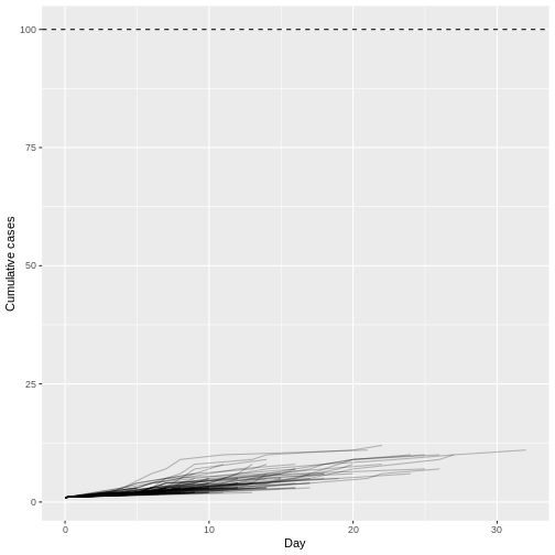
Assuming a Monkey pox outbreak with \(R\) = 0.32 and \(k\) = 0.58, there is no trajectory among 1000 simulations that reach more than 100 infected cases. Compared to MERS (\(R\) = 0.6 and \(k\) = 0.02).
With superspreading, you can get numerical solutions to processes that epichains solve using branching processes. We invite you to read the superspreading vignette on Epidemic risk and respond to:
- What is the probability that a newly introduced pathogen will cause a large outbreak?
- What is the probability that an infection will, by chance, fail to establish following initial introduction(s)?
- What is the probability the outbreak will be contained?
Check how these estimates vary non-linearly with respect to the mean reproduction number \(R\) and dispersion \(k\) of a given disease.
From a distribution of secondary cases
Christian Althaus, 2015 reused data published by Faye et al., 2015 (Figure 2) on the transmission tree on Ebola virus disease in Conakry, Guinea, 2014.
Using the data under the hint tab:
- Estimate the offspring distribution from the distribution of secondary cases.
- Then estimate the large outbreak potential from this data, simulating 100 runs with one initial case.
- Print the summary of the
<epichains>class object. This should help us count how many chains reach asizeof more than 100 infected cases.
For reproducible results use set.seed(645).
Code with the transmission tree data written by Christian Althaus, 2015:
R
# Number of individuals in the trees
n <- 152
# Number of secondary cases for all individuals
c1 <- c(1, 2, 2, 5, 14, 1, 4, 4, 1, 3, 3, 8, 2, 1, 1,
4, 9, 9, 1, 1, 17, 2, 1, 1, 1, 4, 3, 3, 4, 2,
5, 1, 2, 2, 1, 9, 1, 3, 1, 2, 1, 1, 2)
c0 <- c(c1, rep(0, n - length(c1)))
c0 %>%
enframe() %>%
ggplot(aes(value)) +
geom_histogram(binwidth = 1)
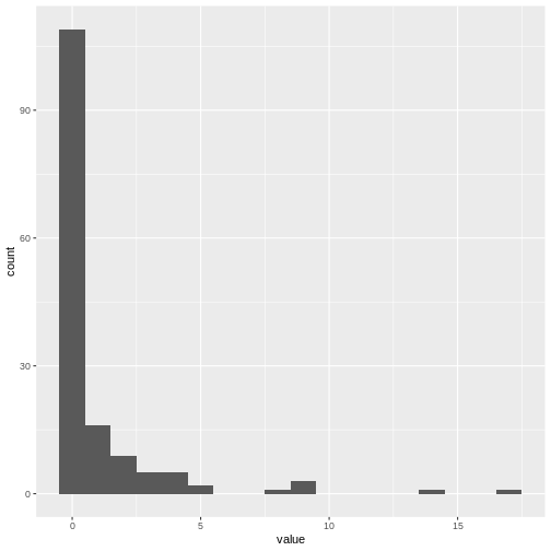
Optional challenge:
- Reproduce Figure (B) from Christian Althaus, 2015 with the simulation output.
R
# load packages ---------------------------
library(epichains)
library(epiparameter)
library(fitdistrplus)
library(tidyverse)
R
# fit a negative binomial distribution ------------------------------------
# Fitting a negative binomial distribution to the number of secondary cases
fit.cases <- fitdistrplus::fitdist(c0, "nbinom")
fit.cases
OUTPUT
Fitting of the distribution ' nbinom ' by maximum likelihood
Parameters:
estimate Std. Error
size 0.1814260 0.03990278
mu 0.9537995 0.19812301R
# serial interval parameters ----------------------------------------------
ebola_serialinter <- epiparameter::epiparameter_db(
disease = "ebola",
epi_name = "serial interval",
single_epiparameter = TRUE
)
# simulate outbreak trajectories ------------------------------------------
# Set seed for random number generator
set.seed(645)
sim_multiple_chains <- epichains::simulate_chains(
n_chains = 100,
statistic = "size",
offspring_dist = rnbinom,
mu = fit.cases$estimate["mu"],
size = fit.cases$estimate["size"],
generation_time = function(x) generate(x = ebola_serialinter, times = x)
)
# summarise ----------------------------------------
summary(sim_multiple_chains)
OUTPUT
`epichains_summary` object
[1] 9 1 2 1 1 4 1 20 14 1 1 131 1 2 1
[16] 1 7 1 2 2889 1 1 1 13 3 1 1 1 1 1
[31] 5 6 1 1 1 1 1 1 1 1 2 1 1 2 1
[46] 1 1 1 1 1 1 1 1 1 335 1 11 3 24 6
[61] 1 1 1 1 1 1 1 1 1 1 1 1 1 1 111
[76] 1 1 1 1 1 1 2 1 544 1 1 1 3 1 2
[91] 6 1 1 1 1 1 1 1 2091 1
Simulated sizes:
Max: 2889
Min: 1R
# visualize ----------------------------------------
sim_chains_aggregate <-
sim_multiple_chains %>%
# use data.frame output from <epichains> object
as_tibble() %>%
# Count the daily number of cases in each chain
mutate(day = ceiling(time)) %>%
count(chain, day, name = "cases") %>%
# Calculate the cumulative number of cases for each chain
group_by(chain) %>%
mutate(cumulative_cases = cumsum(cases)) %>%
ungroup()
sim_chains_aggregate %>%
# Create grouped chain trajectories
ggplot(aes(x = day, y = cumulative_cases, group = chain)) +
geom_line() +
# Define a 100-case threshold
geom_hline(aes(yintercept = 100), lty = 2) +
ylim(0, 100) +
xlim(0, 100) +
labs(x = "Day", y = "Cumulative cases")
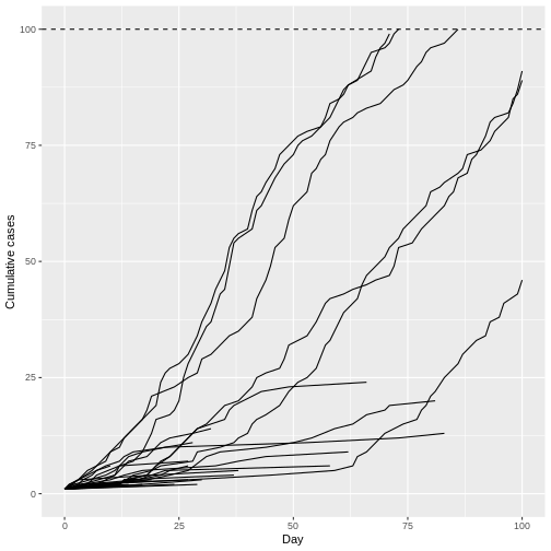
Remarkably, even with R0 less than 1 (R = 0.95) we can have potentially explosive outbreaks. The observed variation in individual infectiousness in Ebola means that although the probability of extinction is high, new index cases also have the potential for explosive regrowth of the epidemic.
- Use epichains to simulate the large outbreak potential of diseases with overdispersed offspring distributions.